Design system · study copy · claude.ai web app · October 2026
Claude
A calm, warm, reading-first chat app. One box to type in, Claude's answers set in a book-like serif, almost no colour except a small orange spark. Since September 2026 chat, Cowork and the new Docs, Slides and Design outputs live in one place.
This page is built from claude.ai's own stylesheet (loaded by the public sign-in page on 12 Oct 2026), the real icon font (370 Anthropicons), the real logo, and pictures from Anthropic's own September 2026 launch videos, claude.com and the Claude help centre. We never signed in. Every value is tagged real (from claude.ai's files), measured (from real pictures) or est. (our guess).
What you notice first
- Two voices. Your words are sans-serif in a soft grey bubble; Claude's words are serif with no bubble at all. It reads like a letter, not a chat.
- Almost no colour. Warm greys from #FCFCFB to #0B0B0B. The only brand colour is clay orange (#D97757) on the spark and #C6613F on the send button.
- One big box. The new-chat page is a greeting ("Good morning, Robin"), the composer, and three small pickers under it: Project or folder, Output, model.
- Work opens beside the chat. Artifacts (docs, slides, designs, apps) open in a panel on the right, with their own toolbars, while the chat stays on the left.
- Quiet motion. Text streams in word by word, the spark spins while Claude works, and a grey line shimmers with what it is doing.
data-color-version="v2": cooler, cleaner greys than the old parchment look. real--cds-*) with light, dark, two densities and sizes xs–lg. We follow it. realStudy use only. Claude, the spark, the Anthropicons icons and Anthropic's fonts belong to Anthropic. All names, companies and messages in our copies are made up.
Product screens
Six screens rebuilt only from this design system. Four are checked pixel by pixel against a real picture (share of pixels within 24/255, and the stricter "edges only" score on text and lines). Fonts are stand-ins and all text is made up, which keeps the edge scores near 45%. Dark switch at the top also switches the copies. All screens with notes.
Colours
Read live from claude/claude-tokens.css in both modes. The names in the last column are Claude's own (--cds-*).
| Role | Light | Dark | Source | Claude's token |
|---|
The grey ramp (real: --cds-gray-*)
Every grey leans very slightly warm (yellow-green). Light mode uses the top of the ramp, dark mode the bottom.
Accent ramps (real)
Type
Three families: sans for the interface and your messages, serif for Claude's replies and big headings, mono for code. Sizes below are claude.ai's own at "comfortable" density real. Our stand-ins are tuned so lines are the same length: the sans gets +0.015em spacing, the serif uses optical size 12 ours.
claude/fonts/ with their licence files. In dark mode Claude draws text thinner (weight 360 instead of 400) real; our stand-in sans cannot go below 400.Icons
The real set: every named glyph of Anthropicons, the variable icon font claude.ai loads, drawn as SVG at its default weight. Names are Claude's own. Click an icon to copy its SVG. real
Shape & space
Soft corners that grow with the size of the thing: 7–10px on controls, 12px on cards, menus and panels, 14px on the composer, 32px on the sign-in card. real
Heights and spacing
| Token | Value | Used for | Source |
|---|
Shadows
Depth is a 1px ring plus a very soft shadow. In light mode the ring sits outside the box; in dark mode it moves inside real. Popovers get the only strong shadow.
Components
Every part is live: point, click, tab to it. Each has a Copy for Figma button (paste into Figma with Ctrl+V for real layers).
Press and hold any button: it squishes to 97.5% in 60ms and springs back in 450ms real. Secondary = 10% white fill + 1px ring + tiny drop shadow (light); filled grey with no ring (dark).
Delete chat?
"Fennick Foods renewal deck" will be deleted for good. Artifacts made in it stay in Artifacts.
Composer: white, 14px corners, 1px ring + very soft lift; 16px text; the send button appears in clay orange only when there is something to send measured. Model, effort and "Auto" (thinking) sit under the box as plain text measured Sep 2026.
Here's a short follow-up you can send today:
"Hi Dana, thanks for the call this morning. As promised, I've attached the pilot plan: 40 scored clinic leads a week for four weeks. Could we talk Thursday to decide?"
Searched "clinic front desk missed calls"
Your words: sans, grey bubble (5% black), right side. Claude's words: serif, no bubble, full width real (--font-claude-response = serif). Tool steps fold into one grey line with a chevron; artifacts appear as a card inside the answer measured.
A white header (title + menu, comments, Share, full screen, close), floating toolbars on a grey canvas (#EDECE8, Claude's editor canvas), and a strip of slides at the bottom measured Sep 2026.
Calling scripts
Openers, voicemail scripts and objection answers for the outbound team.
Updated yesterday · 31 chats
No projects yet
Projects keep chats, files and instructions together.Sidebar order and words are real (from claude.ai's nav list); its width and tint are est. because no 2026 picture shows it open. The pictograms are Claude's own real.
A wide dialog: search + sections on the left (Settings, Customize), plain rows with a title, a grey line of help and a switch or button on the right; lists as quiet tables measured 2026.
OR
By continuing, you acknowledge Anthropic's Privacy Policy.
All values read from the live page's computed styles (12 Oct 2026): card 448px, 28px padding, 32px corners, 0.5px border; buttons 40px tall, 10px corners, 15px text real.
Try it
A small working Claude: type a question and press Enter. The answer streams in; Stop works; the menus under the box open; the sidebar button shows the sidebar (Ctrl+.). Everything here is made up and nothing leaves your computer.
States & motion
| State | What changes | Value | Source |
|---|---|---|---|
| Hover (ghost) | 5% black wash (7.5% white in dark) | --cl-hover | real |
| Selected / open | 10% black (15% white in dark) | --cl-selected | real |
| Focus (keyboard) | 1px page gap, 1px blue ring, 6px soft blue glow | --cl-focus | real |
| Pressed | Squish to 97.5% in 60ms, spring back in 450ms | --cl-press, --cl-btn-spring | real |
| Disabled | 40% opacity, no pointer | --cds-opacity-disabled .4 | real |
| Invalid field | 1px red ring | --cl-danger | real |
| Working | Spark spins; grey status line shimmers | 1.6s / 2.2s loops | measured (video) |
Motion (press Play)
| Speed | Value | Curve | Value |
|---|---|---|---|
| fast | 60ms | ease-out | (.165, .84, .44, 1) |
| snap | 120ms | snap | (.32, .72, 0, 1) |
| default | 150ms | standard | (.4, 0, .2, 1) |
| base | 200ms | overshoot | (.34, 1.3, .64, 1) |
| sheet | 300ms | button spring | linear(0, .25, .65, .95, 1.08, 1.09 …) |
| slow | 450ms | all real (--cds-dur-*, --cds-ease-*) | |
Dark mode
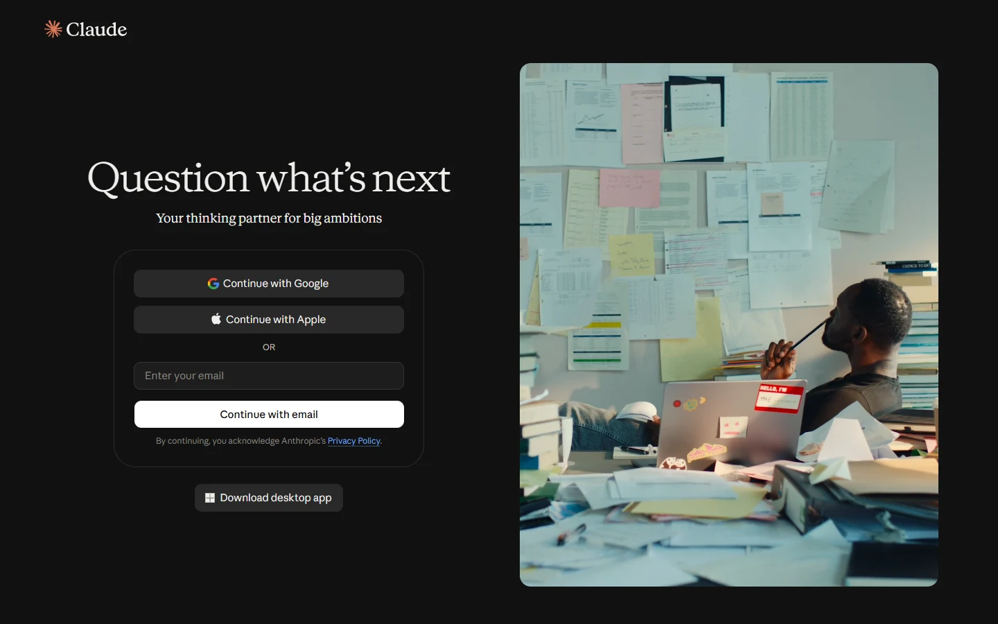
Claude's dark mode is near-black and almost neutral: page #151515, panels #1A1A19, menus #20201F, text #F0EFEC. Rings move inside boxes, the primary button turns white with black words, links turn light blue (#6DA7EC) and text gets thinner (weight 360). All dark colours are real (from the stylesheet). The only real dark picture is the sign-in page; every other dark screen is our build from those colours.
| Part | Dark value | Status |
|---|---|---|
| All colours, rings, shadows, link blue | from [data-mode=dark] .cds-root | real |
| Sign-in page layout | matches the dark picture | real picture |
| Sidebar tint (#111) | one step darker than the page | est. |
| Artifact canvas | #0B0B0B | est. |
| Output-menu tiles | blue / orange / violet 750 | est. |
The help centre (Mar 2026) shows three colour modes: Light, Match system and Dark; and three chat fonts: Default (serif), Match system and Dyslexic friendly (OpenDyslexic, which the stylesheet also loads).
Do & don't
UX principles
Contrast & accessibility
Measured live from the tokens in both modes (WCAG 2.2: 4.5 for small text, 3 for large text and parts).
| Pair | Light | Dark | Needs |
|---|
Accessibility checklist
- Keyboard: Enter sends, Shift+Enter new line, Ctrl+. sidebar, Ctrl+K search; menus open with Enter and move with arrow keys; Esc closes (our copies do the same).
- Focus is visible: a blue ring with a page-coloured gap on every control (real token).
- Dyslexia-friendly font and Atkinson Hyperlegible are loaded by the real stylesheet; chat text has small / medium / large sizes.
- Artifacts with a keyboard or screen reader have their own help article (Oct 2026).
- Muted text (#898781 on #FCFCFB) is about 3.5:1: fine for large text, too light for small grey labels. Use the secondary grey for anything people must read.
- Small icon buttons (28–32px) are below the 44px touch size on phones.
- Reduced motion: we stop the spin, shimmer and spring when the computer asks for less motion; we could not check the real app.
Laws of UX scorecard
All 29 laws from lawsofux.com, judged honestly from what we could see without signing in. Click a square to jump to a law.
Lessons for AltLeads
AltLeads is a sales-calling CRM: callers read a lead, call, write notes and plan the next step. Three places where Claude is a good teacher: an AI assistant panel, writing help, and a calm reading layout.
Borrow
- Assistant as a side panel. Like Claude's artifact panel, open the AI helper on the right of a lead, and keep the lead on the left.
- Two voices. AI drafts in a different face (or a tinted card) from the caller's own notes, so nobody sends an AI line by mistake.
- One box to ask. A single "Ask about this lead" box with small pickers under it (lead, tone, length), not a toolbar of buttons.
- Show the work in one grey line. "Read 3 call notes, checked the company site" that opens on click.
- Draft cards with a next step. Every AI draft ends with one clear action: Copy, Send, or Save to lead.
- Calm colour. Warm greys, one accent for the Call button, the spark-like colour only for AI.
- Streaming + Stop. Start showing text at once; let callers stop a long answer.
- Memory you can read. A plain list of what the assistant remembers about a lead, with "Tell Claude what to change".
Skip
- Serif for everything. Fine for long replies; too slow for lists of numbers and phone numbers in a CRM.
- Hidden sidebar by default. Callers jump between leads all day; keep the list in view.
- Small grey icon buttons. Dial, hang up and log outcome need big, labelled buttons.
- Too many feature words. Skills, Plugins, Connectors, Routines confuse new users; use callers' words.
- Very light muted text. Claude's muted grey is about 3.5:1. Keep call times and statuses at 4.5:1 or more.
- Expensive default. Claude defaults to its biggest model; AltLeads should default to the fast, cheap one for quick drafts.
Copy & use
Link the two files, add class="cl-root" to the body (and cl-dark on html for dark), then use the parts.
<link rel="stylesheet" href="claude/claude-tokens.css"> <link rel="stylesheet" href="claude/claude.css"> <script src="claude/claude-icons.js"></script> <script src="claude/claude-kit.js"></script> <body class="cl-root"> … <script>CLAUDE_KIT.icons()</script>
<div class="cl-composer">
<textarea rows="1" placeholder="How can I help you today?"></textarea>
<div class="cl-composer-bar">
<button class="cl-icon-btn" aria-label="Add files"><svg data-i="Add"></svg></button>
<span class="grow"></span>
<button class="cl-send" aria-label="Send"><svg data-i="ArrowUp"></svg></button>
</div>
</div>
<div class="cl-msg-user">your words</div> <div class="cl-msg-claude"><p>Claude's words, in the serif</p></div> <button class="cl-btn cl-btn--primary">Primary</button> <button class="cl-btn cl-btn--secondary">Secondary</button> <button class="cl-switch" role="switch" aria-checked="true"><span></span></button>
Sources & gaps
| What | Status | Where from |
|---|---|---|
| Colours, sizes, radii, shadows, motion, dark mode | real | claude.ai's stylesheet (assets-proxy.anthropic.com, the file the public sign-in page loaded, 12 Oct 2026). claude.ai itself shows a bot check, so the page was read from the Wayback Machine copy; the stylesheet, fonts and icons came straight from Anthropic's public asset server. |
| Sign-in page (light + dark) | real | Wayback copy of claude.ai/login, 12 Oct 2026, computed styles read with Chrome |
| Icons (370) | real | Anthropicons-Variable font + the name list in claude.ai's script |
| Logo, spark, pictograms | real | Inline SVG on the sign-in page. Trademarks of Anthropic; study use only |
| Menu and nav words | real | claude.ai's public script (about 2,900 files): Recents, Projects, Artifacts, Design, Customize, Output, Let Claude pick … |
| Home, Output menu, chat + artifact panel | measured | Anthropic videos on YouTube, 16 Sep 2026 (4K): "Meet Claude Slides, Claude Design and Claude Docs", "Claude Cowork and chat are now one Claude" |
| Settings (Memory) | measured | claude.com/import-memory image (2026) |
| Appearance, projects, chat menu | measured | support.claude.com articles (updated Mar–Oct 2026) |
| Fonts | stand-in | Instrument Sans, Source Serif 4, JetBrains Mono (OFL), picked by matching shapes and widths against Anthropic's fonts |
Honest gaps
- No 2026 picture of the open sidebar, the Projects page or the model menu. Their words are real; their layout is our estimate.
- The launch videos may show colours from just before the "v2" greys (the page reads #FAF8F4 there; the live stylesheet says #FCFCFB). We follow the live stylesheet.
- Video screens are zoomed; we removed the zoom by matching text sizes (1.33x home, 1.44x chat, 2.29x settings). Small errors of 1–2px are possible.
- No real dark picture of the app itself; only the sign-in page. App dark screens use the real dark colours on our layouts.
- Mobile apps were not studied beyond the App Store pictures.
Full list of sources with sizes and dates: inspiration/claude/NOTES.md. Comparison with Open Design's built-in Claude system: built-in vs ours vs real.