Design system
HungerBox
The colours, type, icons, shapes and components of the HungerBox website, written down so every new page matches it. Each value was read from the site's own computed styles, not guessed from a picture.
Measured means the value was read from the site. Ours means the site does not have it and we added it in the same style.
brand colour, #3A1593, always flat with no gradients.
fonts. Ubuntu for titles, HK Grotesk for everything else.
corners on buttons, cards, inputs and photos.
shadows on cards and buttons. One grey page colour, #F9F9F9.
Product screens
The real site first, then the landing page built from this system.
The HungerBox site Measured
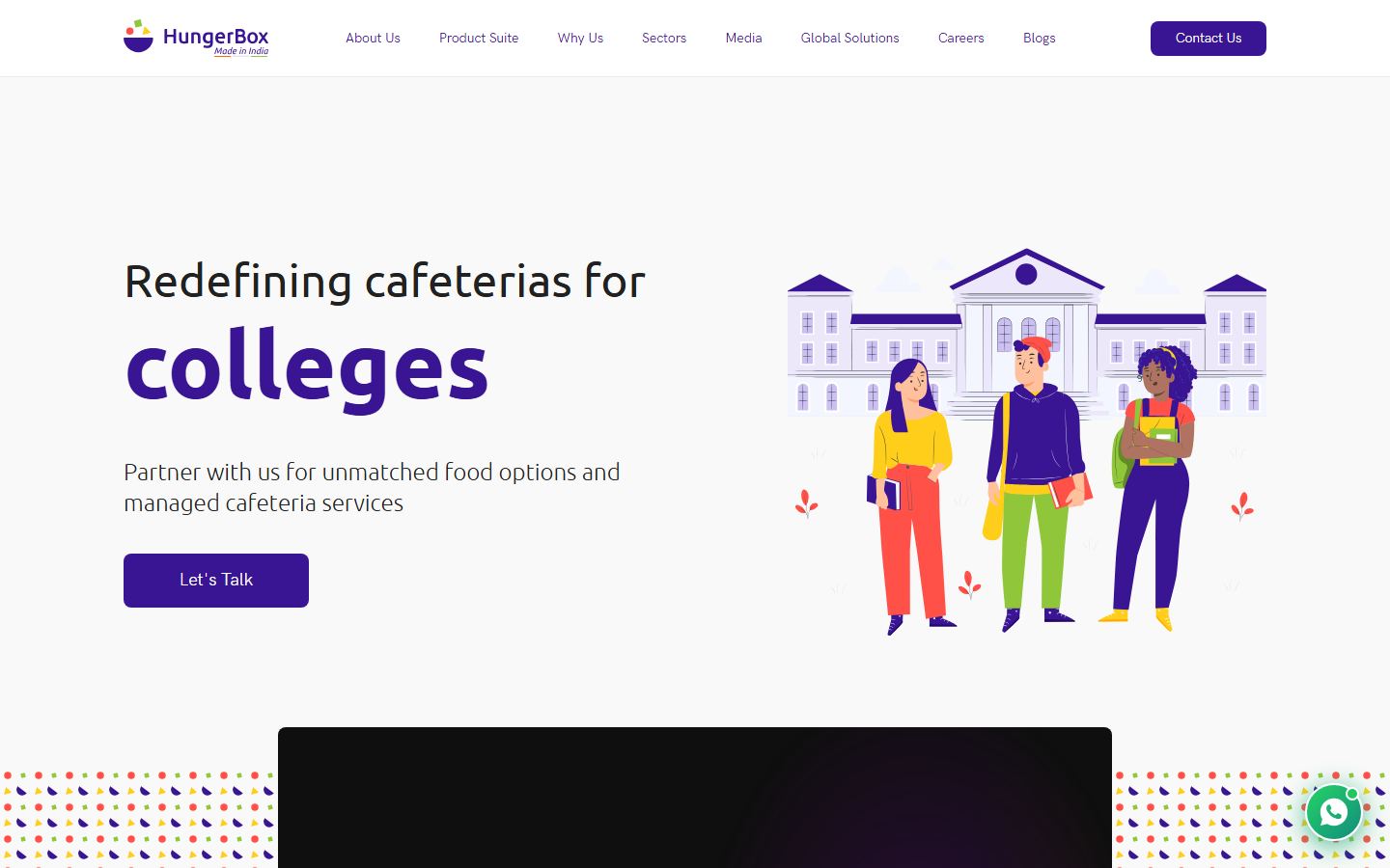
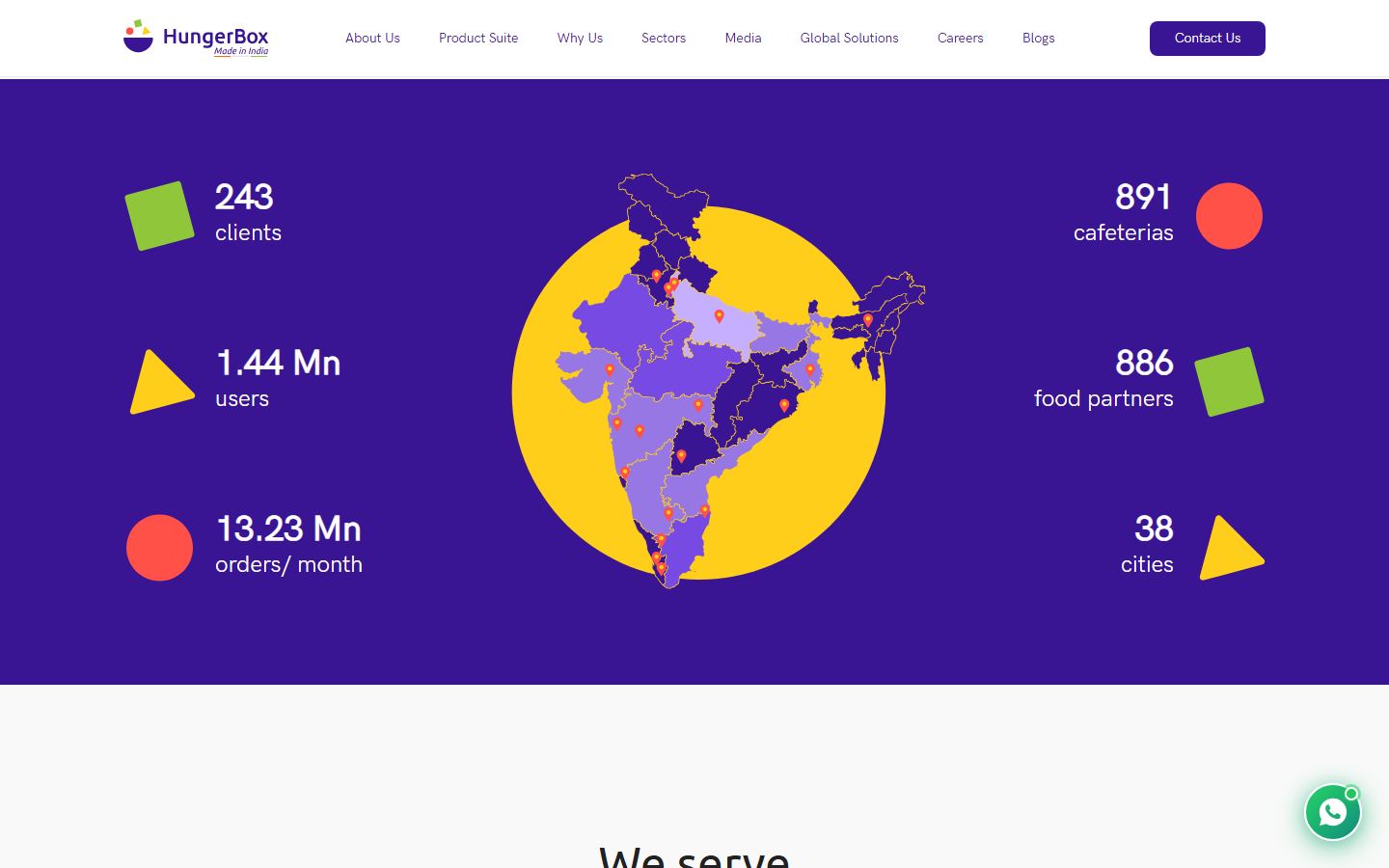
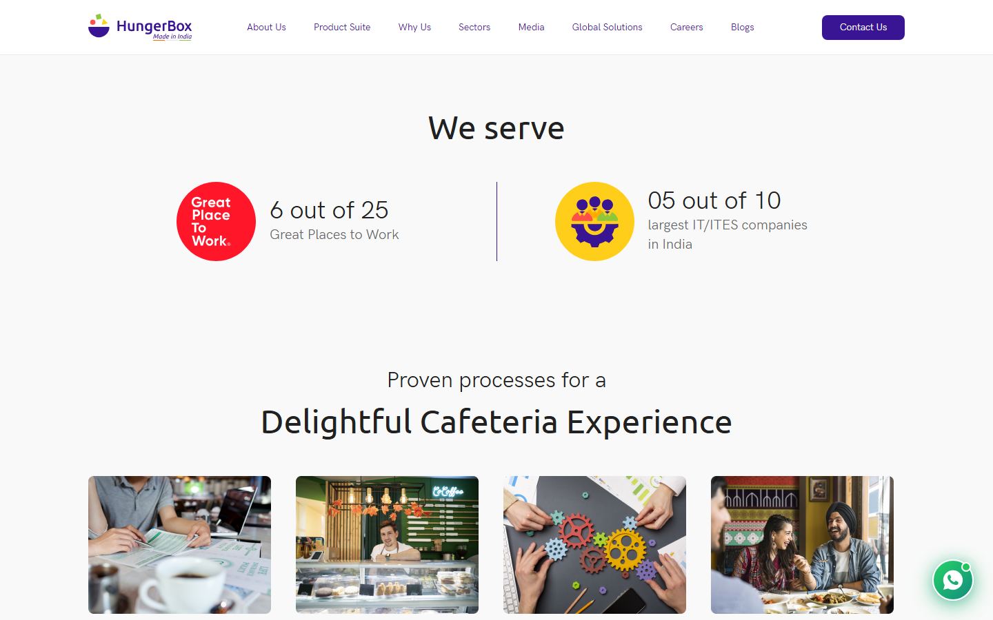
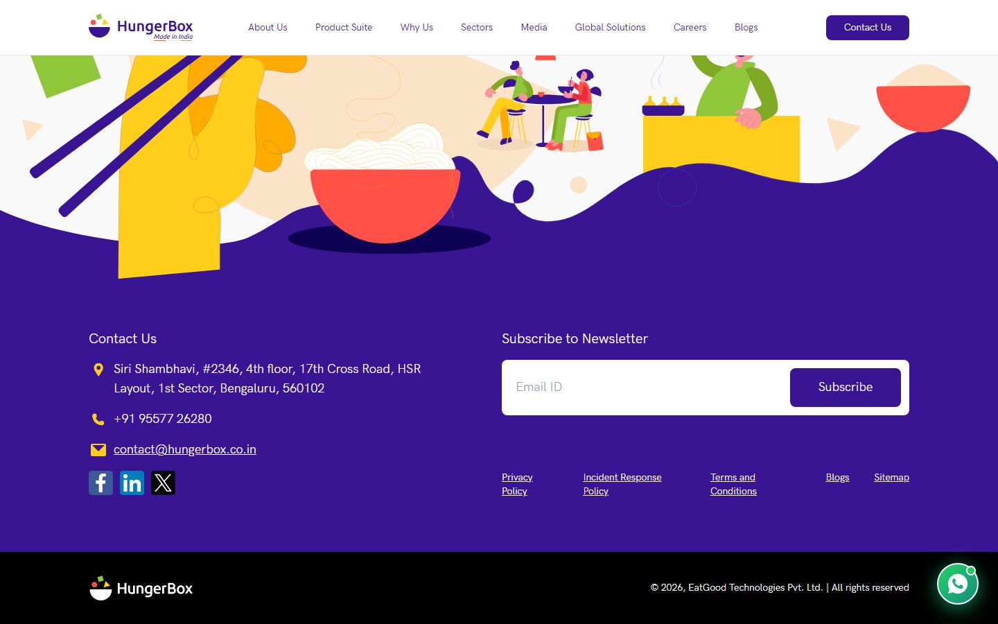
Built with this system: the Facility Manager landing page
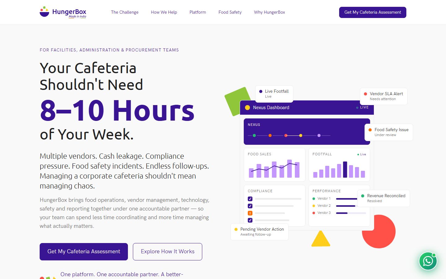
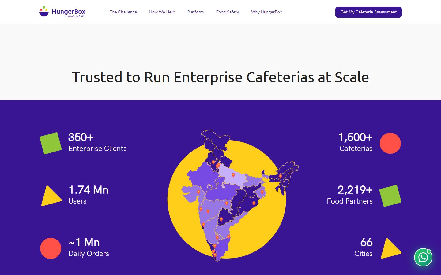
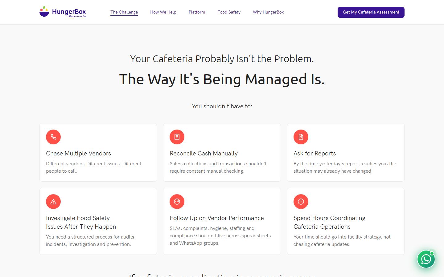
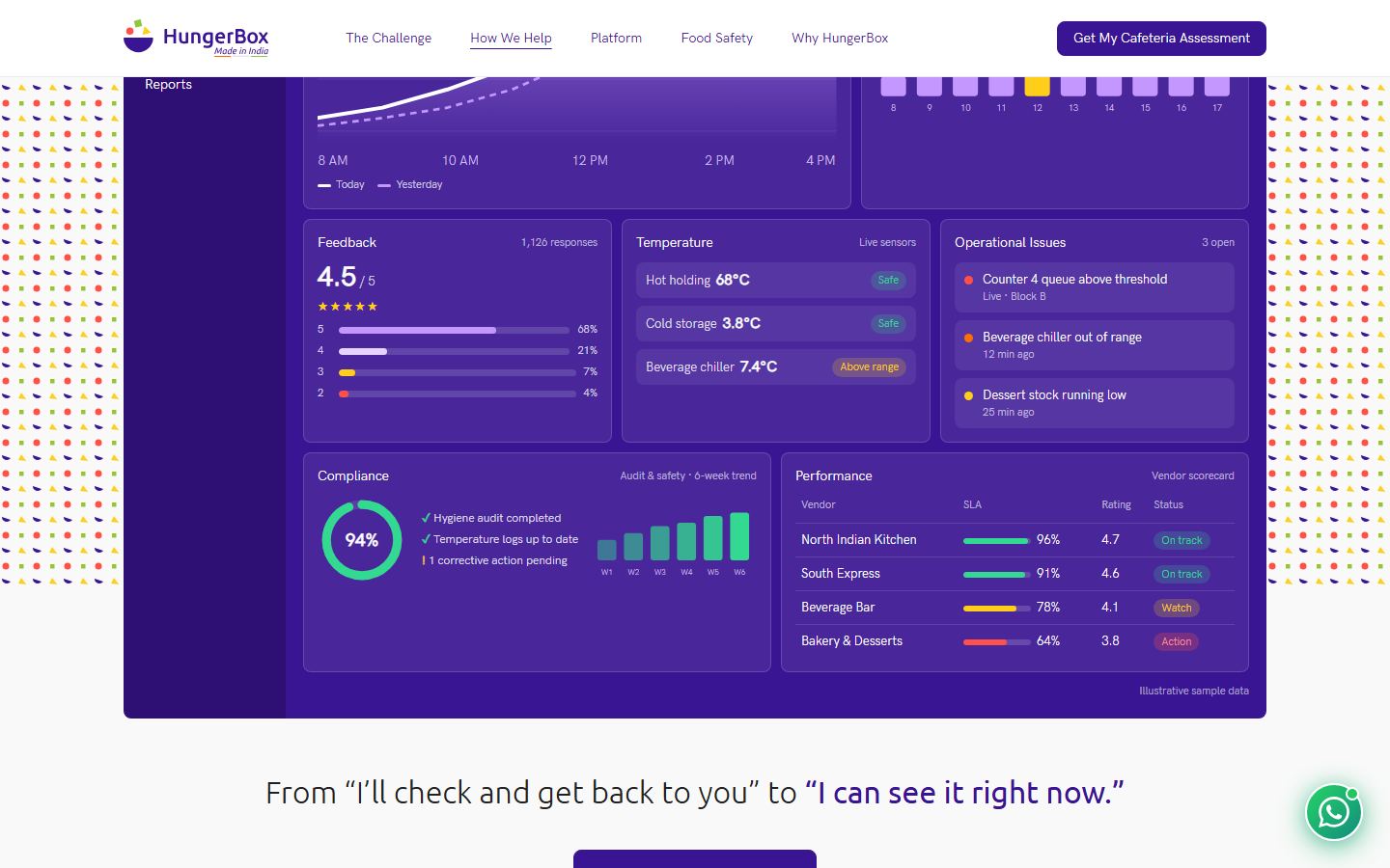
Files: site Desktop\hungerbox-landing\index.html · landing page Desktop\hungerbox-landing\smarter-cafeteria\index.html
Colours Measured
One purple does all the brand work. Text is near-black or grey. The bright colours belong to the three shapes and the illustrations, not to text or buttons.
Core
Shapes and illustration
Status In the site CSS, not seen on the home page
Where each colour goes
| Use | Colour |
|---|---|
| Page background, every section | #F9F9F9 |
| Header, cards, inputs | #FFFFFF with a 1px #EBEBEB border |
| Titles and lead lines | #212121 |
| Body copy | #666666 |
| Buttons, hero word, nav links, names, stats band, footer block | #3A1593 |
| Text on purple | #FFFFFF. Footer icons are #FFCE1A. |
| Footer bottom bar | #000000 |
Typography Measured
Ubuntu is only for titles. Everything else is HK Grotesk. The site ships one HK Grotesk weight, so 500 looks regular and 700 is the browser's own bold.
| Role | Size / line / weight | Sample |
|---|---|---|
| Hero word | Ubuntu 96 / 96 / 700 purple | factories |
| Title | Ubuntu 48 / 48 / 400phone 24 | We serve |
| Over-title (line above a title) | Ubuntu 32 / 28 / 300phone 20 | Proven processes for a |
| Hero sub | Ubuntu 24 / 32 / 300 | Partner with us for unmatched food options |
| Stat number | HK Grotesk 36 / 40 / 700phone 28 | 1.44 Mn |
| Stat label | HK Grotesk 24 / 32phone 18 | food partners |
| Lead, card title, caption | HK Grotesk 20 / 28 #212121 | Hassle-free managed cafeteria services |
| Body large, button text | HK Grotesk 18 / 28 #666 | Digital cafe platform onboarding |
| Body | HK Grotesk 16 / 24 #666 | HungerBox has streamlined our office food service. |
| Name, link | HK Grotesk 18 / 28 / 500 purple | Rajashree Mehta |
| Nav link, small link | HK Grotesk 14 / 20 | Product Suite |
| Caption | HK Grotesk 12 / 16 / 300 #212121 | Director - Facilities - ITES company with over 10,000 employees |
The two-line title
We are
India's leading cafeteria management company
A light 32px line, 20px gap, then the 48px line. Centred. No bold and no colour in section titles. Bold purple appears only as the 96px hero word.
Icons
Brand marks and shapes From the site's files
 Logo, light pages
150 x 39 in the header
 Logo, dark bar
 Favicon
 Square
#90C73A
 Circle
#FF5148
 Triangle
#FFCE1A
Site icons From the site's files
 location, 28px
 phone, 28px
 mail, 28px
 avatar, 40px
 client
 organization
 food-partner
 other
other Great Place To Work
 IT/ITES
 offices
 social, 35px
 social, 35px
Line icons for cards Ours
The site has no icon set for feature cards. These 26 were drawn for the landing page: 24px grid, 1.8 stroke, round ends, shown in yellow on a 48px purple disc (the same yellow-on-purple pairing as the footer icons). Problem cards use a red disc with a white icon.
Shape and space Measured
Corners
8px: buttons, cards, inputs, photos, the video. 12px: slider dots only. Circles: icon discs, avatar, WhatsApp button. Nothing is pill shaped.
Sizes and spacing
| Thing | Desktop | Phone |
|---|---|---|
| Page container | 1280px wide, 48px gutters (1184px of content) | 16px gutters |
| Header | 80px tall, white, 1px border below, sticky | same |
| Logo in header | 150 x 39 | same |
| Nav links | start 80px after the logo, 40px apart | hidden behind a menu |
| Button | 56px tall, 192px wide, 16px side padding | 48px tall |
| Small button (header) | 36px tall, 120px wide | hidden |
| Card | 20px padding, 1px border, 20px between cards | same |
| Space above a section title | 160px | 80px |
| Over-title to title / title to content | 20px / 48px | 8px / 24px |
| Stats band | 64px top and bottom, 96px between stats, 75px shapes | 58px shapes |
| Footer block / black bar | 72px / 32px top and bottom |
Shadows Measured
There are none. Cards, buttons, the header and inputs are flat, separated by a 1px #EBEBEB border. The single exception is the WhatsApp button, which glows green.
Flat card
1px border, no shadow.
0 4px 20px rgba(18,140,126,.45)Buttons
Solid purple, white HK Grotesk 18px regular, 8px corners. The label is plain text without arrows, icons or capitals. The site has one button style; the outline and white versions were added for pages with two actions or a purple band.
Forms Measured
The only form on the home page: a white 8px box with 12px padding, a borderless 56px input (18px text) and a 160px button. It has no label above it, and the site CSS gives it no focus ring.
Choice card Ours
Cards
"HungerBox has streamlined our office food service like never before."
Photo with a 20px caption
Measured: photo cardFood Safety
Track audits, incidents and corrective actions.
Ours: icon cardWhite, 1px #EBEBEB, 8px corners, 20px padding, no shadow. Cards do not lift or change on hover, because they are not links.
Stats Measured
Purple band, full width. Three stats on the left, the India map in the middle, three on the right with the shape on the outer side.
On the grey page: a 115px round icon, the number in 36px #212121, a 20px grey label, and a 1px purple line between items.
Header and footer Measured
Header: white, 80px, sticky. Footer: the illustration runs into a purple block (20px headings, 18px white text, yellow 28px icons, 14px underlined policy links), then a black bar with the white logo and a 14px light copyright line.
Small parts
Pattern band Ours: a light redraw of the site's pattern
The site puts a band of this dotted pattern behind its video. Use it behind one large block per page, never behind text.
States and motion Measured
| Thing | What the site does |
|---|---|
| Button hover | The button does not change: it keeps the same colour and opacity and has no transition. Only the cursor becomes a pointer. |
| Nav link hover | The link does not change: it gets no underline and keeps its colour. |
| Cards | Cards have no hover state. |
| Hero word | Words swap with a fade (a slider), one at a time. |
| Quotes | Slide sideways; dots show the active page. |
| WhatsApp button | Lifts 4px and grows 3% on hover in 0.25s. The green dot pulses every 2s. A dark tooltip slides in from the right. |
| Header | It stays at the top while the page scrolls and gets no shadow. |
| Scroll effects | Sections do not fade or slide in. |
Ours Keyboard focus ring (3px #C497FF), the selected choice card, the open and closed FAQ row, and the underline on the nav link of the section in view. The site has no rules for these.
Dark mode
The HungerBox site has no dark mode, and none has been made here. Pages built with this system stay light on every device. If one is ever needed it has to be designed from this palette and labelled ours.
Do and don't
Keep every section on #F9F9F9. Separate sections with space, not with colour.
Alternate white and grey sections, or add tinted panels.
Use the two-line title: a light 32px line over a regular 48px line.
Bold or colour words inside a section title. Purple bold is for the 96px hero word only.
Use flat purple #3A1593, 8px corners and 1px borders.
Use gradients, shadows, pill buttons or a second purple.
Write buttons as plain text: "Let's Talk".
Add arrows, emoji or icons to buttons.
Use Ubuntu for titles and HK Grotesk for all other text, body in #666.
Set card titles, labels or buttons in Ubuntu.
Use the green square, red circle and yellow triangle as decoration, at 75px, beside numbers or behind a visual.
Use green, red or yellow for text, links or buttons.
Contrast check
Worked out on this page from the token values. 4.5 or more passes for normal text, 3 or more for large text.
| Text | On | Ratio | Result |
|---|
Laws of UX
| Law | How the site does |
|---|---|
| Hick's law (fewer choices) | Good. One button per section, one button style. |
| Von Restorff (the odd one stands out) | Good. Purple is rare on the grey page, so buttons and the hero word pull the eye. |
| Law of proximity | Good. Large gaps between sections, tight groups inside them. |
| Jakob's law (works like other sites) | Good. Logo left, links, one button right, footer with contact details. |
| Doherty threshold (fast feedback) | Weak. Buttons and links give no hover or press feedback, and there is no keyboard focus style. |
Copy and use
Link the two files, put class="hb" on the body, then use the hb- classes.
<link rel="stylesheet" href="hungerbox/hungerbox-tokens.css">
<link rel="stylesheet" href="hungerbox/hungerbox.css">

<body class="hb">
  <p class="hb-overtitle">Proven processes for a</p>
  <h2 class="hb-title">Delightful Cafeteria Experience</h2>
  <div class="hb-card"><h3>Card title</h3><p>Card text.</p></div>
  <a class="hb-btn" href="#">Let's Talk</a>
</body>
| File | What it is |
|---|---|
design-systems/hungerbox/hungerbox-tokens.css | Colours, type, sizes and the font files |
design-systems/hungerbox/hungerbox.css | Buttons, cards, stats, header, form, small parts |
Desktop\hungerbox-fm-landing\_build\ | The landing page source: styles.css, app.js, build.py |
Desktop\hungerbox-landing\ | The website itself and its assets |
Sources
- The site copy at
Desktop\hungerbox-landing\index.html, a copy of www.hungerbox.ai made on 28 Sep 2026. Opened in a browser at 1440px and 390px; every text style, surface, border, corner and size was read from the computed styles. - Fonts, logos, shapes and icons are the site's own files, copied into
hungerbox/fontsandhungerbox/img. - Hover behaviour was tested by hovering the real button and nav link and reading the styles again.
- Only the home page was measured. Inner pages of hungerbox.ai (product, contact form, blog) have not been checked.
Not done yet, against our design-system checklist
- Two real screens rebuilt and compared pixel by pixel.
- A comparison page, an independent review, and a dark mode.
- Inner pages of the live site, and its real form fields (contact form).