Notion design system
Everything that makes Notion look like Notion, in one place: its colours, type, real icons and components. Every value was read from Notion's own app on 2 Oct 2026, or measured from Notion's own screenshots. Study copy for our team only.
Notion at a glance
A calm, paper-like workspace. Near-black text on white, a warm off-white sidebar, grey icons, and colour only in small tags. Everything is low, quiet and close together.
What you notice first
A warm off-white sidebar of pages. Each page has a small emoji or grey icon. The open page gets a pale grey fill, not a colour.
Pages start with a big icon and a 40px bold title. Databases add a row of rounded view tabs. The active tab sits in a pale grey pill, and the tools on the right are small grey icons.
Tags and status pills are pale tints with dark text of the same colour. Notion uses only one strong colour: the blue of the "New" button.
Product screens
Left: a real Notion screen (Notion Help Center, Notion for Mac). Right: our copy, built only from this design system and drawn live in the frame. Use them to see the system working on a real screen. The copies work: open one full size to switch views, filter, sort, search, add pages, open the search dialog, Share and "…" menus, and flip light/dark or wipe against the original with the bar at the bottom.
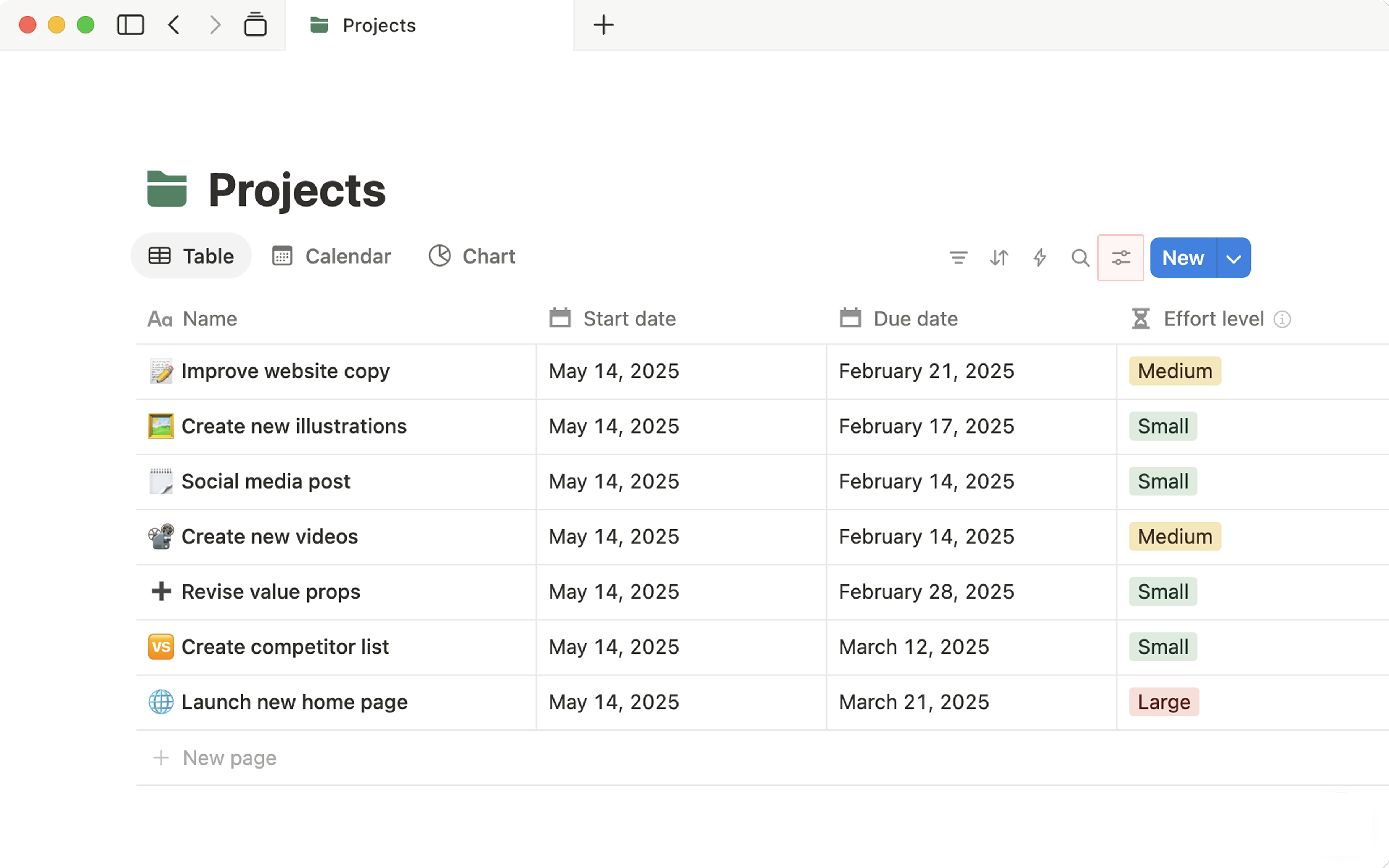
Screen 2 · sidebar and page
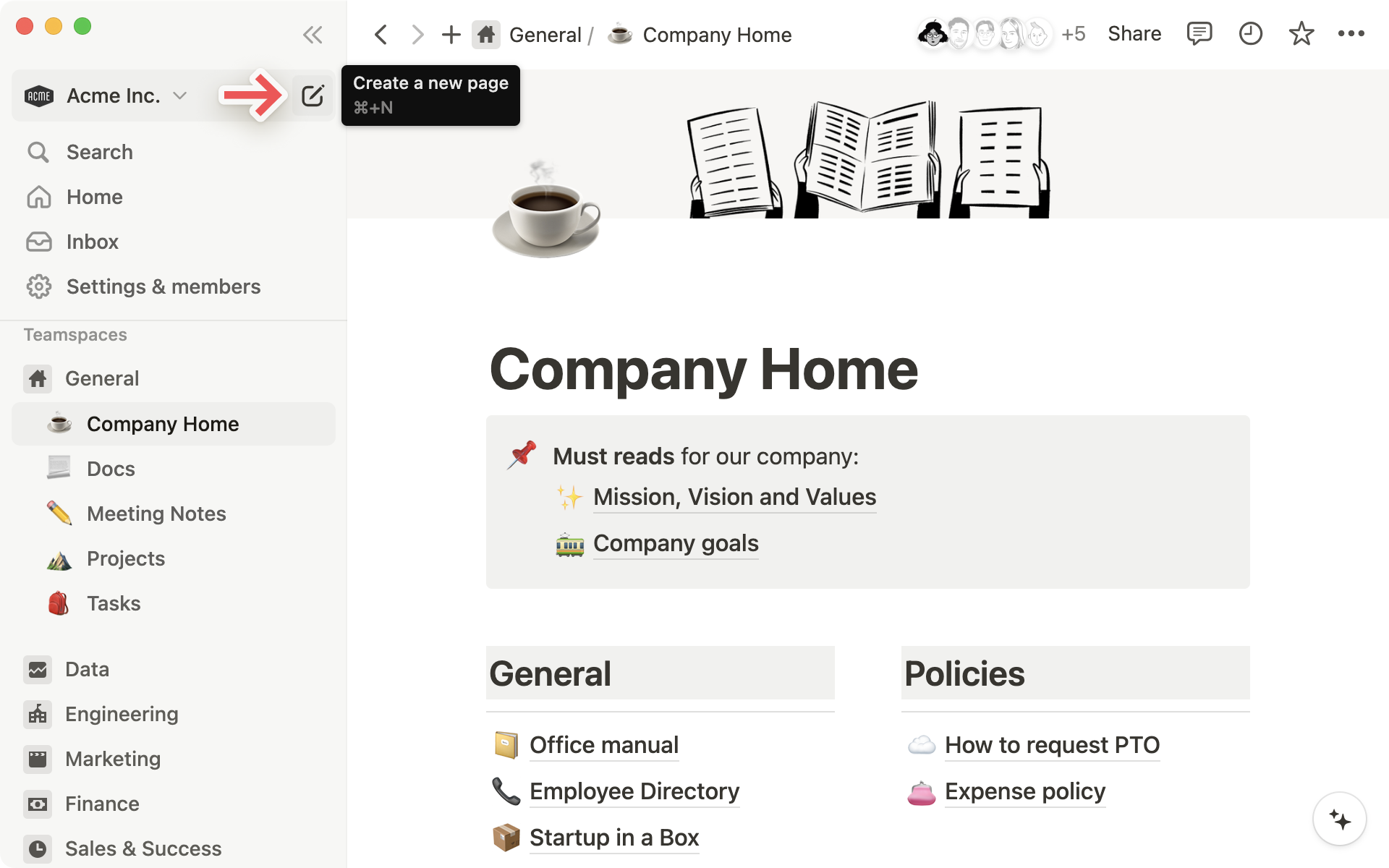
Notion today (live, 2 Oct 2026)
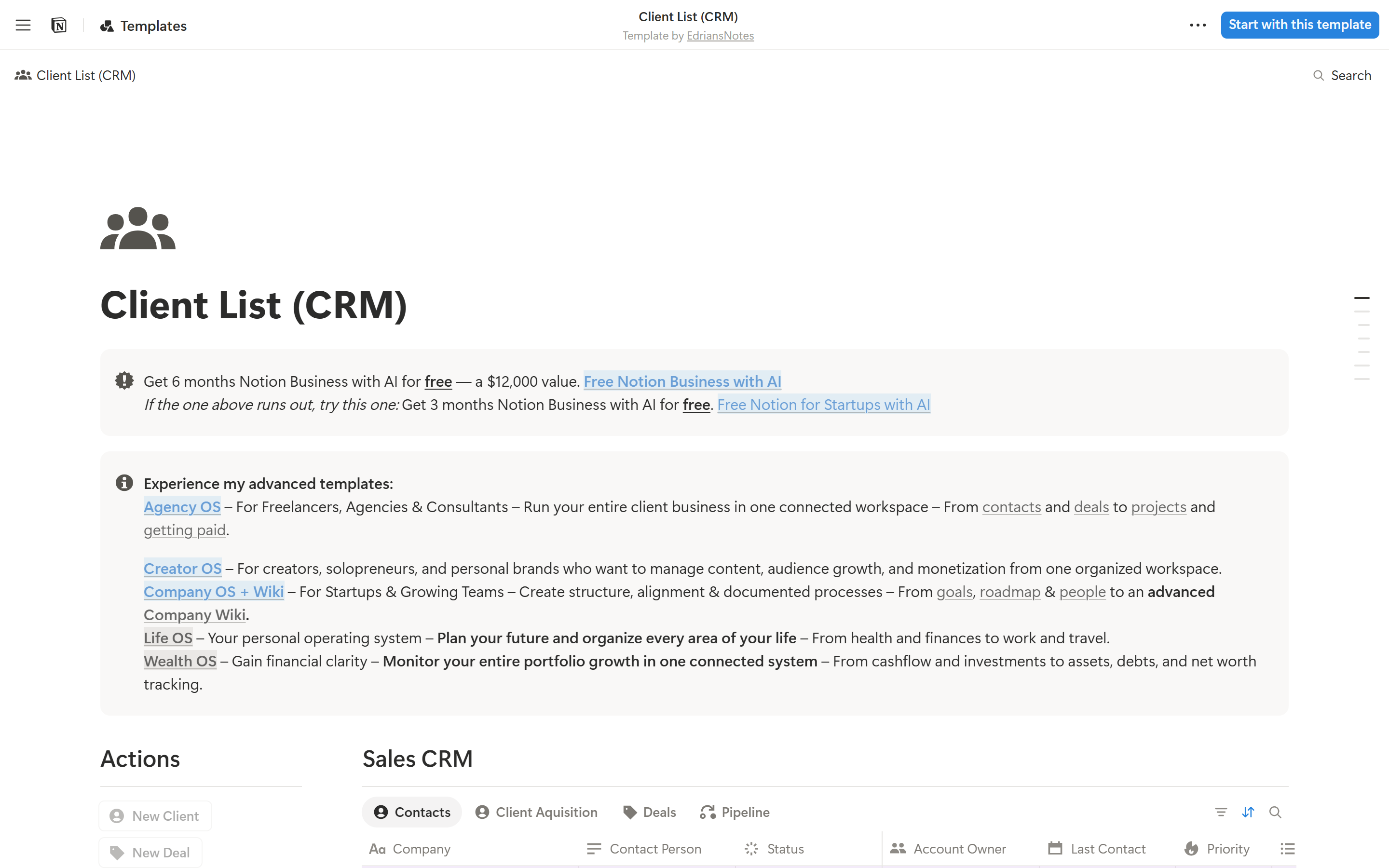
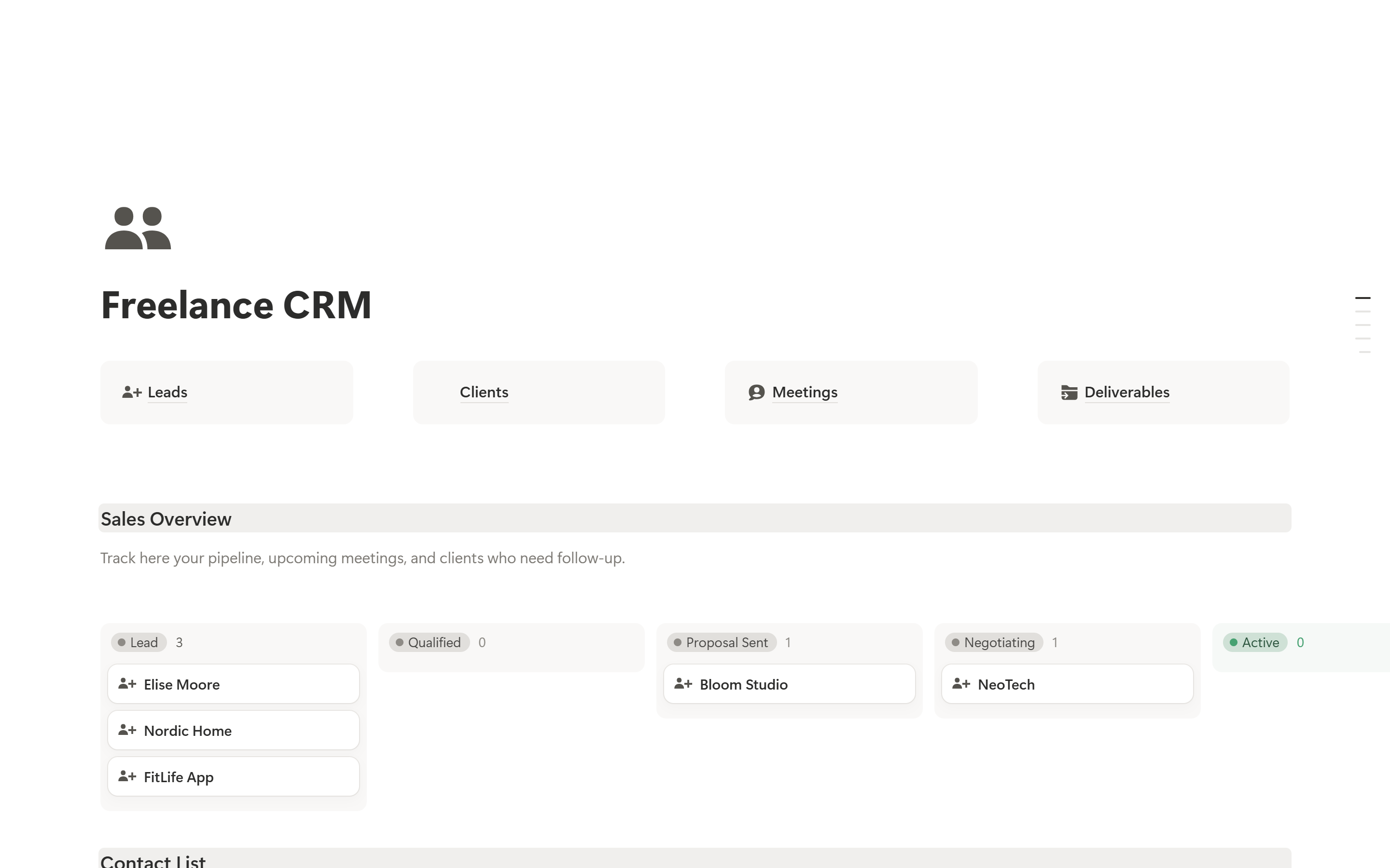
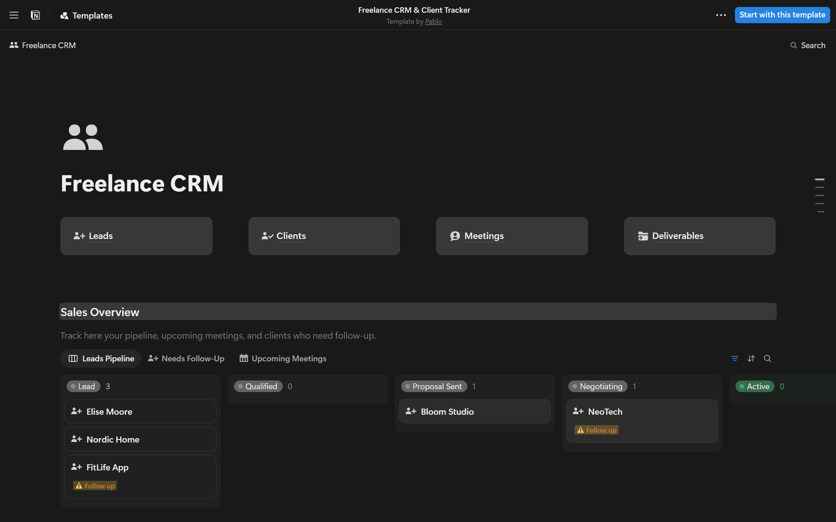
Both screens in Notion's dark mode
The originals above are light, so these have nothing to be measured against. They use Notion's own 741 dark colours, the same ones we read from Notion's live dark pages (our dark capture). Every fixed colour of the older build was mapped to its Notion dark twin.
Colours
Notion names every colour by its job. tex = text, ico = icon, bor = line, bac = background. Pri / Sec / Ter = strong / medium / soft. Values below are read live from the token file, so they are always the real ones.
Core roles live
The 10 colours live
The same ten families are used for tags, status, text colour, block backgrounds and board lanes. A pale fill always carries dark text of the same colour, close to ink, as you prefer.
Full palette scales live
Steps 30–100 are soft fills (often see-through), 500 is the colour itself, 800–900 is text on a fill.
Typography
Notion has no custom font. It uses the computer's own system font: San Francisco on a Mac and Segoe UI on Windows. This page uses the same rule, so on your Windows laptop you see what Notion shows you. Weights in use: 400, 500, 600 and 700.
Icons real
These are Notion's own icons, copied from Notion's app code and icon files. None are redrawn. There are two families: interface icons (thin, 20px grid, grey) for tools, and gallery icons (solid, used for pages and properties, shown at 16px scaled ×1.2).
Interface icons
Gallery icons (pages & properties)
Shape & size
Notion uses few corner sizes, and each one has a job. Heights stay low so lists fit a lot on screen.
Heights and spacing live
Shadows live
Shadows are faint. Most pair a soft blur with a 1px hairline ring, so edges stay crisp on white.
Components
Live and clickable, built with notion.css. Hover, click and use the keyboard: the states and motion are Notion's real ones. Under each one: the exact numbers and Notion's token names.
--c-bluBacAccPri #2783DE, hover #1F76CC, pressed #1C69B6 · text --c-bluTexInvPri 14px/600 · split part 24px with a darker 1px divider. Button block 32px · padding 8×12 · radius 6 · 1px --ca-borPriTra line · 14px/500 · icon 20px pulled 4px left. Icon button 28×28 · radius 6 · hover --ca-bacIntTra ×1.5.--c-[colour]TexPri on --ca-[colour]BacTerTra. Status same height · radius 10 · padding 7px / 9px · 8px dot in --c-[colour]IcoAccPri, 5px gap. Multi-select tags sit 6px apart vertically and 8px apart sideways.--c-texSec; active: text --c-texPri on --ca-bacIntTra · icon 16px ×1.2, 6px gap. Tool 28×28 · padding 6 · radius 6 · 16px icon in --c-texSec.--c-texSec · 16px icon ×1.2 in --c-icoSec · 6px gap · bottom line --ca-borSecTra. Rows 37px · cells padded 7.5×8 · lines right and below in --ca-borSecTra · name column 500 weight with a 22px page icon · hover --ca-tabRowHovBac. Last row "+ New page" in tertiary grey.--ca-[colour]BacPriTra) · 12px between lanes · header pill + count. Card radius 10 · --c-bacEle · shadow --c-shaBasSm plus a 1px --ca-borSecTra ring · padding 8×10 · title 15px/500 · 8px apart.--c-bacSec with a 1px --c-borSec edge · text 14px in --c-texAccPri · items 30px, radius 6, 1px apart · open page: --ca-bacIntTra fill and --c-texPri text · section labels 12px/500 in --c-texTer · child pages indent 14px. Top bar 45px · breadcrumbs 14px with "/" in tertiary grey · 28px icon buttons.Acme Logistics
Account notes
Renewal talk is set for next week. See last quarter's review, ping @Maya Shah, and check the PO-2291 invoice first.
Do not call before 10 AM their time. They asked twice.
Callouts take any of the 10 background colours.
"Fast replies matter more than discounts."
Linked pages
--c-graBacPri · 24px icon. Page link 24px icon · 500 weight · 1px --ca-borPriTra underline. Divider 1px --ca-borPriTra in a 13px row. Link underline in --ca-opaLinDecCol.Try them. Click a button to open a real Notion-style menu, hover the rows, use the arrow keys and Enter, and press Esc or click outside to close. Hover a grey icon and wait a moment for its tooltip.
Oct 1 · Asked for pricing
Sep 24 · Intro call
--c-popBac · shadow --c-shaOutLg · groups padded 4px · items 28px, radius 6, 20px icon + 8px gap · one row highlighted at a time (--ca-bacIntTra), following the mouse or the arrow keys · opens and closes in 200ms (fade + 96%→100% size, growing from the button) live. Disabled rows 40% · danger text #EB5757 · switches inside a menu change without closing it. Tooltip near-black, 12px/500, radius 6, shows after a short pause est.. Toast slides up 50px and fades in, with Undo for actions you might regret.States & motion live
Every clickable thing in Notion has the same set of looks. Each state is shown frozen below, so you can compare them without hovering. Notion keeps hover and press as soft grey tints that only get darker, never a new colour.
| Component | Rest | Hover | Pressed | Keyboard focus | Selected | Disabled |
|---|---|---|---|---|---|---|
| Blue button | New | New | New | New | n/a | New |
| Button | Share | Share | Share | Share | n/a | Share |
| Icon button | ||||||
| View tab | All | All | All | All | All | n/a |
| Sidebar item | n/a | |||||
| Menu row | ||||||
| Board card | Acme | Acme | Acme | Acme | Acme | n/a |
| Input | n/a | n/a | ||||
| Switch | same | same |
Hover = --ca-bacIntTra (5% warm grey). Pressed = the same colour at double strength. Focus = Notion's blue ring --c-butBluFocRin, shown only when you use the keyboard. Disabled = 40% see-through.
Motion
Notion moves fast and quietly. Hovers take 20–150ms, menus 200ms, and nothing bounces. Press "Play" to watch each one.
If someone turns on "reduce motion" on their computer, all of this switches off. Movement is a bonus, never the only signal.
Dark mode live
Same names, dark values: background #191919, sidebar #202020, text #F0EFED. The components below are unchanged; only the token file switches. You can flip this whole page with the switch at the top.
What changes in dark mode
Do & don't
Checked against the live app on 2 Oct 2026. The small grey label after each rule names the Law of UX it comes from. Click it to jump to that law in the scorecard below. A red bullet marks a rule where Notion itself falls short.
Do
- Keep text near-black (#2C2C2B) or warm grey on white. Put colour only in tags, status pills, callouts and icons. Von RestorffSelective attention
- Keep rows, menu items and sidebar items low and quiet: 28–37px tall with grey icons. Show hover with a pale grey fill, not a border. Cognitive load
- Use the same 10 colour families everywhere: a pale fill with dark text of the same colour. Similarity
- Always show where people are: breadcrumbs at the top, and the open page lightly filled in the sidebar. Working memoryJakob's law
- Use the one blue button (#2783DE) only for the main action in an area, such as "New" or "Invite". The lighter Notion blue #2383E2 is for links, focus rings, switches and checkboxes. Von RestorffHick's law
- Answer every click fast: a grey tint on hover within 20–150ms, menus open in 200ms, and a shimmer while data loads. Doherty threshold
- Put the most used item first and the dangerous one last in every menu, as Notion's "Move to trash" sits alone at the bottom. Serial positionChunking
- Accept messy input and tidy it up: a pasted link becomes a bookmark, typed Markdown becomes formatting. Postel's law
Don't
- Don't use heavy shadows or thick borders. Cards get a faint ring and a soft shadow, and tables use hairline lines. Occam's razorCommon region
- Don't add coloured header bars or a dark sidebar. The sidebar is a warm off-white (#F9F8F7) next to a white page. Selective attention
- Don't use strong colours or white text in tags. If every tag shouts, none stands out. Von Restorff
- Don't mix corner sizes freely: 4px tags, 6px buttons and items, 10px cards, menus and callouts, 20px view tabs. Similarity
- Don't hide key actions behind hover only. Notion's drag handle and "+" appear only on hover, so touch users never see them. Fitts's law
- Don't end a task silently. Notion finishes most actions with only a small toast; a clear "done" plus "what's next" feels better. Peak-end rule
- Don't greet new users with a blank page and dozens of block types. Offer a few ready-made templates first. Choice overload
For AltLeads: borrow the light sidebar of saved lists with small icons, the quiet table and the pale status pills. Skip Notion's large empty page header (big icon and title): it takes space a caller needs for the list.
UX principles, in plain words
The rules behind Notion's calm feel. Use them for AltLeads too. Each card names the UX law, explains it simply, and shows where Notion follows it. All 29 laws are checked one by one in the scorecard below.
Every click gets an answer
Anything clickable must react on hover, on press, and after the action.
Six looks for every control
Rest, hover, pressed, keyboard focus, selected and disabled. Missing one makes a product feel broken or cheap.
One loud thing per area
If everything is colourful, nothing stands out. Keep one strong action per area.
Short, grouped menus
Split long lists into small groups with labels and dividers. Put dangerous actions last.
Easy to hit
Rows and buttons need enough height, and key actions sit close to where the eye already is.
Look like what people know
Use the familiar: sidebar on the left, breadcrumbs, ••• for more, Esc to close, Ctrl+K to search.
Group with space, not boxes
Things close together read as one group. Space and faint lines are calmer than heavy borders and cards.
Always show where you are
Show where people are and what just happened.
Let people undo
Prefer Undo over "Are you sure?" pop-ups. Confirm only actions that can't be undone.
Readable for everyone
Grey text looks elegant but can be too faint. Check every text colour. See the live check below.
Works without a mouse
Tab reaches everything, arrows move inside menus, Enter picks, Esc closes, and a clear ring shows where you are.
Motion with a reason
Short (under 250ms), starting from where you clicked, never blocking. Switch off for "reduce motion".
Live contrast check
Checklist before any screen ships
Laws of UX scorecard
All 29 laws from lawsofux.com, each checked against Notion. Every card says what the law means in plain words, what Notion really does, and what AltLeads should take from it. Click a coloured bar to jump to a law, or filter by result.
Copy & use
Add three files to any HTML page, then use the classes. Add n-dark to switch to dark mode.
<link rel="stylesheet" href="notion/notion-tokens.css">   <!-- 741 real colour tokens, light + dark -->
<link rel="stylesheet" href="notion/notion.css">          <!-- components (.n-…) -->
<body class="n-root">                                      <!-- add n-dark for dark mode -->
<script src="notion/notion-icons.js"></script>            <!-- real icons as <use href="#n-…"> -->

<span class="n-tag green">Customer</span>
<div class="n-view" aria-selected="true"><svg class="n-gi"><use href="#g-groups"/></svg><span>All</span></div>
<svg class="n-i"><use href="#n-viewTable"/></svg>