Four WhatsApp screens, rebuilt and working
Each copy is built only from our WhatsApp design system: WhatsApp's own colour, type and motion tokens (read from the public sign-in page of web.whatsapp.com), its real icons and chat doodle, and sizes measured from real 2025-26 screenshots. Each copy is checked pixel by pixel against its original. All people, groups, channels and messages are made up, so the words differ from the originals on purpose.
Desktop app: chat list + open group chat
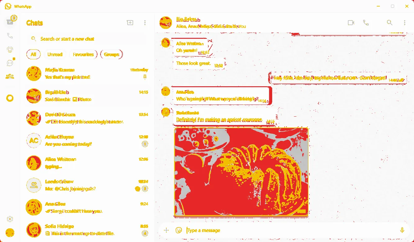
84.3% pixel match, lightedges 37.3%dark: WhatsApp's real dark tokens Original: Microsoft Store listing for WhatsApp (Windows), updated 7 Oct 2026, screenshot 4 of 5. The window is cut out of the 1600 × 900 picture: 1334 × 780 at 1x. Face photos and the cake photo are replaced by initials avatars and a drawn picture, which costs most of the missing points (the photo alone is 12% of the screen).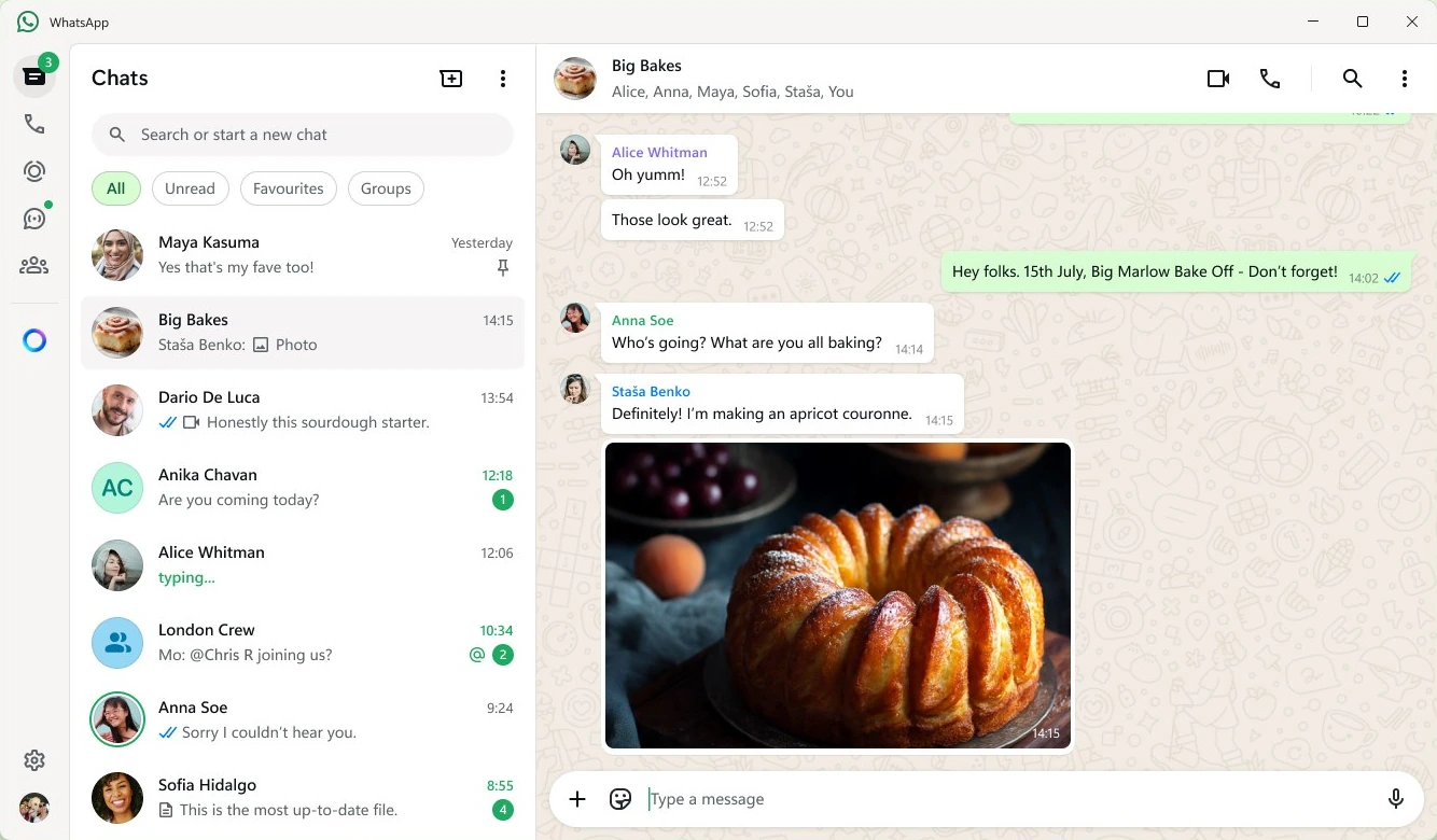
Try it: click a chat to open it; switch All / Unread / Favourites / Groups; type in the search. Type a message and press Enter: the ticks go clock → one grey tick → two grey → two blue, then "Ana is typing…" and a reply arrives. Type / for quick replies. Point at a bubble for the menu (Reply, Copy, React, Star, Delete with Undo). The mic records a voice note; press it again to send, then play it. Click the header for group info. Keys: Ctrl+Alt+N new chat, Ctrl+Alt+/ search, Alt+↑/↓ previous/next chat, Esc close.
WhatsApp Web in dark, with the new call menu
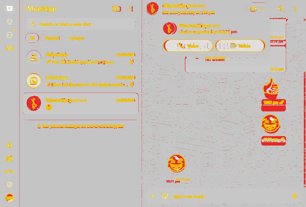
92.8% pixel match, darkedges 39.7%light: WhatsApp's real light tokens Original: WABetaInfo, Feb 2026, 1272 × 862 = a 1018 × 690 window at 125%. The watermark and the beta-only bug button and "BETA" label are in the original; we keep the bug button and label so the layout lines up.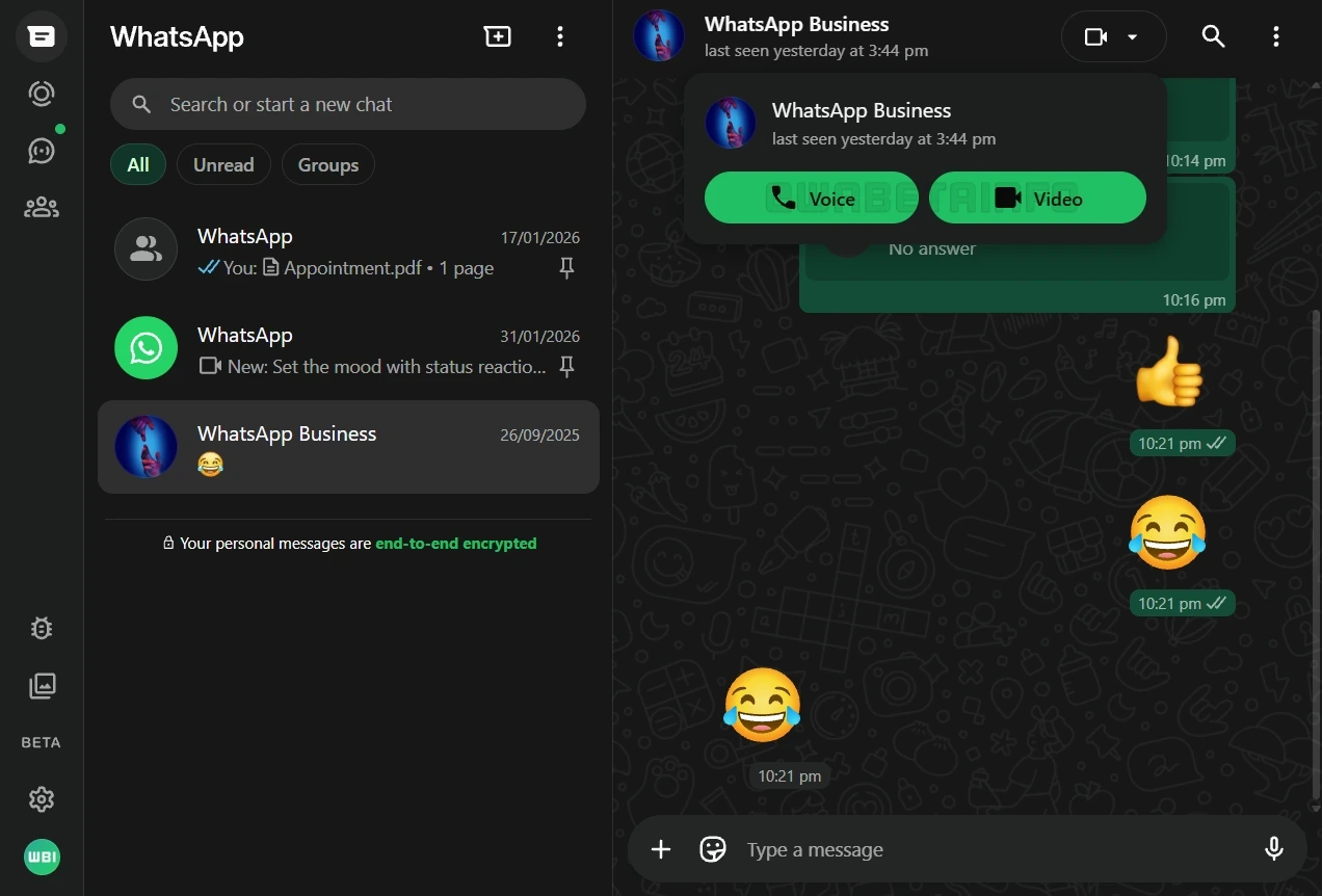
Try it: the call menu is open as in the original; click outside to close it, or the camera pill to open it again (Voice / Video). Click the call-log bubble to call back. Everything from the desktop copy works here too.
Updates tab (Status + Channels)
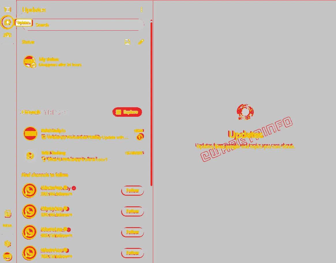
94.6% pixel match, darkedges 36.6%light: real light tokens Original: WABetaInfo, Dec 2025, 1165 × 910 at 1x. In this beta build the rail is 57 px wide (64 px later). The original shows the "Updates" tooltip and a keyboard focus ring; the copy opens the same way.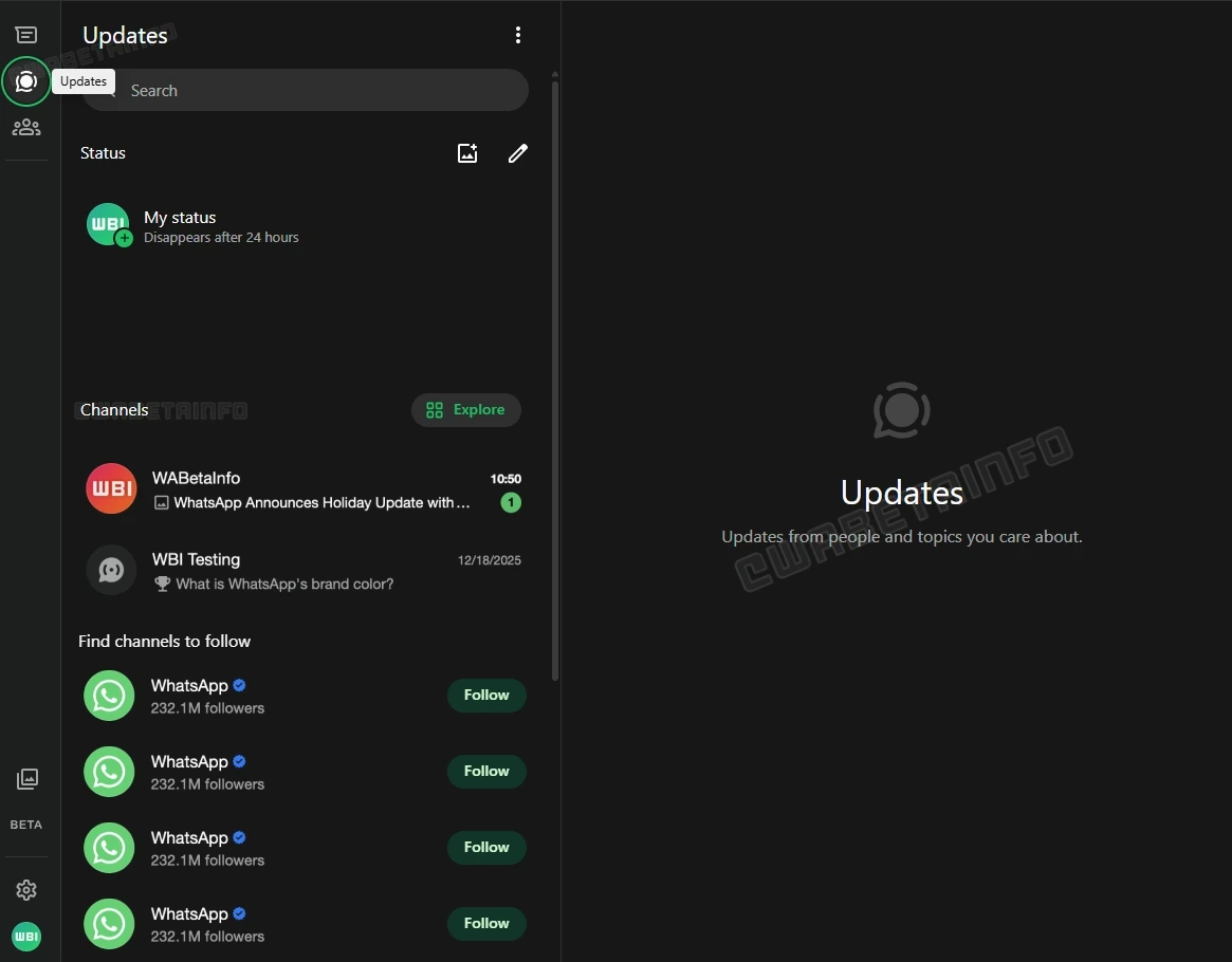
Try it: Follow a channel (it turns into "Following"); hover the rail for tooltips; click Chats in the rail to go back to the chat list.
Settings › Default chat theme, with live preview
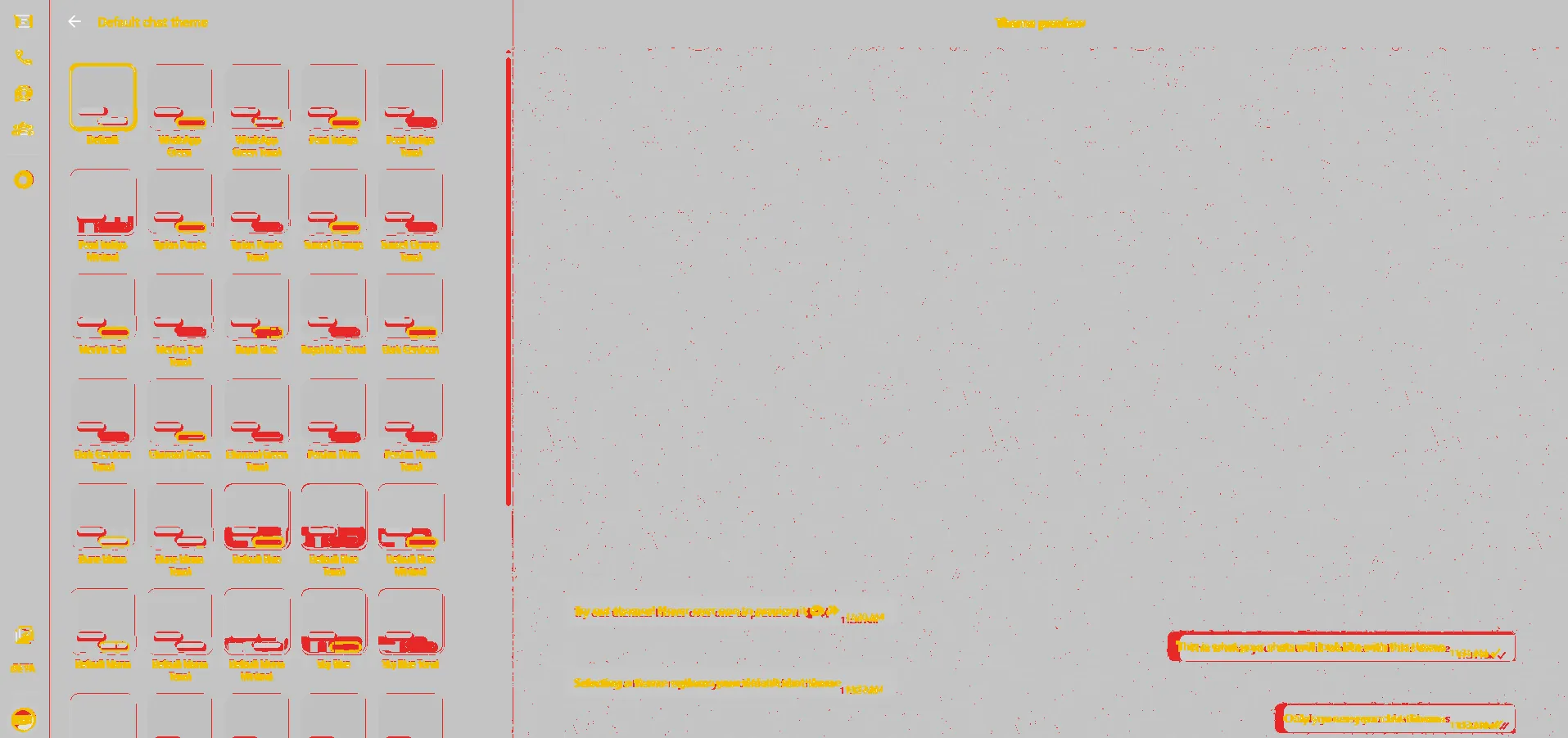
95.8% pixel match, darkedges 38.7%light: real light tokens Original: WABetaInfo, Apr 2026, 1915 × 901 at 1x. Theme names and the preview messages are WhatsApp's own words (also in its public script). Swatch colours are measured from the screenshot and are approximate.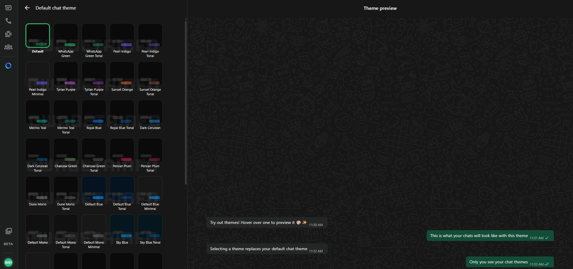
Try it: click a theme tile: the preview on the right changes its bubble colour at once. The back arrow goes to Settings; Chats in Settings brings you back here.
How to read the scores: "pixel match" counts pixels within 24 of 255 per colour. "Edges" counts only text, icon and line pixels, so it drops fast when words differ (all our names and messages are made up) and with small anti-aliasing changes. Where the words are the same (rail, window buttons, header icons, "Type a message") the copies line up to the pixel; the rail icons are WhatsApp's own drawings.
Real or estimated: colours in both modes are real (WhatsApp's WDS variables, read from its public stylesheet). Type sizes are real for the WDS scale (12/14/16/22/24/28/32 px) and measured for the chat screens (names 16 px, previews 14.5 px, bubbles 14.5 px). Layout sizes are measured from the four originals. There is no light picture of three screens and no dark picture of the desktop screen; those modes use the real tokens.
Opened on its own, each copy has links back at the top and a bar at the bottom: Light / Dark, Compare with original (drag the blue line) and Actual size. Keys: D dark, C compare, Esc closes the compare.