Airtable design system
Airtable's colours, type, 580 real icons and components, in light and in its real dark mode. Almost every value was read from Airtable's own app on 3 Oct 2026 (public shared views, no login) or from its stylesheet. The few estimates are marked est. Study copy for our team only.
Airtable at a glance
A dense, spreadsheet-like workspace. The computer's own font at 13px, thin grey grid lines, row numbers and soft pill-shaped options in 10 colours. Each base wears its own colour in the top bar. A tool turns a pale colour while it is switched on. Almost nothing moves: hovers fade in 85ms, and menus and records open with no animation.
What you notice first
Product screens
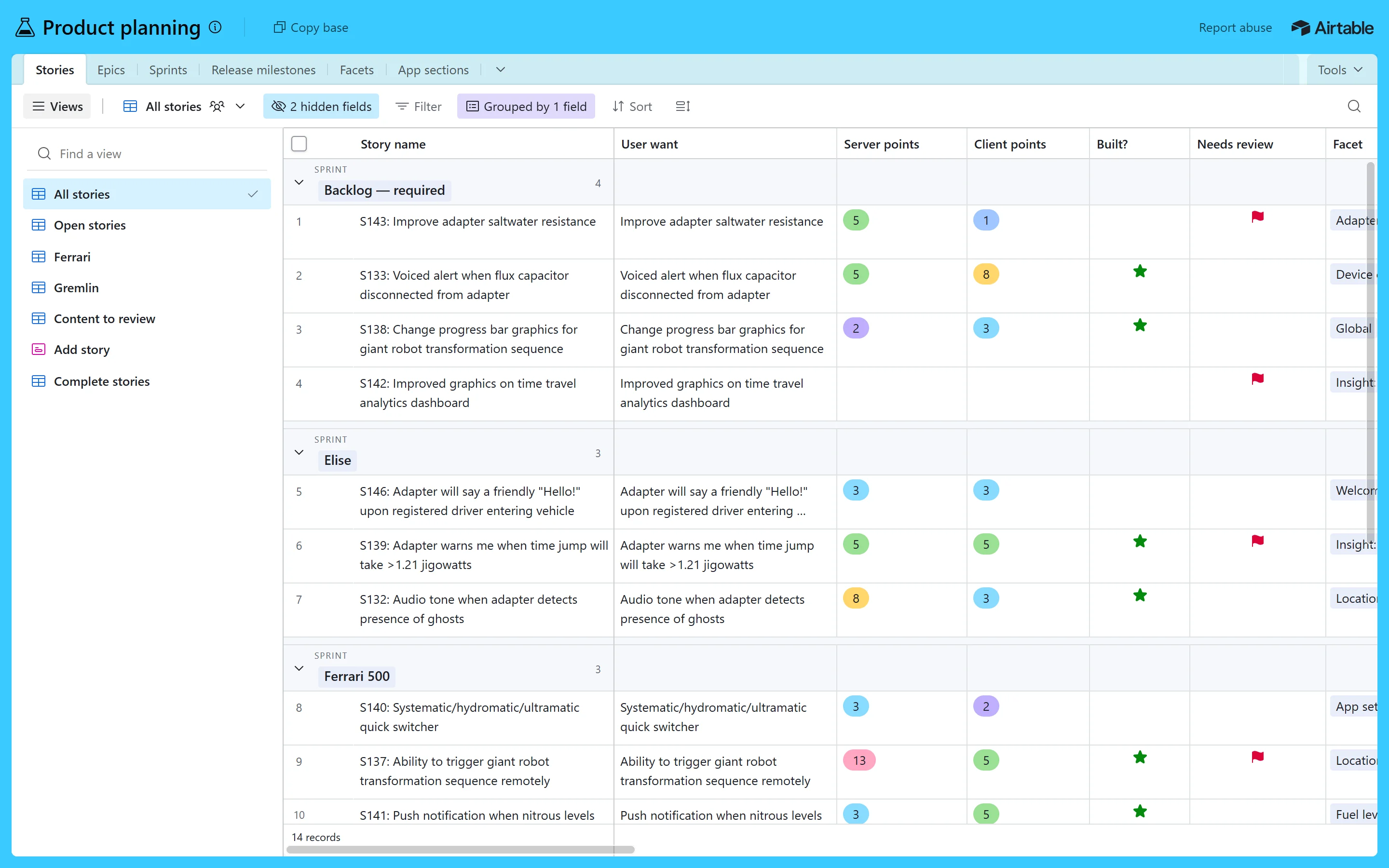
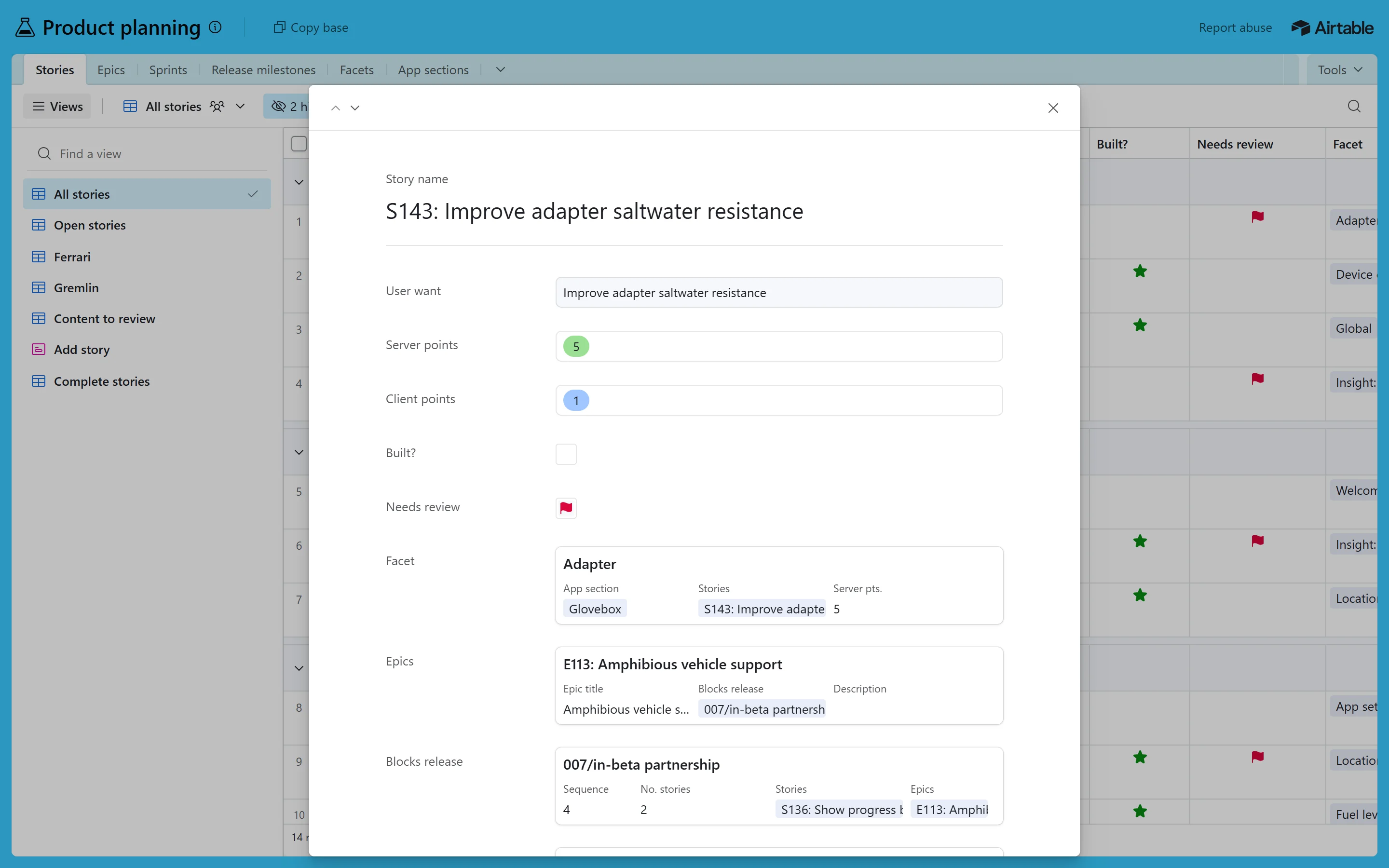
Left: the real Airtable app, captured live on 3 Oct 2026. Right: our copy, built only from this design system. The copies work. Open one full size to try the tables, groups, rows and menus. You can also open a record, switch to dark, or wipe against the original with the bar at the bottom.
Screen 1 · grid view (grouped)
Screen 2 · expanded record
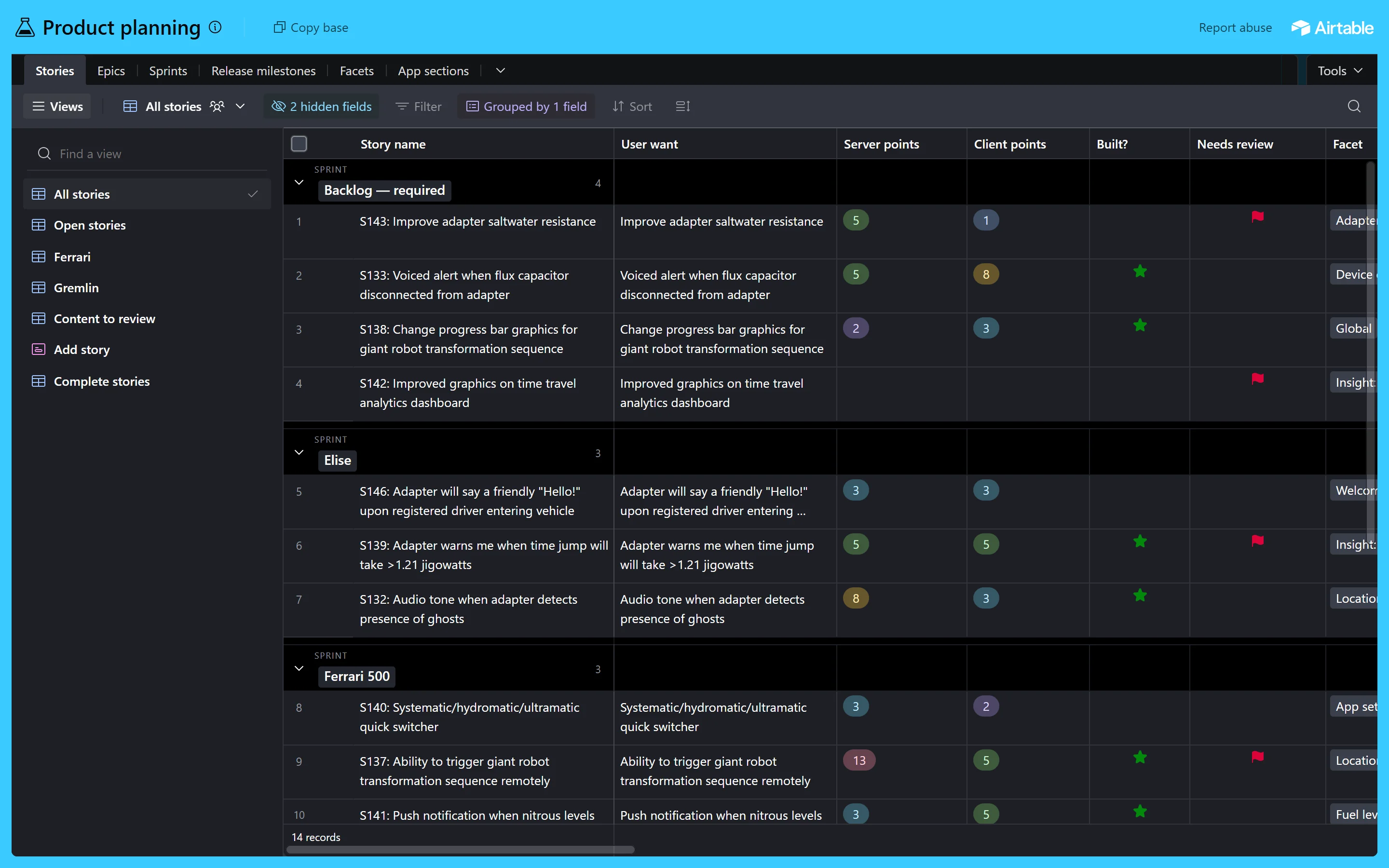
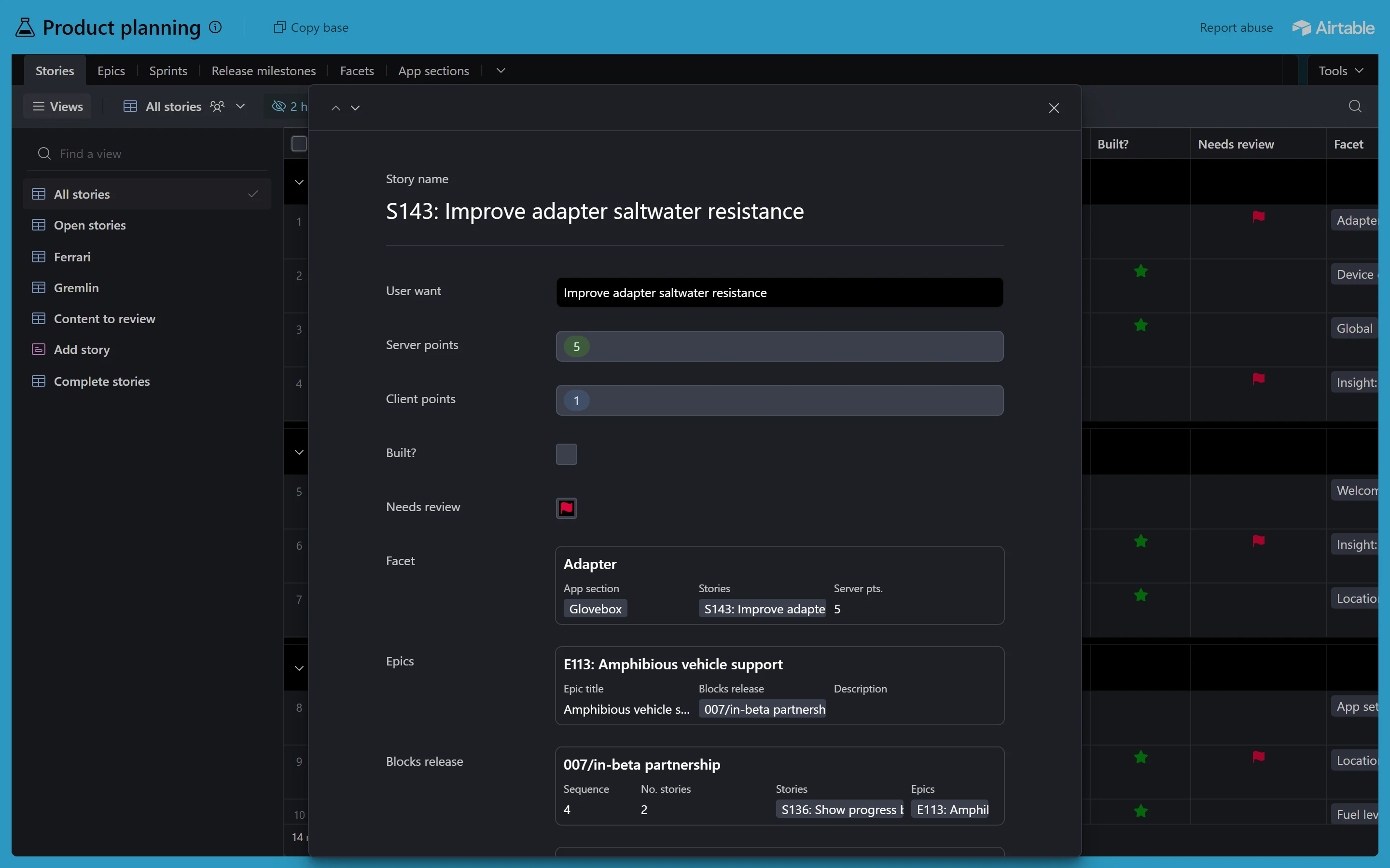
Both screens in Airtable's dark mode
This time the dark originals are real too: Airtable's own dark CSS, switched on in the live app. Our dark copies are measured against them.
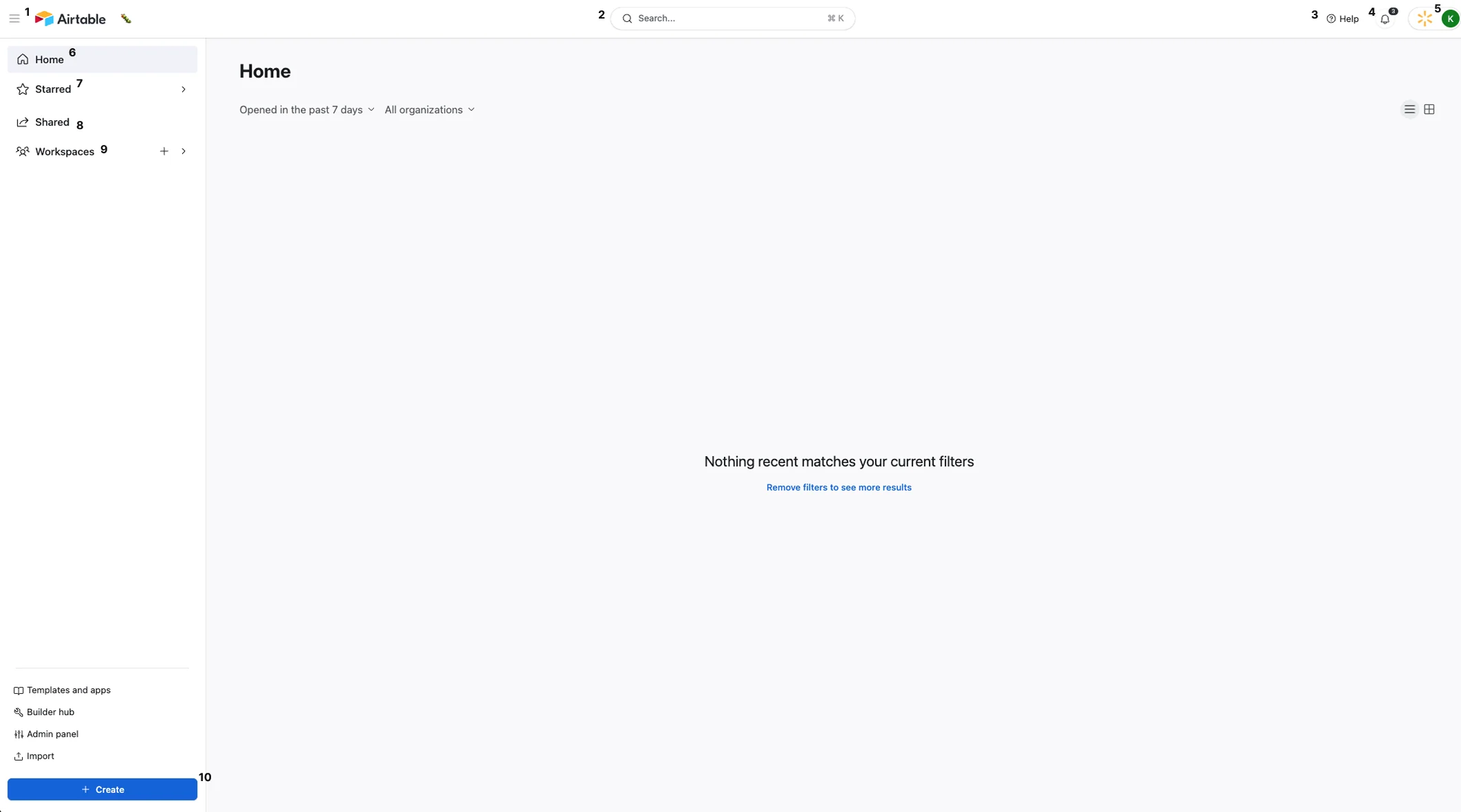
Airtable today (live, 3 Oct 2026)
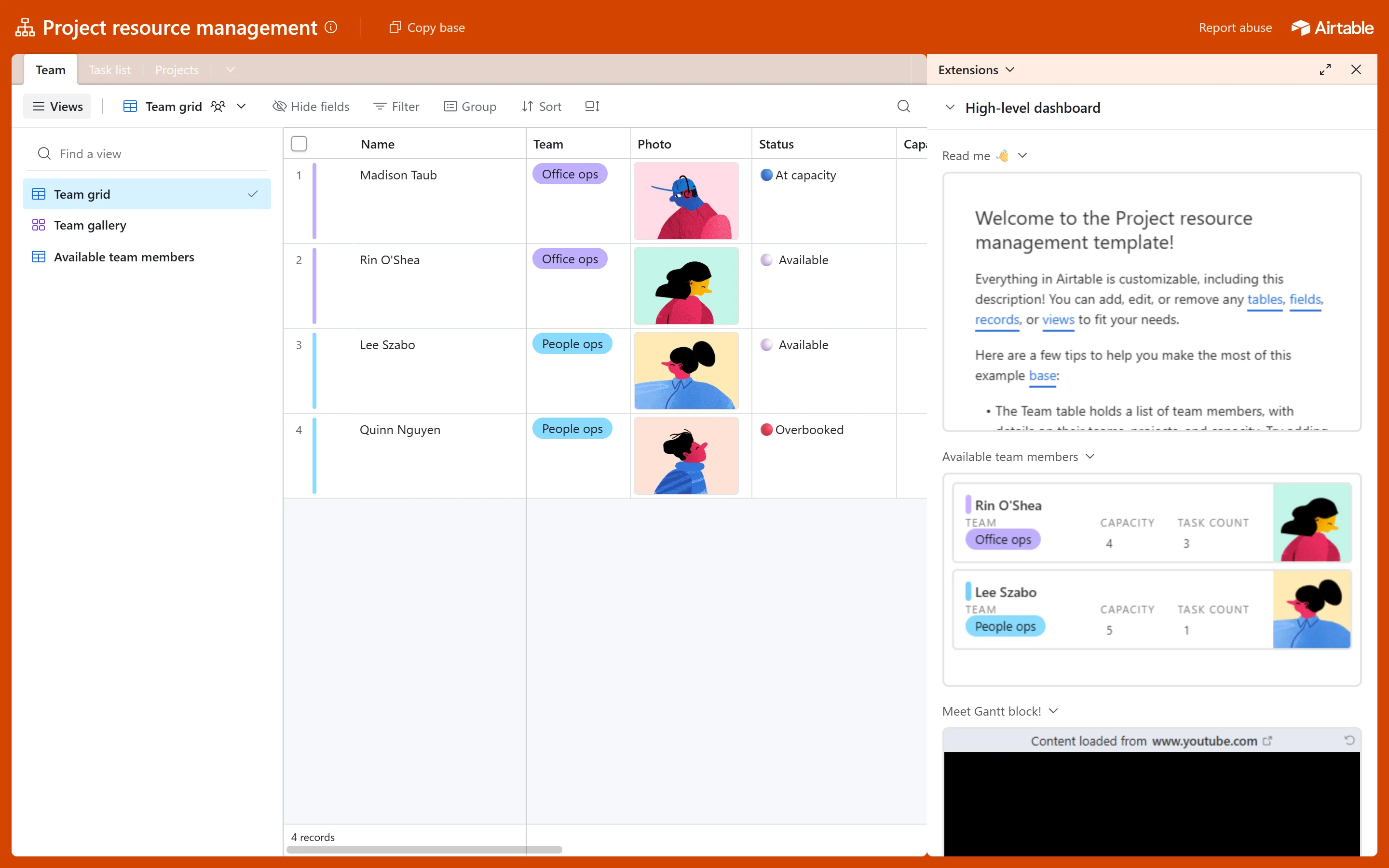
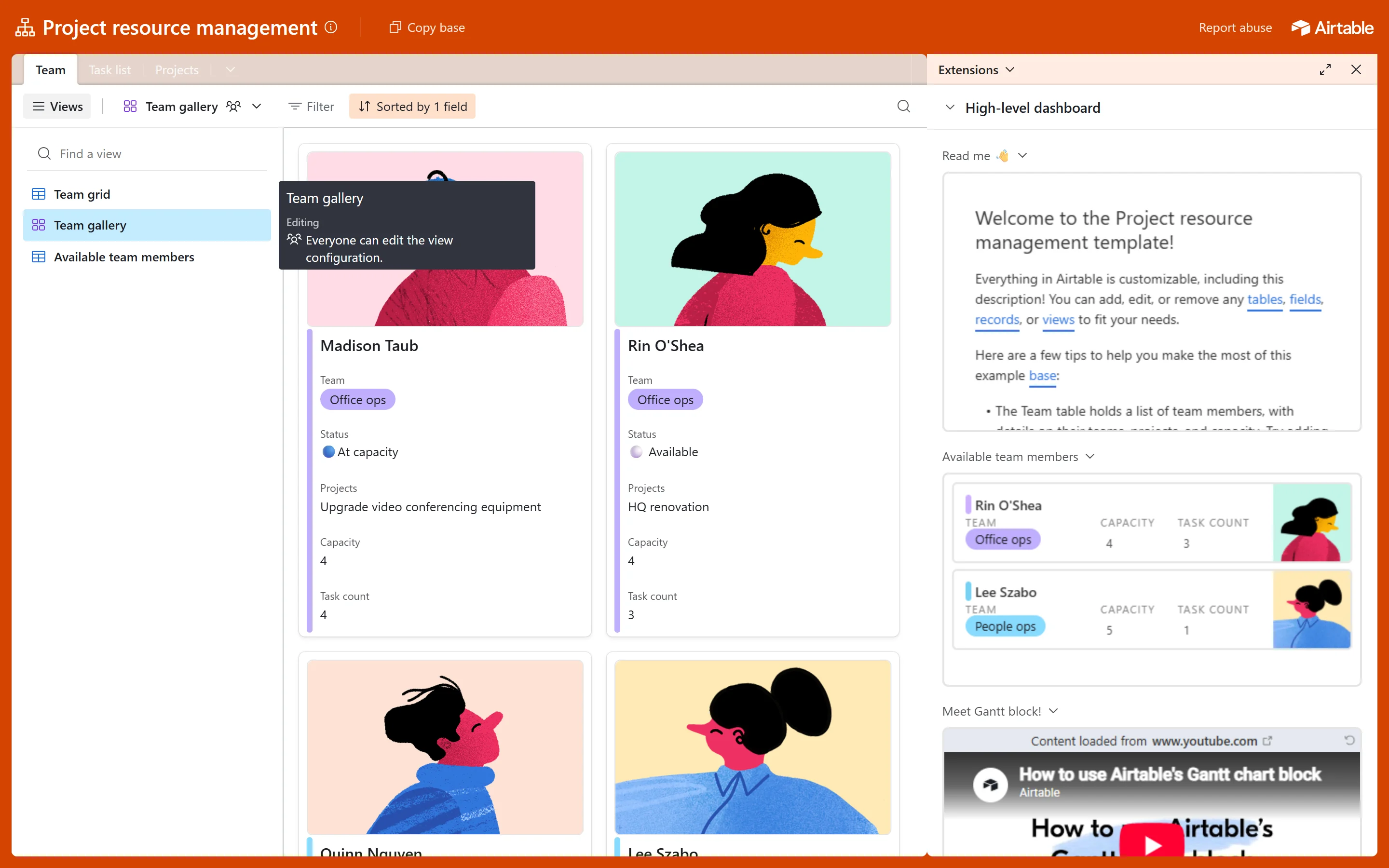
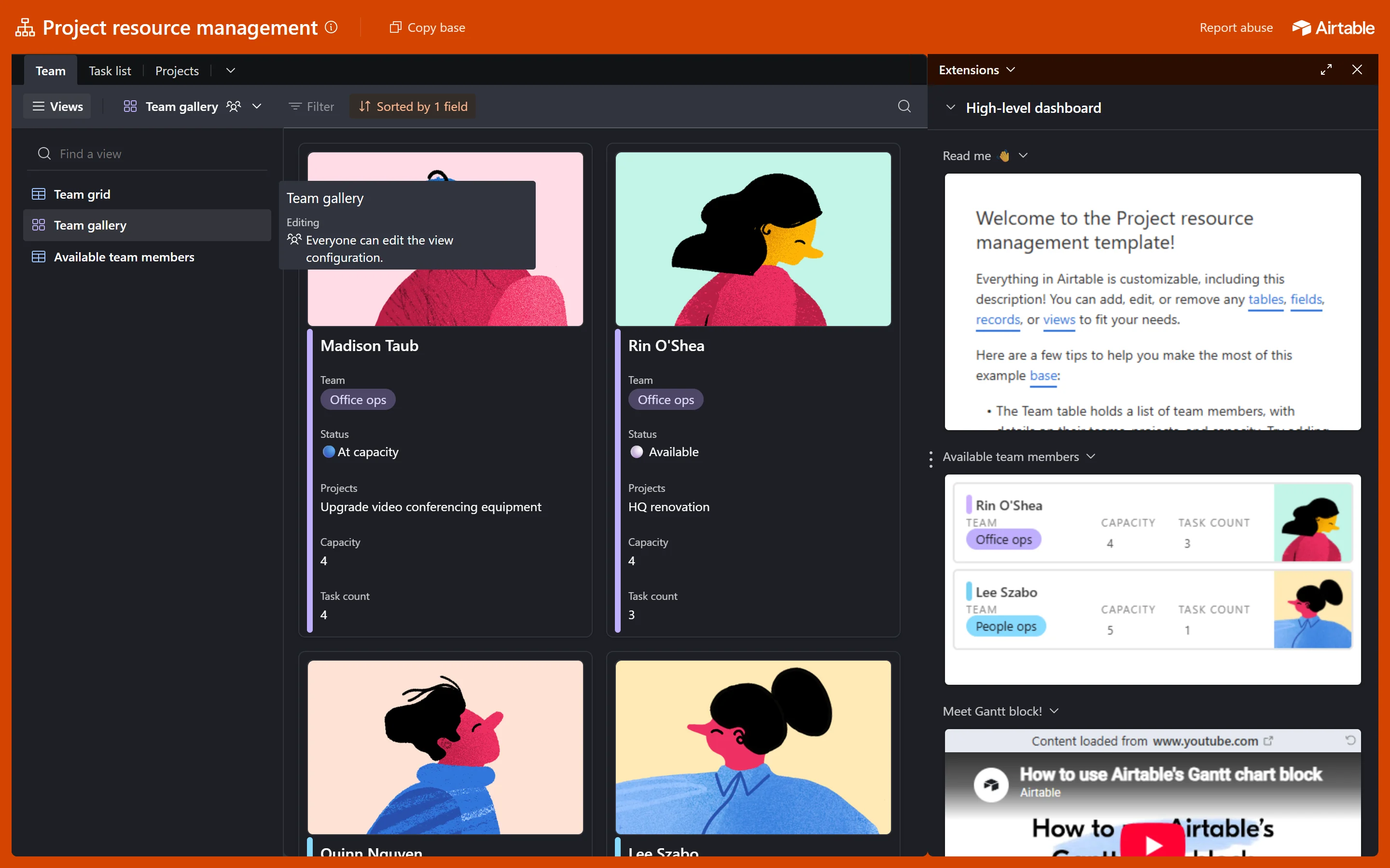
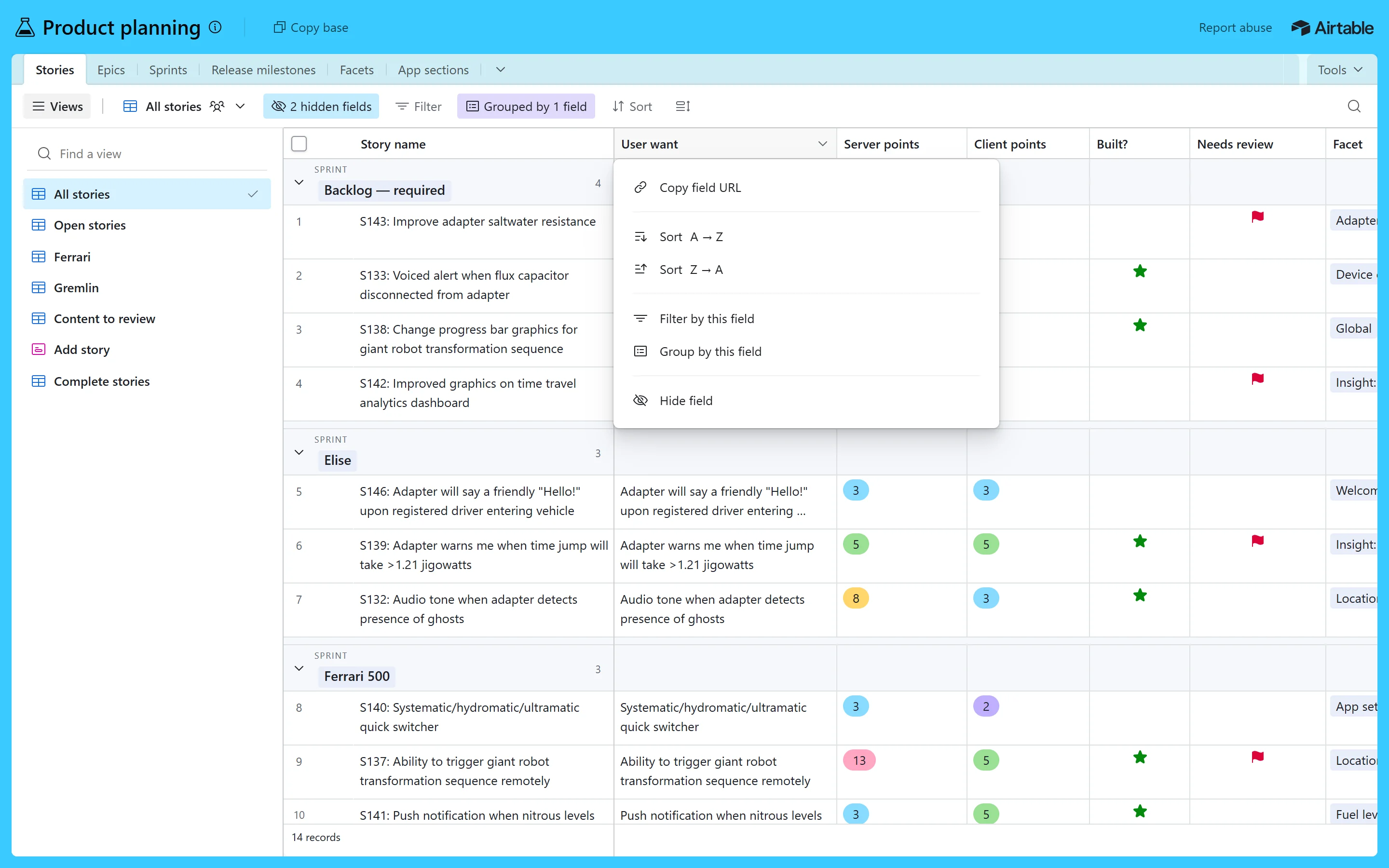
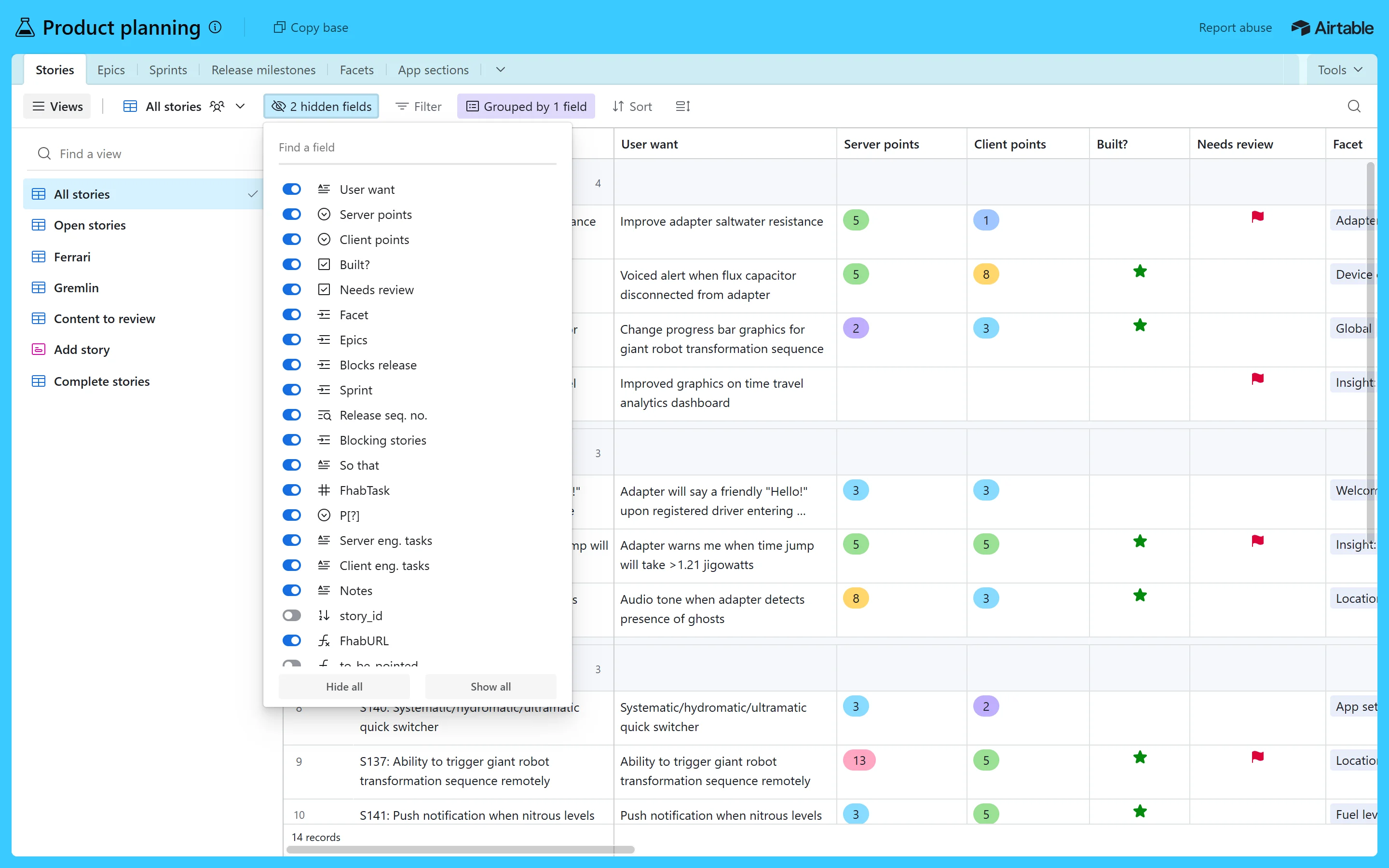
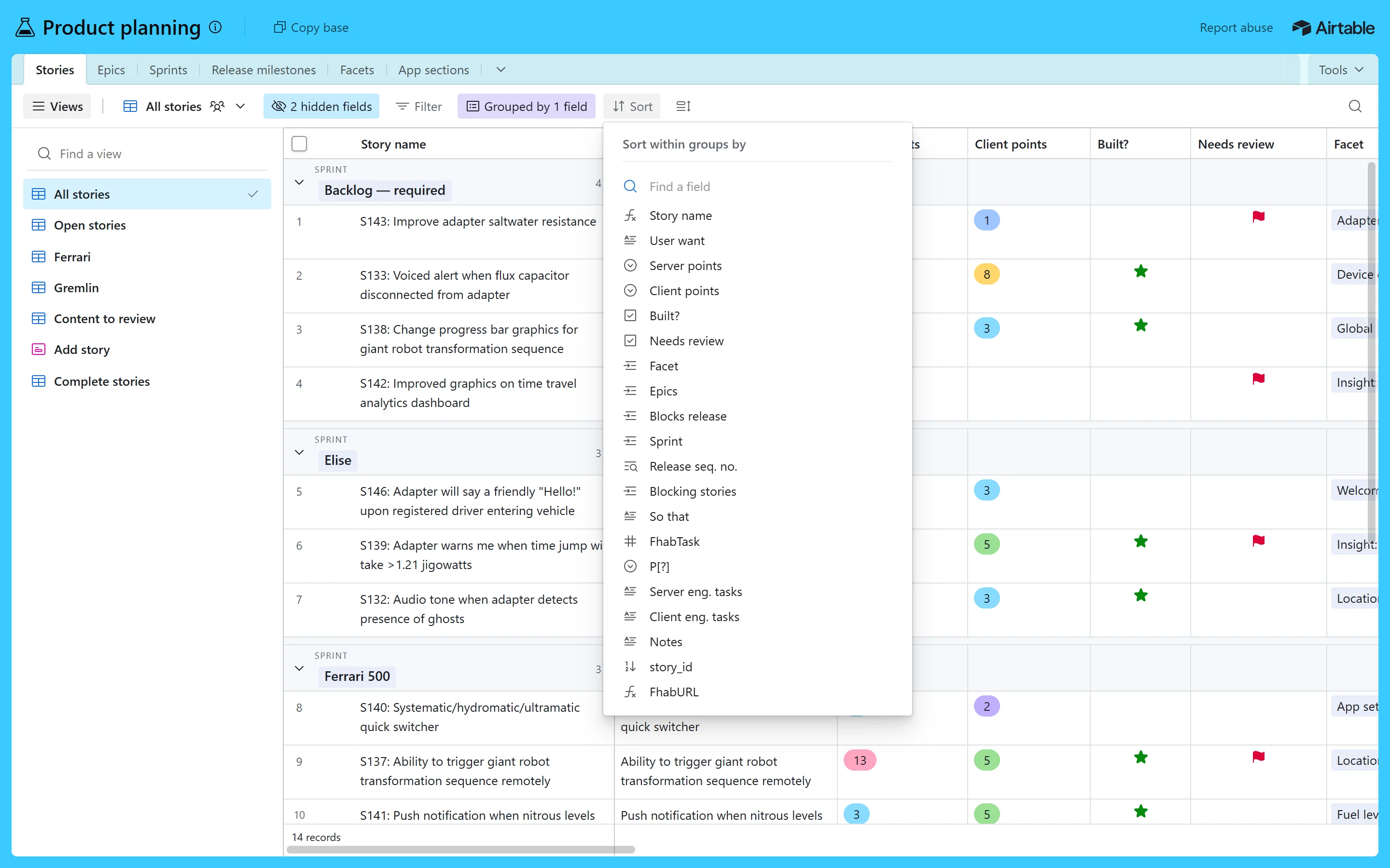
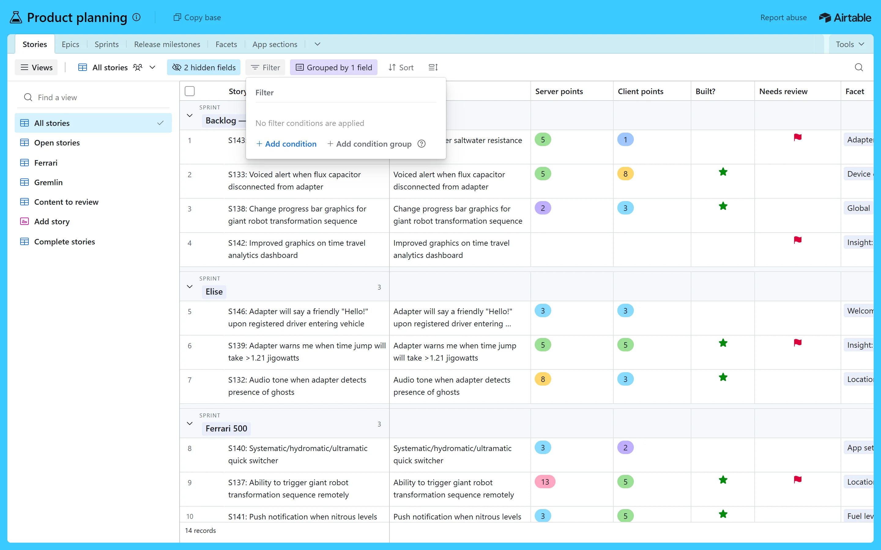
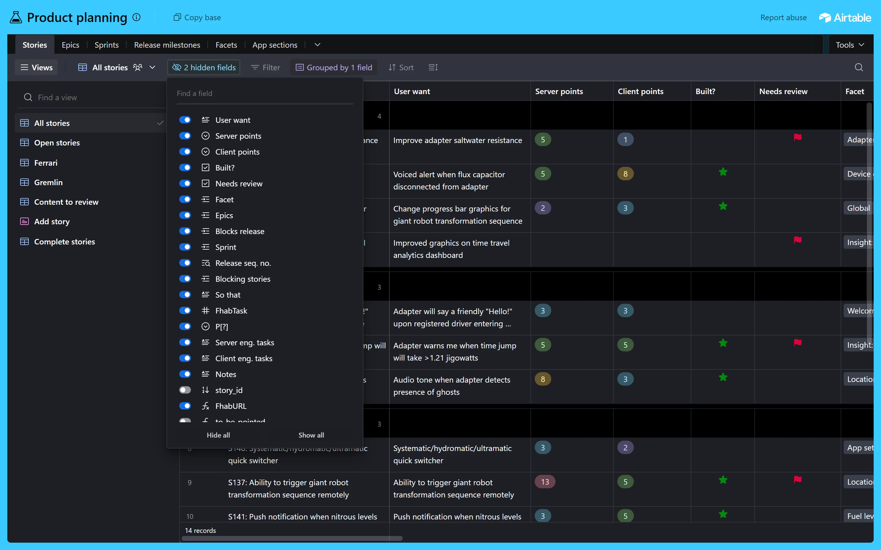
Colours real
Airtable names each colour by its job: foreground = text and icons, background = fills, border = lines. subtle / subtler / subtlest get fainter step by step. Values below are read live from the token file (Airtable's list of named colours), so they are always the real ones.
Core roles
The 10 option colours
Every select option, row colour and base colour comes from the same 10 families. Each family has 4 strengths. The pale two carry near-black text, which is how most bases use them. In dark mode the fills turn deep and the text takes the family's pale tint.
Base colours
A base takes one colour for its top bar. The table-tab strip below it is the same family at its palest, under a see-through layer (10%) of the darker shade. Light families (cyan, teal, yellow) use dark text; the others use white.
Full palette
Light3 to Light1 are pale fills, the plain name is the colour itself, Dusty is a muted version, Dark1 is for text on a pale fill. The grey scale runs from 25 (almost white) to 900 (almost black).
Typography live
Airtable's app has no custom font. It uses the computer's own: Segoe UI on Windows, San Francisco on a Mac. We measured 981 visible elements on the grid screen, and 980 use it. Weights in use: 400, 500 and 600. This page follows the same rule, so you see what Airtable shows on your laptop.
Airtable's size scale (stylesheet): body 9, 11, 13, 15 · headings 13, 15, 17, 21, 23, 27, 31, 35. Most of the app lives at 13px.
Icons real
All 580 of Airtable's own app icons, copied from its icon file (icon_definitions.svg). None are redrawn; numbers are rounded to 0.001 and checked against the original. They are drawn on a 16px square and filled with the text colour. Many names match the open-source Phosphor icon family. View icons take a colour: blue grid, pink form, purple gallery and so on.
The ones you see on the grid screen
All icons
Shape & size live
Airtable uses three corner sizes plus a full round, and keeps everything low so a table fits a lot on screen.
Heights and spacing
Shadows real
Airtable calls them elevations: how high a thing seems to float. Most start with a sharp 1px edge, so cards stay crisp on white, then add a soft blur. In dark mode the low ones add a faint white ring and the medium and high ones a grey ring (#31353E), because shadows hardly show on dark.
Components
Live and clickable, built with airtable.css. Hover, click and use the keyboard: the states and timings are Airtable's real ones. Under each one: the exact numbers and Airtable's token names.
--colors-background-primary-control #166EE1, hover …-emphasis #0D52AC in 150ms (--motion-standard-fast) · white 13px/500 text · 6px corners. Secondary white raised control with --elevation-low, hover --colors-background-raised-control-hover. Heights 24 / 28 / 32 / 36 from Airtable's .button-size-* rules. Top-bar button 28px, full round, 12px sides, hover = the base's dark shade at 10%. Side padding 12px est.--at-choice-[colour][strength] · dark text on pale fills, white on strong ones. Dark mode fills from Airtable's dark-mode-darken-row-color rules, text = the family's Light2. Linked record 22px · 3px corners · 6px sides · #E9EEF9 (dark: see-through blue-white 18%). Checkbox field shows Airtable's own shapes: a green star, a red flag. Row checkbox 16px · 3px corners · 1px grey gray400 edge.rgba(0,0,0,.65); hover darkens the text on an 8% grey. The open tab is white, 500 weight, with 3px top corners. View bar 44px white, 1px line below. Tool 26px · 4×8px padding · grey --colors-foreground-subtle · hover 5% grey in 85ms ease-in. Tool that is on takes its own pale colour and ink text, hover adds a 2px inner ring. Click Sort to switch it on.--cell-borderColor-header #D1D1D1. Cells white, lines --cell-borderColor #DDE1E3 · 6px padding · 2 lines then "…". Row hover --row-background-cursor #F8F8F8 · the row number becomes a checkbox and a 24px expand button appears. Selected --cell-background-selected #F1F6FF · active cell 2px blue ring. Group header 48px, caret turns 90° in 200ms ease-out. Try: hover, tick a row, click a cell, fold a group.--elevation-medium, hover --elevation-medium-hover in 85ms ease-in · 16px apart · title 16px/500 starting 22px in. Cover height and inner spacing est.--elevation-high · opens with no animation (measured frame by frame; closing was not measured). Header 48px with up/down arrows (next/previous record) and a round close button. Body 32 × 40px padding · 640px column · the record's name at 23px · then one row per field: 160px label at 75% strength, value box 32px, light grey --colors-background-subtler, 6px corners, 1px inner line. Linked record is a small card with three looked-up fields.Try them. Click a toolbar button to open Airtable's real menu, hover the rows, use the arrow keys and Enter, press Esc or click outside to close. Note there's no fade or zoom: Airtable's menus appear and vanish instantly.
--colors-background-raised-popover · 3px corners · --elevation-high · no animation live. Header 13px/500 grey + a 1px line. Field menu 12px padding, rows 34px with 8px padding, 16px icon + 12px gap, groups split by a 1px 5% line. Field pickers (Sort, Group) rows 26px. Hide fields a 19 × 12px switch per field, blue when on. Hover row 5% grey --colors-background-selected. Tooltip Airtable's dark menu tooltip: #444, white 12px text, 5 × 7px padding (stylesheet). It shows after 0.2s with a 0.2s fade, the timing of the hint captured live (which is white with grey text).Try it: mini CRM live
One working base, built only from this design system. Switch tables, search, filter, group, sort and hide fields. Tick rows and delete them (with a confirm and Undo), add a record, or open one full size and edit it. Keyboard: click a cell, then the arrow keys move the blue outline, Space opens the record, Delete removes ticked rows, Esc closes.
Delete records?
They disappear from every view. You can undo this right after.
States & motion live
Every clickable thing has the same small set of looks. Each state is shown frozen below, so you can compare them without hovering. Airtable's hover is a 5% grey wash; pressing looks the same as hovering (we held the mouse down on a real toolbar button to check).
Hover = --colors-background-selected (black 5%, white 5% in dark). Focus = a 2px solid blue outline #166EE1 with a 2px gap, shown when you use the keyboard (measured by tabbing through the real toolbar). Disabled = 50% strength.
Motion
Airtable barely moves. Hovers fade in 85ms, the blue button in 150ms, and a group's arrow turns in 200ms. Menus and the record window have no animation: we sampled every frame, and the first frame they appear in, they are already full size. (Ease-in = starts slowly, ends fast; ease-out = the opposite.) Press "Play" to watch each one.
Airtable's motion tokens
The stylesheet defines a full set of curves and speeds, even though the views above use only the fastest ones. The four numbers describe how the speed changes along the way. Press a card to see it move.
If someone turns on "reduce motion" on their computer, every transition here switches off.
Dark mode real
Airtable has a real dark mode (public beta since May 2025: Account › Appearance). Same token names, dark values: page #1D1F25, behind the grid pure black, text white. Only the token file switches; the components are unchanged. Flip this whole page with the switch at the top.
What changes in dark mode
Do & don't
Checked against the live app on 3 Oct 2026. The small grey label after each rule names the Law of UX it comes from. Click it to jump to that law in the scorecard. A red bullet marks a rule where Airtable itself falls short.
Do
- Keep the grid quiet: 13px text, grey hairlines, grey row numbers. Put colour only in options, row colours and view icons. Von RestorffSelective attention
- Show which tools are on. Airtable paints a tool in its own pale colour and rewrites its label ("2 hidden fields", "Grouped by 1 field"), so nobody wonders why rows are missing. Working memorySimilarity
- Use the same 10 colour families everywhere, and keep text dark on the pale ones. Similarity
- Group long lists and show the count on each group ("Backlog — required · 4"). ChunkingCommon region
- Let people open any row full size with one click, then step to the next record with the arrows. Fitts's lawFlow
- Answer clicks at once: hover in 85ms, menus with no animation. Doherty threshold
- Put a search box on top of any long field list (Sort, Group, Hide fields all have one). Hick's law
- Offer row heights (32, 56, 88, 128px) so people choose between density and reading. Cognitive load
Don't
- Don't add colour to headers, borders or text. Airtable's chrome stays grey and white; the base colour lives only in the top bar. Occam's razor
- Don't use big corners. Airtable is 3px on small parts and 6px on windows and buttons; round only for options and switches. Similarity
- Don't animate menus for show. Airtable shows that a work tool feels faster when things just appear. Doherty threshold
- Don't hide key actions behind hover only. Airtable's expand button and row checkbox appear only on hover, so touch users never see them. Fitts's law
- Don't rely on grey-on-grey. The toolbar labels pass in light (5.8:1) but reach only 4.1:1 in Airtable's dark mode, and the 9px group labels and 11px counts are tiny. Cognitive load
- Don't drop new users into a blank base with more than 25 field types. Airtable's templates help, but the empty builder still stalls people. Choice overloadActive user
UX principles, in plain words
The rules behind Airtable's feel, for AltLeads too. Each card names the UX law, explains it simply, and shows where Airtable follows it. All 29 laws are checked one by one in the scorecard below.
Instant beats pretty
In a tool people use all day, speed matters most. Skip animations that make people wait.
Show what's switched on
If a filter hides rows, say so where people look, in words and colour.
Group and count
Break a long list into groups with a label and a count, and let people fold them.
One meaning per colour
Pick a colour for each status once, and use it on every screen.
Big detail, one click away
Keep the list dense, and open one row big when people need detail.
Search long lists
Any list longer than about 7 items needs a search box on top.
Let people choose density
Some people scan, some read. Offer both.
Works without a mouse
Tab reaches every tool, and a clear outline shows where you are.
Readable for everyone
Grey text looks calm but can be too faint. Check every text colour; see the live check below.
Let people undo
Prefer Undo over "Are you sure?". Confirm only what can't be undone.
Live contrast check
Checklist before any screen ships
Laws of UX scorecard
All 29 laws from lawsofux.com, each checked against Airtable. Every card says what the law means in plain words, what Airtable really does, and what AltLeads should take from it. Click a coloured bar to jump to a law, or filter by result.
Copy & use
Add four files to any HTML page, then use the classes. Add at-dark to any parent for dark mode, and a base colour such as at-base-cyan for the top bar.
<link rel="stylesheet" href="airtable/airtable-tokens.css">  <!-- Airtable's own tokens, light + dark -->
<link rel="stylesheet" href="airtable/airtable.css">         <!-- components (.at-…) -->
<body class="at-root at-base-cyan">                          <!-- add at-dark for dark mode -->
<script src="airtable/airtable-icons.js"></script>          <!-- 580 real icons -->
<script src="airtable/airtable-kit.js"></script>            <!-- draws <svg data-i="…"> -->

<span class="at-token greenLight1">Customer</span>
<span class="at-tool on green"><svg class="at-i" data-i="FunnelSimple"></svg>Filtered by Status</span>
<button class="at-btn primary">Share</button>