Two real Airtable screens, rebuilt
Each copy is built only from our Airtable design system and checked pixel by pixel against our own capture of the live app (public shared base, no login). Both work: open one and click around. The dark copies are measured against Airtable's real dark mode too.
Grid view, grouped by sprint
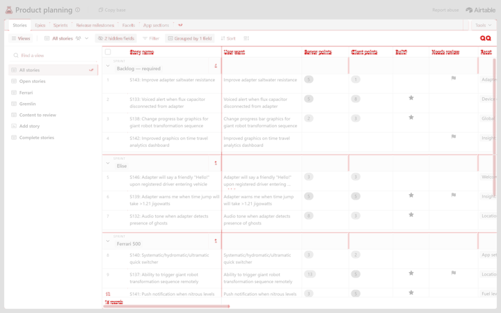
99.1% pixel matchdark 98.6%edges only 96.2% · dark 96.1% Original: live Airtable, "Product planning" base, Stories · All stories, 1440 × 900 at 2x · 5 compare rounds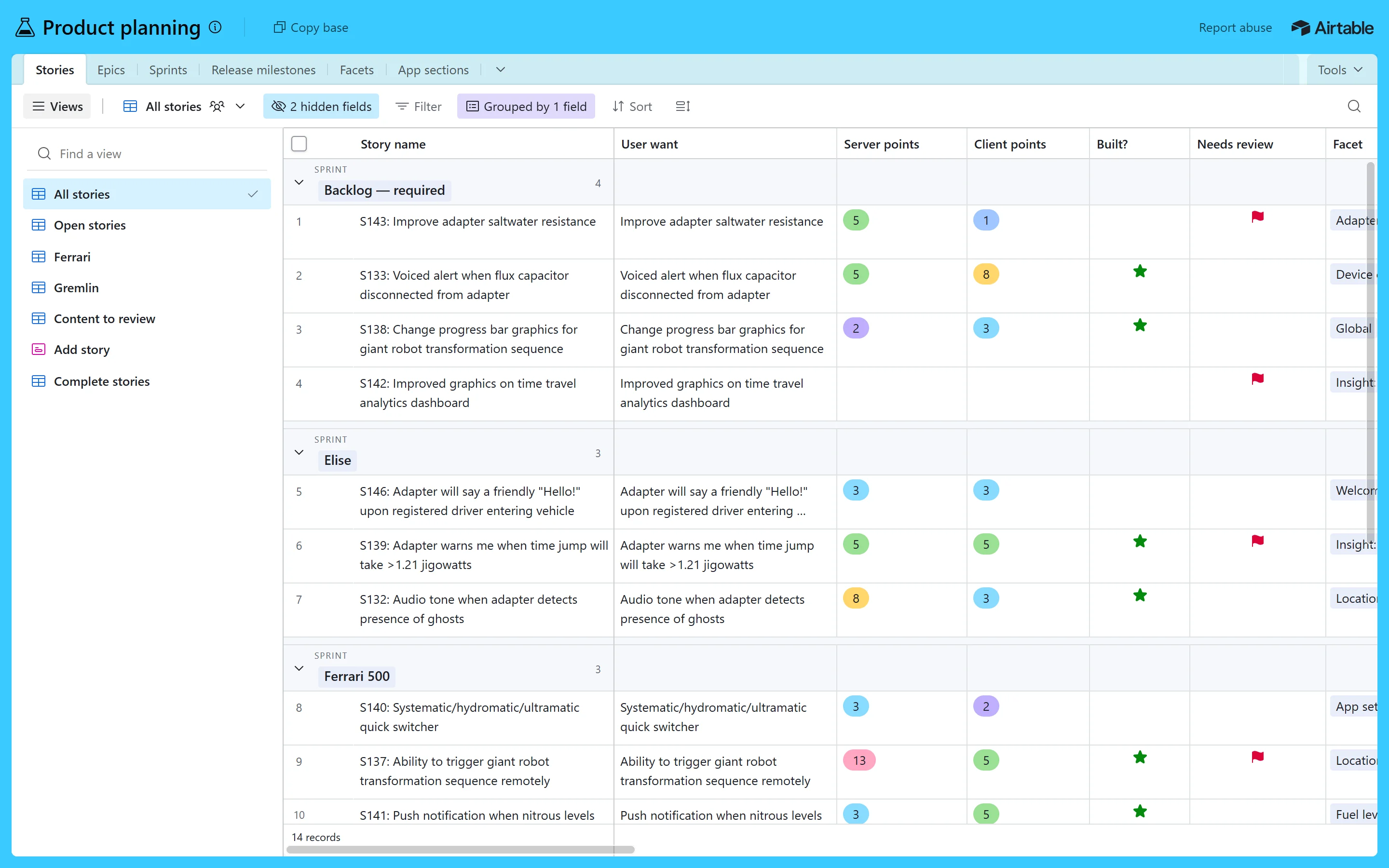
What you can try
- Hover a row: the number turns into a checkbox and an expand button
- Tick rows, click a cell for the blue outline
- Fold a sprint group (the arrow turns in 200ms)
- Open Hide fields, Filter, Group, Sort and Row height
- Switch fields off, sort by a field, change row height
- Open a column's menu, search the view, switch views
Expanded record
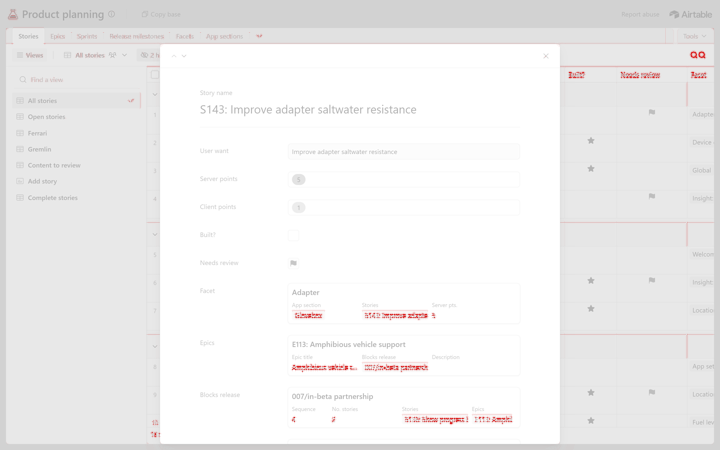
99.5% pixel matchdark 99.3%edges only 94.3% · dark 94.1% Original: the same base, story S143 opened full size, 1440 × 900 at 2x · 3 compare rounds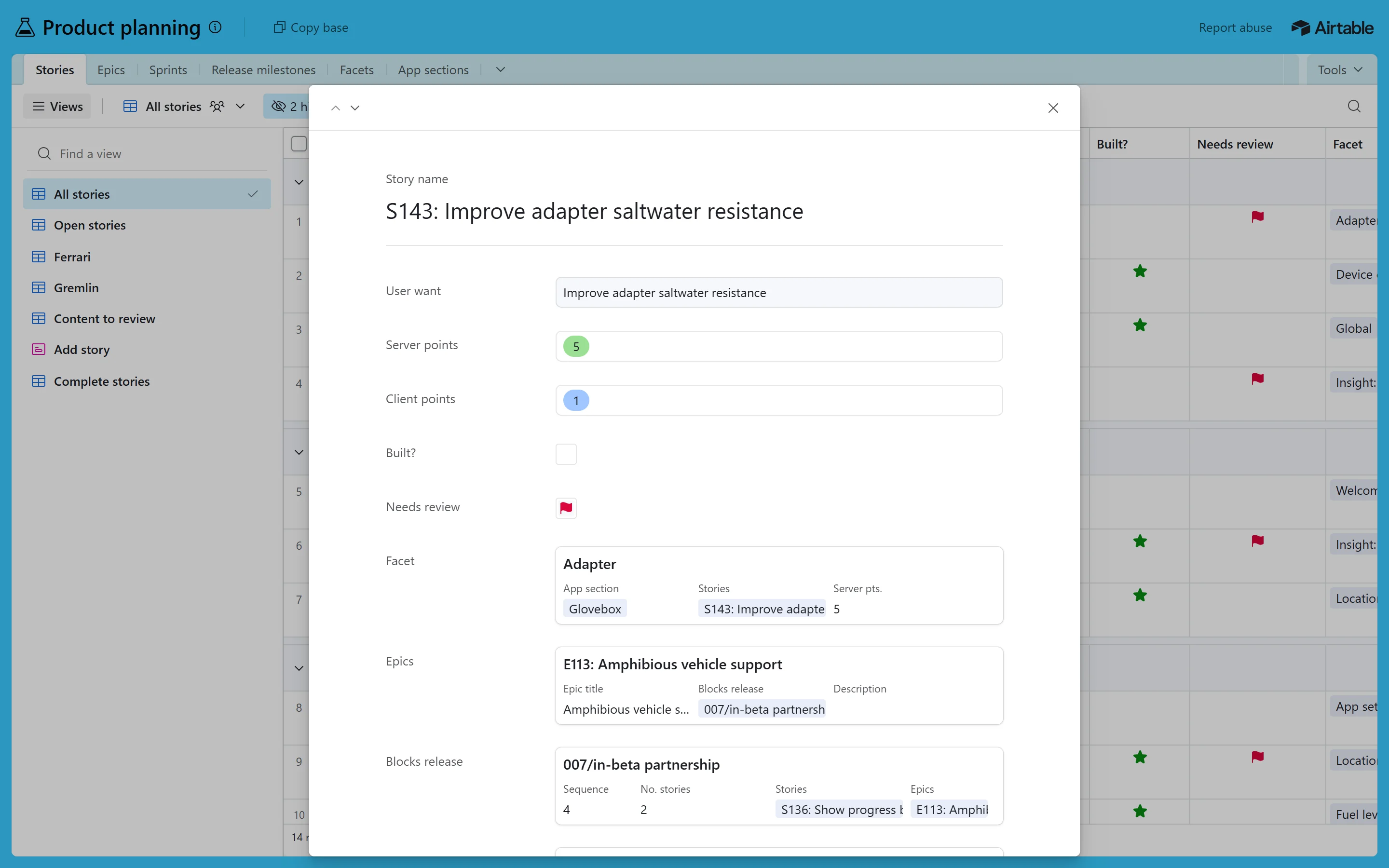
What you can try
- Step to the next or previous story with the arrows
- Scroll the record: its name fades into the header
- Close with ×, Esc or a click outside: back to the grid
- It opens with no animation, as Airtable does
Opened on its own (here in Open Design or in a browser window), every copy shows links back at the top and a small bar at the bottom: Light / Dark, Compare with original (drag the blue line left and right) and Actual size when the screen is scaled to fit. Keys: D dark, C compare, Esc closes the compare.
How to read the scores: the original was captured on this laptop with the same browser and Windows font as the copy, which makes a high score easier. A blank page in the main colour would already score 45 to 72%, so the grey "edges only" number (text, lines and icons only) is the stricter, more honest one. On another computer the font may differ; the layout stays the same.