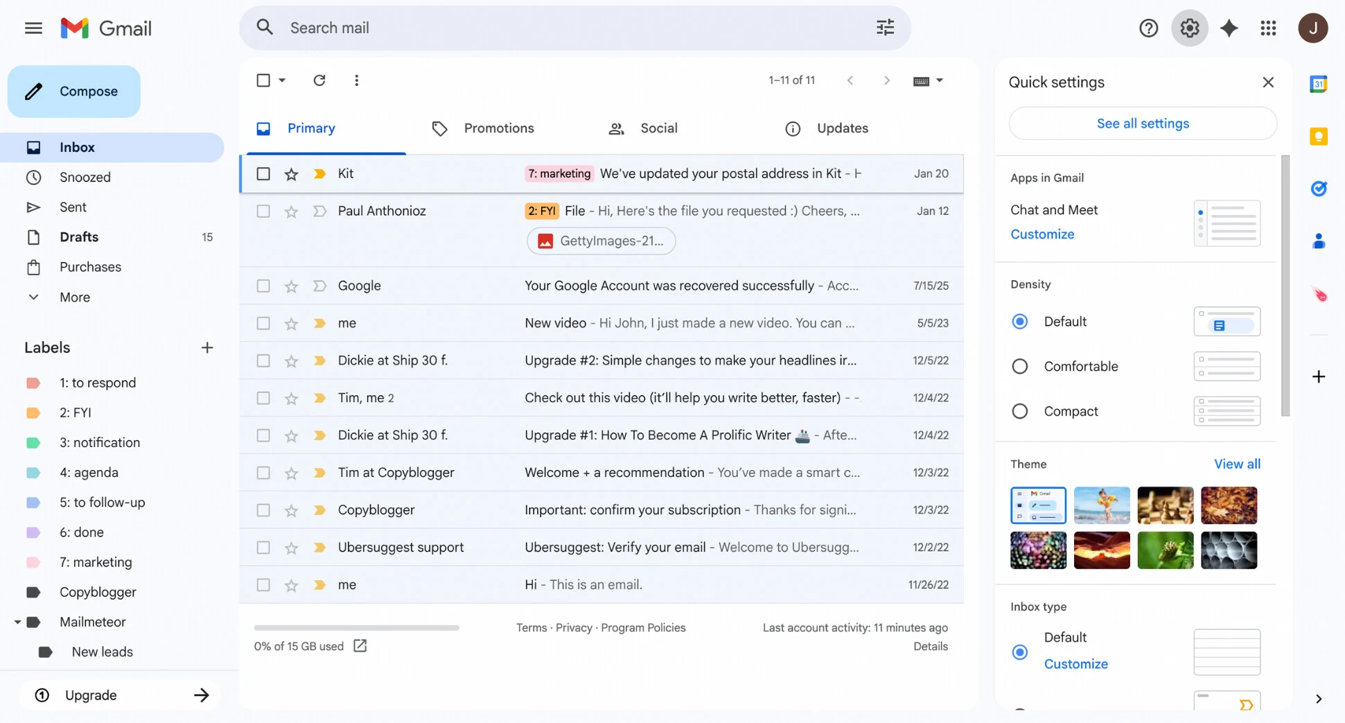
Gmail on the web, in the Material 3 look Google launched in 2022 and still uses in 2026. Colours, type, 163 icons and every main part, in light and dark. Values come from Google's own public files (its GM3 colour tokens and Gmail's own stylesheet, saved by the Wayback Machine in Sept 2024) or were measured on Google's own pictures. We never signed in to Gmail.
real = Google's own filemeasured = read from Google's picturesest. = our best guessours = our design where Gmail shows nothing
Gmail at a glance
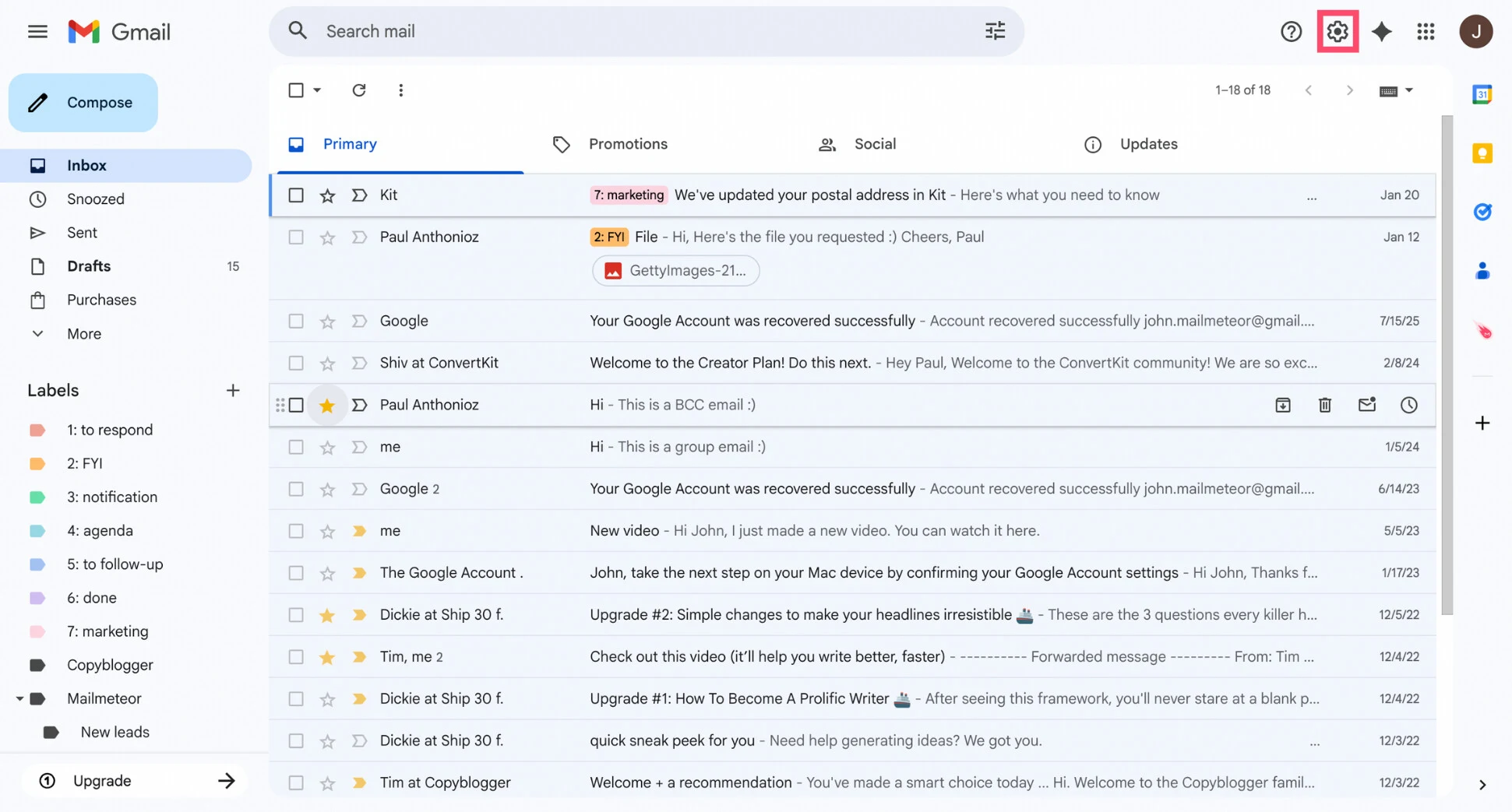
A calm, quiet mail app. A blue-grey page, a white card for the list, one font (Google Sans), 14px text on 20px lines and 40px rows. Unread mail is bold on white; read mail is normal on a pale tint. Colour is saved for two things: the light-blue Compose button and the blue Send button. Hovers change in 150 ms on one curve.
What you notice first
The list is the screen. A white card with rounded corners floats on a pale blue-grey page. Each mail is one 40px row: sender, subject, a grey preview and the date.
One big button. Compose is a 56px light-blue pill at the top left. It is the only large coloured thing on the screen, so you always know where to start.
Actions come to you. Point at a row and four icons (archive, delete, mark read, snooze) replace the date. Do something by mistake and "Undo" waits at the bottom left.
Product screens
Left: Google's picture (or a blog's). Right: our copy, built only from this design system. The copies work: open one full size to point at rows, star, archive with Undo, open a mail, reply and write a new one. The Dark mode switch at the top also switches every copy below.
93.3% of pixels match (light)92.7% (dark, measured)Edges only (text, lines, icons): about 50%. Every name and mail is made up, so the words differ on purpose.
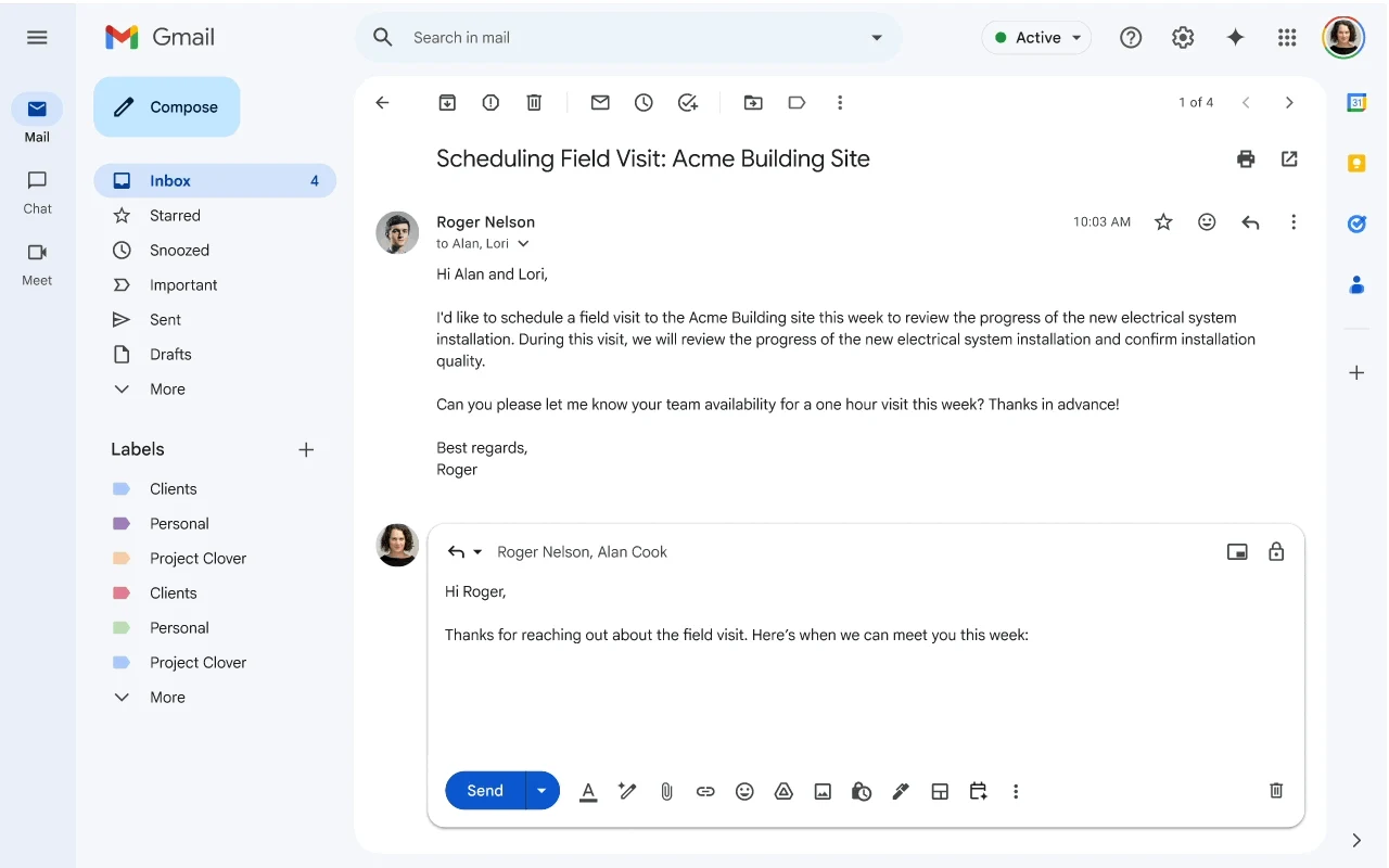
Open conversation with the reply box
Original · Google Workspace Updates blog, Mar 2026 · light only (no dark picture exists)Our copy · open full size · difference map · dark is est.
95.1% of pixels match (light)Letter avatars stand in for the face photos.
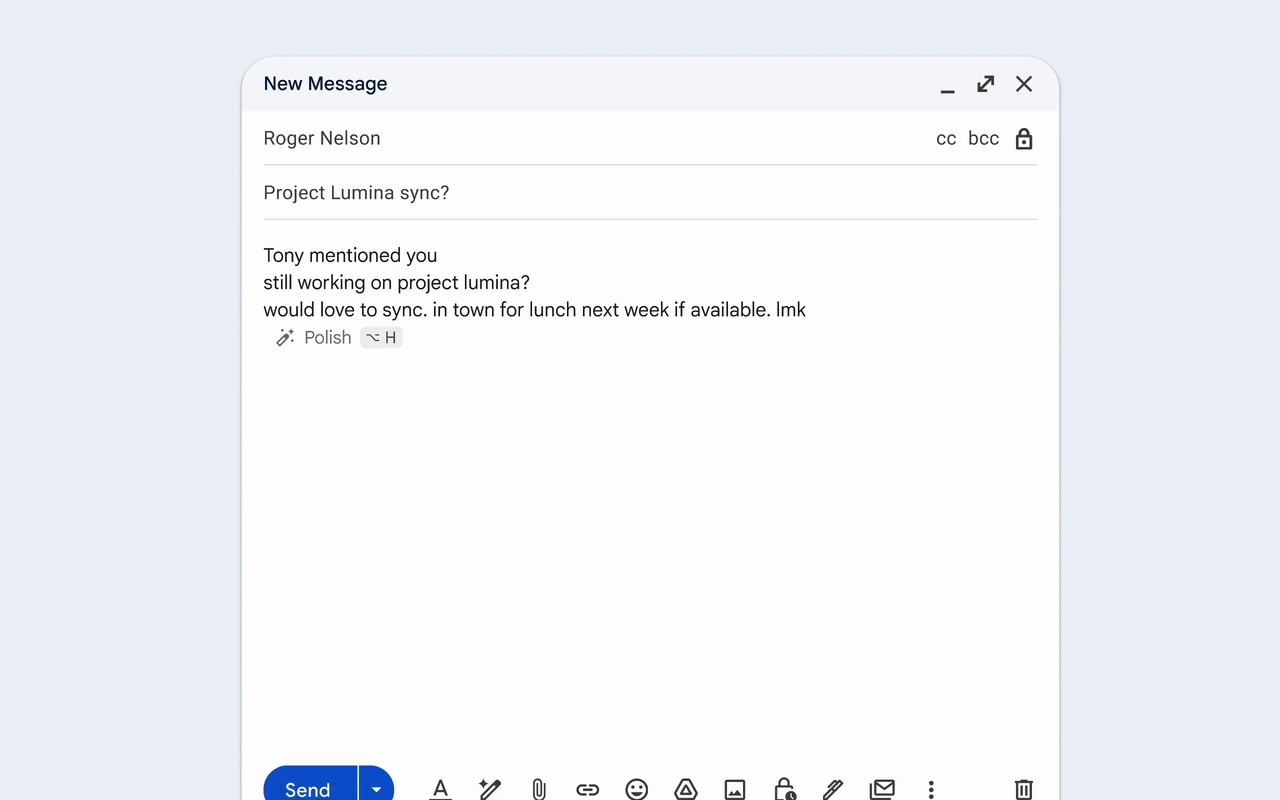
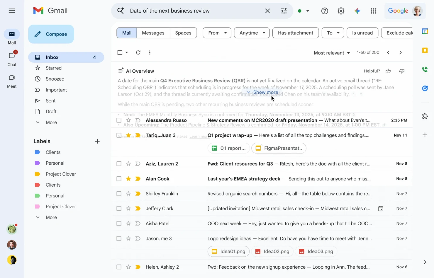
91.7% of pixels match (light)The photo theme tiles are shown as plain colours. All five copies in one place: Gmail screens.
Colours
Gmail uses Google's "GM3" colour set (Google's own version of Material 3) and gives each colour a job. The tables below are read live from the token file, so they always show what the file really says. The small label says where each value came from.
Gmail roles · light and dark
Light comes from Gmail's own stylesheet or from Google's 2022 launch picture. Dark is Gmail's real Dark theme, a neutral grey theme measured on two real dark inbox pictures (2022 and 2026). Where no dark picture shows a part, the dark value is our estimate.
Label colours measured
Measured on the 2026 light and dark pictures. They stay the same in both themes. A label chip in a row uses the label colour as its fill.
Google's GM3 system colours real
Google's own token values from a public Google page; Gmail's stylesheet uses the same values. Note: Gmail's Dark theme does not use the blue-tinted GM3 dark surfaces (#131314, #1E1F20). It uses plain greys instead.
Type
One family: Google Sans, now free to use (open licence since 2025). Gmail's own stylesheet asks for "Google Sans" first, then Roboto. Message text asks for "Google Sans Text", which is not openly licensed, so Google Sans stands in for it here. Most text is 14px on 20px lines. Unread mail is bold (700); buttons and tabs are medium (500).
Google Sans 400
Aa Gg
rows, nav, body
Google Sans 500
Aa Gg
Compose, buttons, tabs
Google Sans 700
Aa Gg
unread rows, counts
Roboto 400
Aa Gg
fallback, older dialogs
Pick your theme
Dialog title24px · 400 · line 32 est.
Q3 plan: final numbers before Friday
Conversation subject22px · 400 · line 28 · --gm-type-title-lmeasured
Quick settings
Panel title18px · 400 · line 24 measured
Search mail
Search box16px · 400 · line 24 real
Labels
Nav heading16px · 400 · --gm-type-title-m size measured
Priya NairVenue booked — We have the hall from 9 to 5 on the 21st.
Size steps: 12, 14, 16, 18, 22, 24. Weights: 400 (most text), 500 (buttons, tabs, sender in a conversation), 700 (unread). Font stack from Gmail's stylesheet: "Google Sans", Roboto, RobotoDraft, Helvetica, Arial, sans-serifreal.
Icons
Gmail draws its icons from Google's Material Symbols (outlined, weight 400; filled when chosen). Gmail's own icon files are named "_20dp", so most icons are 20px; the top bar uses 24px. Every icon here is the real Material Symbols drawing (Apache licence), named as Google names it. Click any icon to copy its name.
The ones you see on the inbox
All icons
Shape & space
Gmail is soft and round: pills for search, Send, nav items and chips; 16px corners on the list card and Compose button; 4px on tooltips and snackbars. Space follows a 4px grid (8, 12, 16, 24).
Gmail has no public space scale. These are the gaps that repeat in its stylesheet and pictures.
Heights and sizes
Shadows
Gmail's shadows are two soft grey layers in Google's grey (60, 64, 67). Things that float get a shadow: the Compose button on hover, a row you point at, menus and the compose window. In dark mode shadows almost vanish, so Gmail relies on lighter greys instead.
Components
Live and clickable, drawn with the real kit classes in gmail.css. Point, click and use the keyboard. In the app these parts are placed at fixed spots; here they sit one after another.
Top bar, search pill, Compose button, left nav realmeasured
Click the search pill: it turns white with a shadow while you type. Type something and a clear (×) button appears; Enter "searches".
Click a nav item to choose it. The chosen item gets the pale blue pill and bold words. Unread folders show a bold count.
Compose opens a New Message window (in the compose demo further down).
Top bar 64px, same colour as the page, icons 24px in 40px round buttons, lockup 109 × 40. Search 48px pill, 24px corners, --gm-search; focus turns it white with --gm-shadow-1est.. Compose 56px tall, 16px corners, #C2E7FF with dark words #001D35 (dark theme: white with black words); hover adds --gm-shadow-2 in 0.08s. Nav item 32px, round on the right, chosen = #D3E3FD + bold; hover 8% grey. Width 256px.
List toolbar, category tabs, mail rows realmeasured
1–50 of 2,481
Toolbar 48px; tick the select box (or any row) and the bulk actions replace Refresh. Tabs 56px, four equal tabs, the open one blue with a 3px bar; "new" pills use the tab's colour. Row 40px (Default), 4px padding + 32px cell real; unread = white + bold, read = --gm-row-read; checked = #C2DBFF. Pointing at a row raises it (--gm-shadow-row-hover) and swaps the date for Archive, Delete, Mark as read, Snooze. Since 2026 the tick box, star and importance marker stay light grey until you point at the row measured. Densities Default 40px with attachment chips (80px rows), Comfortable 40px without chips, Compact 28px real CSS, look est. (no real picture of Comfortable or Compact).
Labels, tags & attachment chips measured
7: marketing2: FYI
Budget_Q3.pdfVenue list.xlsxfloor-plan.png
Highlighted search word
Label chip in a row 20px tall, 4px corners (2026), 12px words, fill = the label colour (seven soft colours, the same in light and dark). Nav label a small tag shape in the label colour. Attachment chip 32px pill, 1px outline, a coloured file-type square, name cut with "…" after 160px. Unsubscribe 20px, 1px outline, appears on hover for mailing lists. Search highlight yellow #FDE293.
Conversation & inline reply measured
Venue booked for the 21st
P
Priya Nair<priya@example.com>
We have the hall from 9 to 5. Can you confirm the head count?
Mon, 9:12 AM
We have the hall from 9 to 5. Can you confirm the head count?
D
Daniel Okafor<daniel@example.com>
to me, Priya
10:42 AM (2 hours ago)
Hi both,
42 people so far. I will send the final list on Thursday. Can we keep the second room for the workshop?
Thanks, Daniel
S
Daniel Okafor
Subject 22px Google Sans. Message 40px round avatar, sender 14px medium (500), address and time 12px grey; earlier messages fold to one line (click to open). Reply chips 36px outlined pills. Inline reply a raised white card with 16px corners, the blue Send pill (36px, 18px corners) with a split arrow for "Schedule send". Sending shows "Message sent. Undo". Dark is est..
Compose window measured
New Message
Window 540px wide, opens bottom right over the list, 16px top corners, a deep shadow. Header 40px, pale #F2F6FC, "New Message" in dark navy; buttons Minimise (drops to a 280px bar), Full screen, Save & close ("Draft saved"). Fields 40px with a thin line; lower-case "cc bcc". Send blue pill; with no recipient Gmail says "Please specify at least one recipient." The formatting button opens a 40px tool bar. Try them all.
Search filter chips measured
Top results
Filter chip 32px, 8px corners, 1px outline; chosen = pale blue fill, no outline. Chips with ▾ open a menu. They appear under the search box after you search. Sort "Most relevant / Most recent". Section head folds results; its arrow turns in 150ms.
Quick settings panel measured
This panel really works on this page:
Density changes the rows in the "Toolbar, tabs, rows" demo above.
Theme: the black tile switches the whole page (and the copies) to Gmail's Dark theme.
Panel 320px, white, 16px corners, slides in from the right in 250ms and pushes the list card left. Sections split by 1px lines, 48px option rows with a 20px radio and a small drawing of the choice. "See all settings" is a 36px outlined pill with blue words.
Menu, tooltip, snackbar & dialog realest.
Archivepoint at the icon
Conversation archived.
Menu white, 8px corners, 32px rows, 8% grey on hover; arrow keys move, Esc closes. Tooltipreal dark grey #303030 with light words, 12px, 4px corners, under the button, after a 0.5s pause; fades in 150ms. Snackbarest. bottom left, dark grey, light-blue "Undo", gone after about 6s. Gmail uses it instead of "Are you sure?" questions. Dialogest. 28px corners, 24px padding, text buttons on the right, a see-through dark backdrop; Esc closes.
Checkbox, radio, switch & buttons realest.
CheckboxCheckedKeyboard shortcuts
Checkbox a Material Symbols box in a 40px round hit area; checked = filled blue est.. Radio 20px ring, blue dot when chosen. Switch 52 × 32 (Material 3), blue track when on. Buttons 36px pills: filled blue (main action), outlined, text (blue words). Icon button 40px circle, 8% grey on hover, 12% when pressed real. Focus = a 2px blue outline.
Try it: mini Gmail
A small working Gmail built only from this design system. Switch folders and tabs, point at a row to archive or delete (with Undo), star, tick rows for the bulk bar, open a mail and reply, write a new mail, search, and change density. It follows the page's light/dark switch. Want the full-size copy? Open the inbox copy.
Keys (click the list first): c compose · j / k move · o open · e archive · # delete · s star · x select · / search · u back · Esc close
States & motion
Every clickable thing has the same few looks: a faint grey layer on hover (8%), a stronger one when pressed (12%), a 2px blue outline for keyboard focus, and a pale blue fill when chosen. Each state is frozen below so you can compare without pointing. Hover and press layers are Gmail's own real; a few press looks are est..
Motion
Gmail moves little and fast. Colour changes take 150ms on one curve (cubic-bezier(.4, 0, .2, 1), from Gmail's stylesheet). Panels and the compose window take about 250ms and slow down at the end. Press Play to see each one.
Motion tokens
If someone turns on "reduce motion" on their computer, the kit switches every transition off.
Dark mode
Gmail's Dark theme is plain neutral grey, not Material's blue-tinted dark. Two real pictures (9to5Google, July 2022 and Mailmeteor, Jan 2026) agree: page #111111, list card #2C2C2C, read rows #161616 (darker than the card!), search #474747, and a white Compose button. Flip the whole page with the switch at the top.
What is real and what is ours
PartDark valueWhere it came from
Page, list card, read rows#111 · #2C2C2C · #161616measured on two real dark inbox pictures measured
Search pill, chosen nav pill#474747 · #595959measured measured
Compose buttonwhite, black wordsmeasured: Gmail flips it to white in dark measured
Row text, snippet, date#B3B3B3 · #8A8A8Ameasured on a JPEG, so ±3 measured
Main text, icons#E3E3E3 · #C4C7C5Google's GM3 dark tokens; the JPEG is too soft to read exactly est.
Send, links#A8C7FAGM3 dark primary (a real token) but never seen in a dark picture est.
Compose window, conversation, quick settings, dialogs, search#2C2C2C surfacesno dark picture exists, so we used the dark inbox greys + GM3 dark est.
Label chipsunchangedthe chips keep their light colours in dark measured
Scores: the inbox copy matches Gmail's real dark picture at 92.7%. The thread, compose, search and quick settings copies have dark versions, but they are our estimate.
Do & don't
Checked against Gmail's own pictures and stylesheet. The small label after each rule names the Law of UX behind it; click it to jump there. A red bullet marks a place where Gmail itself falls short.
Do
Keep one strong colour per main job: light blue for Compose, blue for Send. Everything else is grey on white. Von RestorffOccam's razor
Make new things look new: unread rows are bold on white, read rows are normal on a pale tint. Selective attentionZeigarnik
Put row actions where the eye already is: on hover, Archive, Delete, Read and Snooze take the date's place. Fitts's lawProximity
Use Undo instead of "Are you sure?": archive, delete and send all show a snackbar with Undo. Doherty thresholdPeak-end
Sort a long list into a few tabs (Primary, Promotions, Social, Updates) with a "new" count on each. ChunkingCommon region
Let the writing window float at the bottom right, so the list and the mail you answer stay in view. Working memory
Keep every row the same height and let people choose density (Default, Comfortable, Compact). SimilarityFlow
Don't
Don't add colour for decoration. Gmail's 2022 redesign removed lines and boxes and kept one blue. Occam's razorAesthetic-usability
Don't make dark mode a simple flip. Gmail's dark keeps rows readable by making read rows darker than the card. Similarity
Don't hide main actions behind hover only. Gmail's row actions appear only when you point, so touch users and new users miss them. Fitts's law
Don't make icons so faint they disappear. Since 2026 the tick box and star rest at a light grey (#B5B9BC on #F2F6FC, about 1.8:1). Fitts's lawSelective attention
Don't ship power tools switched off. Gmail's keyboard shortcuts are off until you turn them on in Settings. FlowCognitive bias
Don't use two ideas that look alike. "Archive" and "Delete", and labels that act like folders, still confuse new users. Mental model
UX principles, in plain words
The rules behind Gmail's feel, for AltLeads too. Each card names the UX law, says it simply, and shows where Gmail follows it. All 29 laws are checked one by one in the scorecard below.
The list is the work
Pareto principle · Selective attention
Give the thing people use most the most room and the least noise.
Gmail: the white list card fills the screen; nav and top bar sit on the quiet page colour.
Undo, not "Are you sure?"
Doherty threshold · Peak-end rule
Do the action at once and offer a way back. People move faster and still feel safe.
Unfinished things should stand out until they are done.
Gmail: bold unread rows, a bold count next to Inbox, "4 new" pills on tabs.
Sort before people read
Chunking · Tesler's law
Let the app do the sorting so people do not have to.
Gmail: category tabs, spam filter, "Important" markers, all done for you.
Actions next to the thing
Fitts's law · Proximity
Put the button where the eye already is, not in a far menu.
Gmail: hover actions sit at the end of the row you point at.
One clear place to start
Von Restorff · Hick's law
One big, different button tells people what to do first.
Gmail: the 56px Compose button, the only big coloured thing on screen.
Works without a mouse
Flow · keyboard access
Every action has a key path and a clear focus outline.
Gmail: c, j, k, e, #, r and "/" for search (after you switch shortcuts on).
Readable for everyone
WCAG contrast (4.5:1 for text)
Check every text colour on its background, in both themes.
Gmail: #1F1F1F and #444746 pass easily on white; see the live check below.
Contrast & accessibility
Each pair is measured live from the token file, in both themes at once. Text needs 4.5:1 (big text 3:1). Icons and outlines need 3:1.
Accessibility checklist
Tick as you check a screen. Your ticks are saved in this browser.
Laws of UX scorecard
All 29 laws from lawsofux.com, each checked against Gmail's own screens. Every card says what the law means in plain words, what Gmail really does, and what AltLeads should take from it. Click a coloured bar to jump to a law, or filter by result.
UI is the look. UX is how it works and feels. We copy the look (UI) to learn the feel (UX). The laws explain why one screen feels easy and another feels heavy.
Looks still count. People believe a polished screen is easier to use. That is why we copy every pixel, state and timing.
Rules of thumb, not maths. Use the laws to explain and check a design, then confirm with real callers using AltLeads.
Lessons for AltLeads
A caller's lead list works a lot like an inbox. These Gmail ideas could move across almost as they are.
Hover actions on lead rowsPoint at a lead and Call, Log outcome, Snooze and Done replace the "last touched" date. No need to open the record.
Undo instead of confirmDisqualify, delete or reassign at once, then show "Lead moved to Lost. Undo" at the bottom left for a few seconds.
Bold means newNew and changed leads in bold on white; worked leads normal on a pale tint. Callers see what needs them at a glance.
A density choiceDefault, Comfortable and Compact rows. Heavy callers see more leads; new callers get more space.
A floating "Log a call" windowLike Compose: bottom right, can be shrunk to a bar, keeps the lead list in view.
Stage tabs with "new" pillsLike Primary / Promotions: New, Calling, Follow-up, Meeting, each with a count of fresh leads.
Filter chips after a searchHas phone, Not called yet, My leads, This week. One click each, chosen chips turn pale blue.
Snooze = callbackSnooze a lead to a time and it comes back to the top of the list then, bold again.
Skip: hover-only actions on touch screens (keep a visible "⋮" too), the faint 2026 row icons, and shortcuts that start switched off.
Copy & use
Add these files to any HTML page, then use the classes. Put gm-dark on <html> (or any parent) for the Dark theme. Icons: <svg data-i="archive"> is filled in by the kit; add .fill to the name for the filled style.
Everything came from public pages, collected 13 Oct 2026. Nobody signed in, and mail.google.com was never opened. Full notes: inspiration/gmail/NOTES.md.
WhatStatusSource
Light coloursreal + measuredGoogle's GM3 tokens (public accounts.google.com CSS); Gmail's own stylesheet saved by the Wayback Machine (22 Sep 2024); Google's 2022 launch picture (2560 × 1600 PNG)
Dark coloursmeasured + est.Mailmeteor's light/dark pair (Jan 2026) and 9to5Google (Jul 2022) for the inbox; GM3 dark tokens for the rest
Sizesreal + measuredGmail's 2024 stylesheet (search 48, Compose 56, rows 40, nav 256); pictures for the rest
FontrealGoogle Sans (open licence since 2025) and Roboto. Google Sans Text is not openly licensed, so Google Sans stands in for it
IconsrealMaterial Symbols (Apache 2.0): 163 icons, 95 of them also filled (258 drawings); checked against Gmail's own 20dp icon files
LogorealThe official "M" and the Gmail lockup from Google's servers. Trademarks of Google; study use only
Motionreal + est.150ms and the (.4, 0, .2, 1) curve from Gmail's stylesheet; panel and snackbar timings from Material 3
Screens19 picturesblog.google, Workspace Updates blog, Mailmeteor, 9to5Google, Streak, Gmail Help
Honest gaps
No real dark picture of the compose window, a conversation, settings or quick settings. Their dark looks are our estimate.
No real picture of Comfortable or Compact density. Heights come from Gmail's stylesheet (40 and 28px), not from a picture.
Gmail's dark stylesheet was not found. Dark text colours are read from JPEGs, so they may be a little off.
The search pill fill differs between sources (#EAF1FB in the 2024 stylesheet, #E9EEF6 in a 2026 picture). We used the stylesheet.
No phone (mobile web) Gmail was collected.
The snackbar, dialog and checkbox colours follow Material 3, not a Gmail picture.

 design system