HubSpot classic at a glance
Friendly, warm and clear. Navy-slate text on white, soft grey fields, teal for anything you can click, and one orange button for the action that matters most. Corners are almost square (3px), shadows are faint, and everything reacts in 0.15 seconds.
This is the classic orange HubSpot most teams use today. HubSpot also has a new black & white beta; that one gets its own page later.
Where the values come from
Product screens
Real classic screens from HubSpot's Knowledge Base (archived copies), and our rebuilds made only from this design system. The copies work: open one to use the Actions menu, Merge and Delete, the activity box and the navigation, and to flip light/dark or wipe against the original. All copies in one place: HubSpot study copies.
Classic screens we study
Colours
HubSpot names its colours (Lorax, Calypso, Obsidian…). Each family has a main colour, a darker shade for hover and pressed, a medium tint for borders and a light tint for backgrounds.
Main colours
Status & accent colours
Neutrals from darkest to white
Colour roles read live from the theme file
These are the jobs each colour does in the product. The values are read straight from HubSpot's tokens when this page loads.
Chart colours
Typography
One font: Lexend Deca (HubSpot's own copy, with its stylistic set "ss01"). Body text is light (300), 14px on a 24px line, which gives HubSpot its airy feel. Code uses Source Code Pro.
Headings and text, as HubSpot defines them
Icons real · 410
HubSpot's icons live in its own icon font, "spacesword". In the product you type the icon's name in that font (for example search) and it turns into the picture. Two weights: low for small icons and high for bigger ones. Click any icon to copy it as SVG.
Shape & size
Nearly square corners (3px) on buttons, fields, cards and menus. Spacing follows a 4px grid. Controls are tall (40px), so they are easy to hit.
Corners
Spacing scale HubSpot tokens, 4px steps
Measured sizes measured live on this page
Shadows
Soft, never heavy. The two small shadows are navy-tinted; the two larger ones are a faint black. Cards use the lightest one; menus and popovers float a little higher.
Buttons & links
Six kinds of button. Orange (primary) only once per page, for the most important action. Hover and press them: every one has HubSpot's real hover and pressed colours, changing in 0.15s.
Sizes
Links
Links are teal (Calypso dark #0091ae) and get an underline on hover. Text that is not clickable is never teal.
Forms
Label above, 40px field with a soft grey fill (#f5f8fa) and a thin border. The field glows teal when you click into it. Required fields get an orange star.
Checkbox, radio, toggle
Checked items turn teal (Calypso #00a4bd). The toggle has a square handle that slides across in 0.15s.
Tags & badges
Tags are small, square-cornered labels in 12px semibold. HubSpot colours the text to match the tint, which is weak for readability on the yellow and orange ones (see the contrast check in "HubSpot's own UX rules").
Badges
Alerts
A pale tinted box with a tinted border and a bold title. Five kinds, plus the orange-to-pink banner HubSpot uses for big announcements.
Import running
Contact created
Almost at your limit
We're having some trouble.
Tip
The "We're having some trouble" text is copied from HubSpot's own alert example.
Tooltips, menus, popovers
Tooltips are dark slate (#425b76) with white text. Menus and popovers are white with a thin border and a soft shadow, and grow out of the button you pressed (0.2s). Try them: they work with the mouse and the keyboard (arrows, Enter, Esc).
Read-only view
This is a HubSpot standard view or created by someone else. Save as new view to keep your changes.
The "Read-only view" popover text is copied from a classic HubSpot screen (Knowledge Base, "save-filter").
Tabs
Two styles. Underline tabs for activity types (a thick rounded bar under the active tab), and boxed tabs for record pages (Overview / Activities). Use the arrow keys to move between tabs.
Table & pages
Uppercase 12px headers on a faint blue-grey band, hairline row lines, and a pale hover. Click a header to sort. Row selection and bulk actions are in the mini CRM further down.
Cards, modal, panel
Cards hold record sections. The modal and the side panel share HubSpot's teal gradient header. The panel slides in from the right so the list behind stays visible.
Copied from a classic record card (Knowledge Base, "manage-associations").
Modal: pops in from 90% size in 0.25s after a 0.1s pause, backdrop fades in 0.1s. Panel: slides in from the right in 0.4s, backdrop fades in 0.1s. Toast: pops in 0.3s. All timings are HubSpot's own CSS. Esc closes each one.
Board view (Kanban) measured
HubSpot's board shows deals (or tickets) as cards moving left to right through the stages of a pipeline. It is the best-known sales Kanban, so we rebuilt it in full from HubSpot's own Knowledge Base recordings (classic look, 2023-24) and its help articles. Everything below works. Open it full size.
What you can do (all real HubSpot behaviour)
- Move a deal: drag its card to another stage, or focus it and press the left or right arrow key. A dashed space shows where it lands; the column tints.
- Required fields: some stages ask for details first (here "Contract sent" asks for the next step).
- Totals update: each column shows its count, its total and its weighted total (amount times the stage's chance of closing). HubSpot shows a small spinner while it recalculates.
- Insights above the board sum up the view: total, weighted, open, closed won, new, average age. Hide / Show insights.
- Fold a stage with its arrow button ("Collapse stage"); it becomes a thin column with its name written sideways.
- Point at a card: it turns white and shows a check box. Tick cards for the bulk bar: Assign, Edit, Delete, Create tasks.
- Click a card for a preview panel on the right (edit stage, amount, owner, next step); click its name to open the full record.
- Pipeline switcher, view tabs, Deal owner and Create date filters, Clear all, search, list / board switch, Create deal.
- Board options: sort, Default or Compact cards, show tags, show activity, fade inactive cards, totals at the top or bottom, edit stages, export.
Sizes and colours measured
- Column 260px wide; header 58px (12px semibold capitals, count, 26px fold button); totals row 60px; folded column 59px.
- Card 249px, 3px corners, 9px by 12px padding; name in teal 14px semibold, then up to four "Label: value" lines (label semibold).
- Card colours: Koala
#EAF0F6, white under the mouse; column headers and folded stages Gypsum#F5F8FA; lines Great White#DFE3EB. - Tags 24px, teal edge on pale teal; owner 24px round initials; activity line 12px grey ("No activity for 6 months").
- Insights: 11.5px capitals, 26px light numbers, 14px "Avg ... per deal". Averages count only deals that have an amount; weighted counts closed won but not closed lost.
- Motion: menus open in 0.2s from 75% size; the preview panel slides in 0.4s; the card colour changes in 0.15s.
- Dark (ours; HubSpot classic has none): page
#253342, cards#2D3E50, card under the mouse#33475B.
The AltLeads adjustments ours, options for you to choose
Each one comes from something HubSpot itself ships (its 2025 board or its board settings), so none of it is invented. They turn on together with "AltLeads adjustments":
- Totals at the top of each stage (HubSpot setting "Summary placement: Header"), so a caller sees the numbers without scrolling.
- Stale and Overdue tags on cards that are old or past their close date (HubSpot 2025 board). Words in ink colour, not white.
- Next step line on the card, and quick actions "Log call" and "Add task" (HubSpot 2025 card quick actions), so the most common job takes one click.
- Kept as HubSpot has it: drag and keyboard moving, required fields per stage, weighted totals, folding, bulk bar, preview panel.
For AltLeads the stages could be the meeting stages (for example Booked, Confirmed, Held, Won, No-show). Now in the AltLeads picker as part 23, "Meetings board (Kanban)", with AltLeads's real meeting stages; this board with the adjustments is the default there.
Tickets board measured
The same board for support tickets. The columns are statuses (New, Waiting on contact, Waiting on us, Closed), cards say how long the ticket has been open and who owns it, and there are no money totals. Rebuilt from HubSpot's recording "move-stage-or-status" (2023).
The redesigned board (2025-26, HubSpot's new look) measured on your beta screenshots
HubSpot's new look: white rounded cards in grey rounded columns, round pill buttons, a black top bar, and HubSpot's own "trellis" colours (light and a real dark theme). Built from your HubSpot beta screenshots, measured at 100%. Your screenshots hold real client names, so every name, owner, amount and date in the copy is made up; only the layout, sizes and colours come from them. I did not log in to your HubSpot.
What is new on the card
- Hints on every icon: point at an icon and a small black label says what it does (Preview, Summary, Email, Create a note; also the timer and every toolbar button).
- Last activity pill ("20 days ago"), amber when the deal has gone quiet. Click it: Previous activity on the left, next activity on the right with one-click Note, Email, Call, Task, Meeting.
- Action row on every card: Preview (side panel), Summary (AI summary of the deal), Email, Create a note. Saving a note turns the pill into "just now".
- Timer next to the name: how long the deal has been in this stage.
- Each column ends with Total amount and Weighted amount (amount times the stage's chance), and updates when you drag.
Sizes and colours measured
- Column 279px, grey
#F0F0F0, 16px corners, 9px apart; header "Lead 204" (name bold, count light). - Card white, 1px
#CCCline, 12px corners; name teal#00616214px semibold. - Pill 24px, beige
#F8F6F1with a#C5B284edge; hint black#141414, 6px corners. - Buttons fully round, 32px tall, 1px dark edge; page
#F0F0F0, white panel with 16px corners, top bar#333. - Dark (HubSpot's own): page
#141414, panel#1F1F1F, cards#292929, text#E6E6E6, lines#4D4D4D.
HubSpot's own board pictures
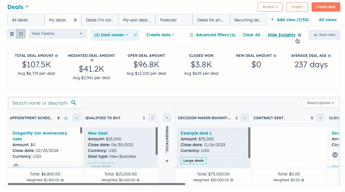
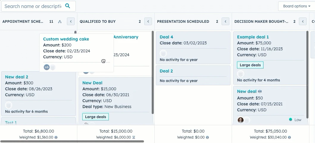
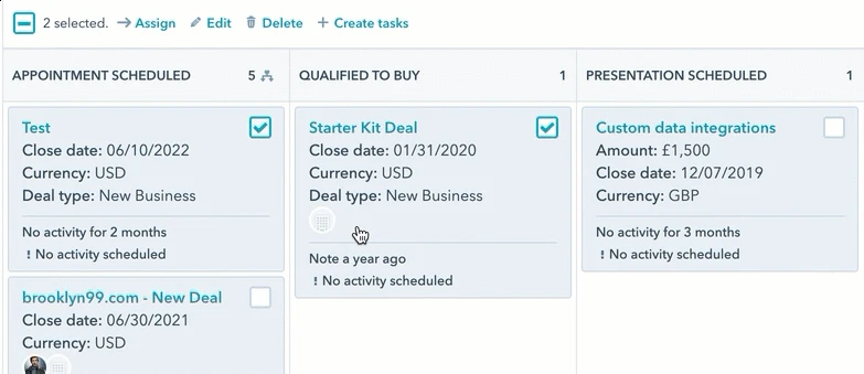
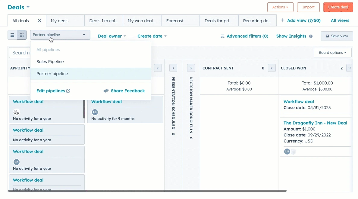
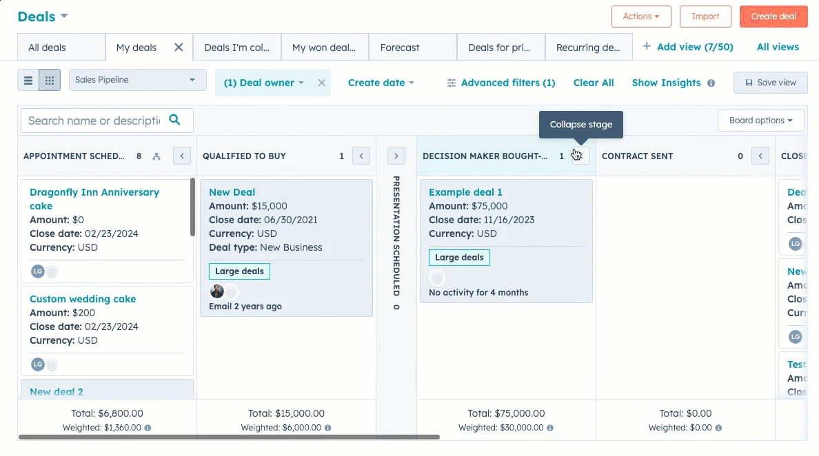
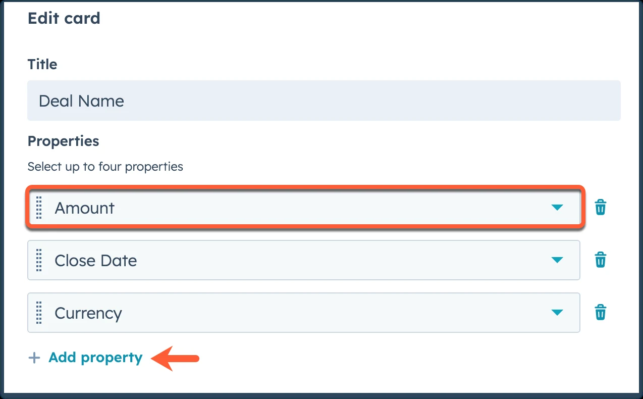
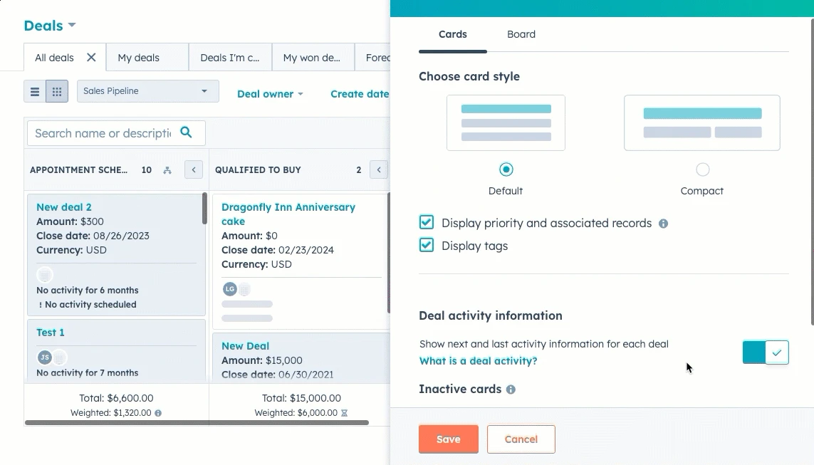
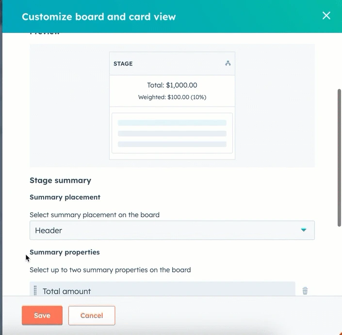
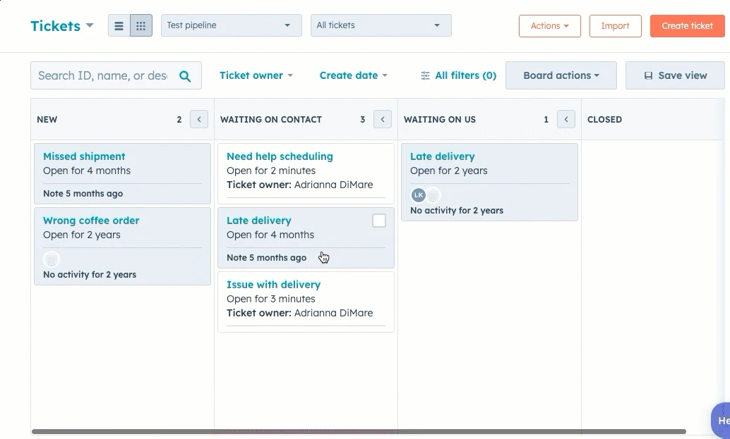
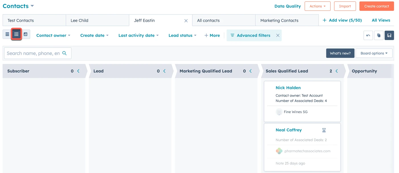
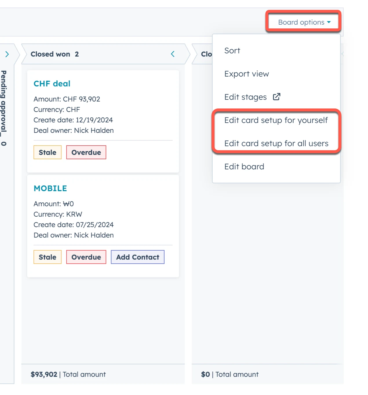
From HubSpot's Knowledge Base: "Manage records in board view" (2023, 2024), "Select properties to show on records in board view" (2022, 2024), "Customize the redesigned board view" (2025). The recordings and pictures are HubSpot's.
Loading & avatars
A thin ring that spins (2s per turn) while its arc grows and shrinks. When the job finishes the ring shrinks away and a tick pops in.
Avatar sizes are HubSpot's (24, 32, 48, 72, 110px). In the product they show a photo or a company logo.
Try it: mini CRM
Everything on one working screen: menus, search, tabs, select rows, bulk delete with a confirm, create in a side panel, and toasts. Keyboard works too (press Tab to see HubSpot's teal focus glow, which mouse users never see).
Contacts
States & motion HubSpot's own CSS
Every control in every state, side by side. "Keyboard focus" is the teal glow HubSpot shows only after you press Tab.
Motion
HubSpot's rule (Canvas, "Motion"): start with 200ms, ease in and out, and "when in doubt, make it faster". Press Play to replay each one.
Dark mode our dark, HubSpot colours
Classic HubSpot never shipped a dark mode. HubSpot's only dark theme belongs to its new black & white UI, which turns the orange buttons white and the links grey. So we built a classic dark mode that keeps HubSpot's identity: every colour is a real HubSpot colour, arranged the way HubSpot's own dark theme arranges surfaces (the higher a surface sits, the lighter it is). Use the switch at the top right to see this whole page in dark.
How it works
The same real screens, light and dark
Light to dark, colour by colour
Rules we followed (use them for AltLeads too)
Page #253342, then cards #2d3e50, then menus and panels #33475b. Shadows barely show on dark, so lift with colour.
The darkest colour is navy #22303e and text is Koala #eaf0f6. Pure white on pure black glares and tires the eyes.
Orange, red and green keep their hue. Text and links switch to HubSpot's lighter tints (links #7fd1de, errors #f8a9ad) to stay readable.
Pale light-mode backgrounds become see-through colour (18% teal, 16% red) so they sit well on any dark surface.
Body text 9.5:1, help text 6.0:1, links 6.3:1 on cards. The live table in "HubSpot's own UX rules" checks both modes.
Dark mode changes colour only. Spacing, sizes and motion stay identical, so nothing jumps when people switch.
Do & don't
From HubSpot's own Canvas guide and its real CSS. The small grey label after each rule names the Law of UX it comes from. Click it to jump to that law below. A red bullet marks a place where classic HubSpot itself falls short.
Do
- Use one orange button per page, only for the most important action. HubSpot's Canvas guide says exactly this. Von RestorffHick's law
- Use Obsidian #33475b for all text and teal (#0091ae) only for things people can click. Similarity
- Put an icon next to a word, never alone. HubSpot: "Icons should be used with text… If you need a tooltip to explain the icon, you need a text label." Cognitive loadJakob's law
- Create things in a panel that slides in from the right, so the list behind stays in view. Working memoryFlow
- React fast: hover colours change in 0.15s, menus open in 0.2s. Canvas: "Start with 200ms". Doherty threshold
- Label above the field, 40px tall fields, an orange star for required ones, and a red message under a wrong value. ProximityPostel's law
- Put the main button first in a footer (Create, then Create and add another, then Cancel). Serial position
Don't
- Don't add a second orange button. If two things shout, neither is heard. Von Restorff
- Don't use 12px grey microcopy for anything important. Canvas: microcopy is "only for supporting text". Selective attention
- Don't use "junk drawer" icons (hamburger, •••, gear menus). Canvas (2020) also said "no icons in navigation"; HubSpot's newer left navigation breaks that rule, as the nav section shows. Cognitive load
- Don't put small white text on the orange button colour. White on #ff7a59 is only 2.6:1, below the 4.5:1 reading rule. HubSpot's own primary button fails here. WCAG contrast
- Don't colour the text inside pale tags. HubSpot's yellow "warning" tag text (#f5c26b on #fef8f0) is about 1.6:1 and hard to read. Use dark text on the tint. WCAG contrast
- Don't use HubSpot's teal for small link text on white without checking. #0091ae on white is 3.7:1, below 4.5:1. Its own hover colour #007a8c passes (5.0:1). WCAG contrast
- Don't stack boxes inside boxes. Classic record pages put tiles inside cards inside columns, which feels heavy. Occam's razorCommon region
For AltLeads
HubSpot's own UX rules, in plain words
HubSpot wrote these in its Canvas design guide (archived copy, 2020). They still drive the classic product.
"There should only be one orange button on a page to help a user identify the most important action."
Calypso "should always indicate that something is clickable". Never use teal for plain text.
"All text should be [Obsidian] unless it is a link or microcopy."
Additive (used with text), specific, functional. "The first rule of icons is: push yourself not to use icons."
"Start with 200ms duration for most transitions." "When in doubt, make it faster." Motion should explain, not decorate.
"Maintaining a cohesive experience is more important than arbitrary consistency." Break a rule if it makes the whole feel better.
Live contrast check
Calculated in your browser from HubSpot's real colours. 4.5:1 is the minimum for normal text, 3:1 for large text and icons.
Laws of UX scorecard
All 29 laws from lawsofux.com, each checked against classic HubSpot: what the law means, what HubSpot really does, and what AltLeads should take from it. Click a coloured bar to jump to a law, or filter by result.
Copy & use
Add three stylesheets, put hs-root on the body, and use HubSpot's own class names.
<link rel="stylesheet" href="hubspot/hubspot-tokens.css">  <!-- 1,084 classic theme values + named colours + fonts -->
<link rel="stylesheet" href="hubspot/hubspot-ui.css">      <!-- HubSpot's own component CSS (.private-…) -->
<link rel="stylesheet" href="hubspot/hubspot.css">         <!-- page layer: base text, glyphs, motion helpers -->
<body class="hs-root">

<button class="uiButton private-button private-button--primary private-button--default private-button--non-responsive">Create contact</button>
<span class="private-tag private-tag--success">Customer</span>
<span class="private-icon private-icon__low">search</span>   <!-- icon = its name in the spacesword font -->
