

monday.com, exactly
monday.com looks like a cheerful shared spreadsheet: big coloured status cells, round friendly titles, plenty of white space and one strong blue for the main button. This page is a study copy of monday's own design system, called Vibe, built from monday's real files and checked against monday's real screens.
#0073EA "primary"#323338, grey #676879Product screens
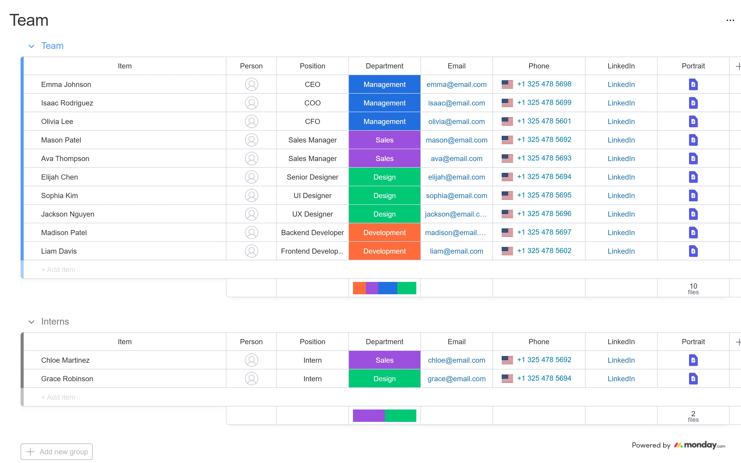
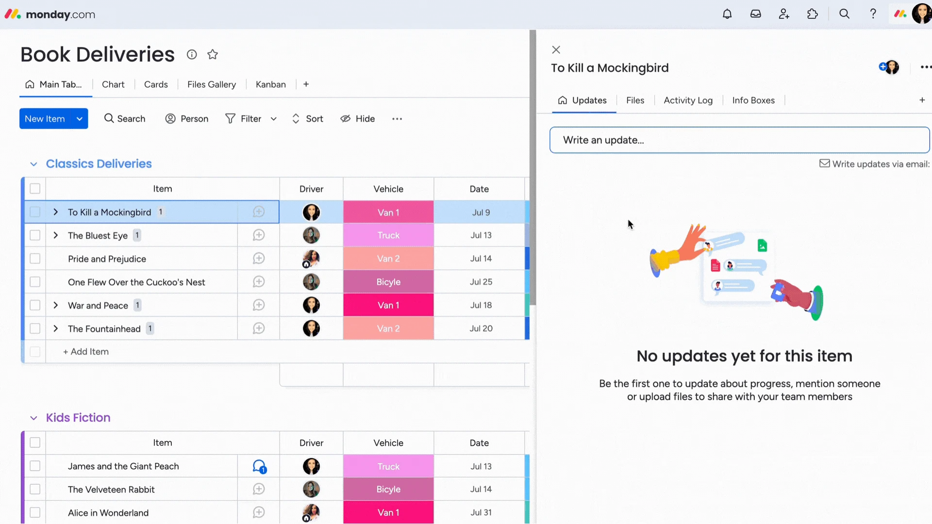
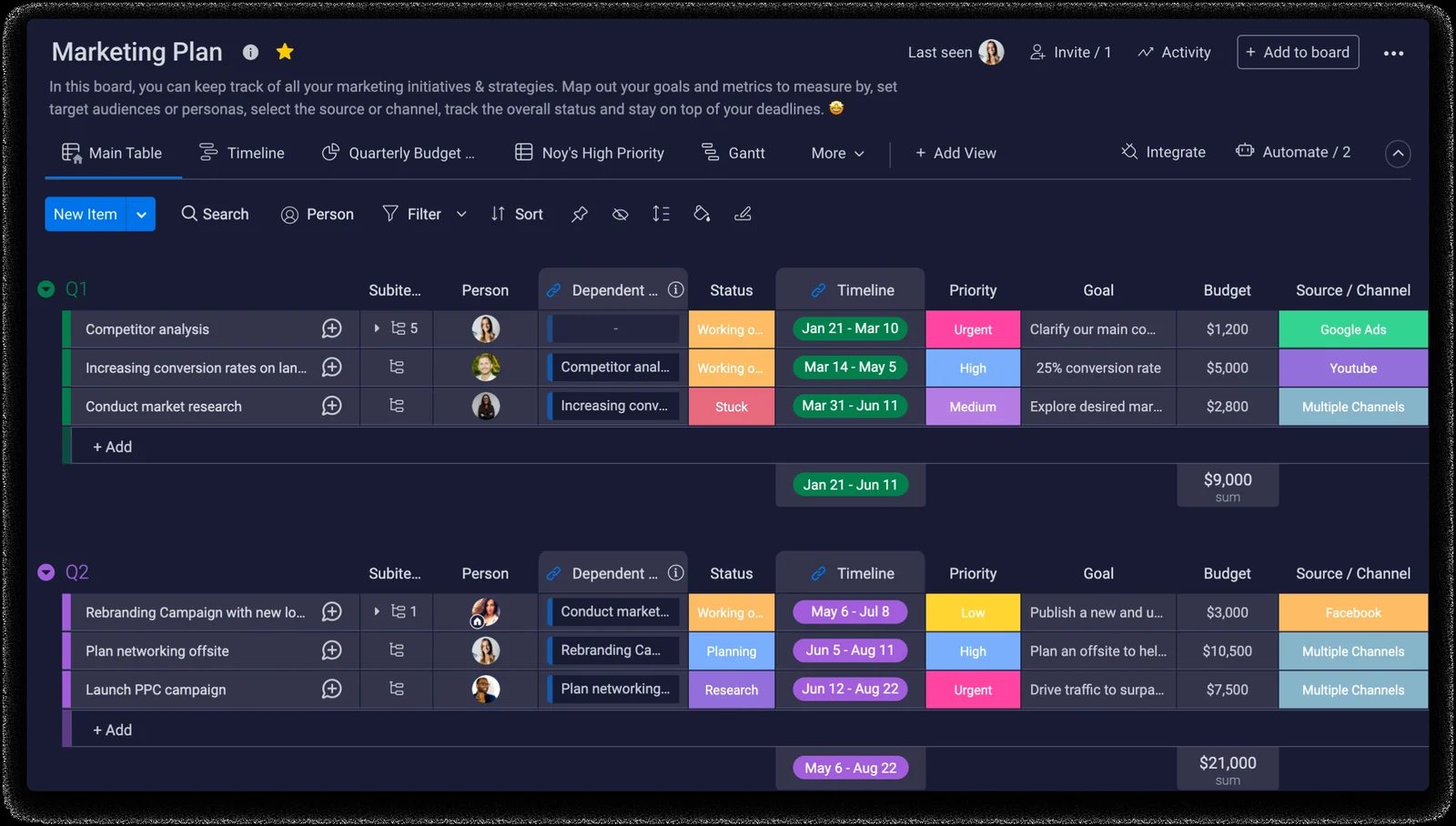
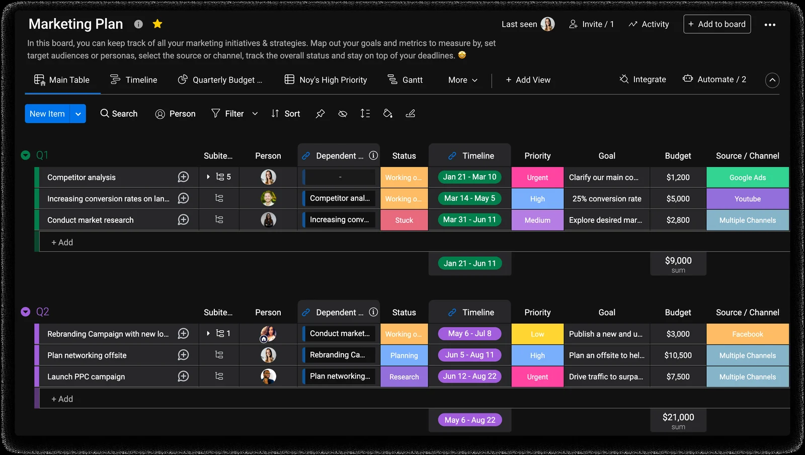
Left: monday's own screen. Right: our copy, built only from this design system. The copies work: open one full size to point at rows, click a status, open the ⋯ menu, fold a group, or open an item's card. Each copy has a slider to compare it with the original.
1 · A board (monday's public board, captured 12 Oct 2026)
2 · The app with an item card open (monday's help-centre recording)
3 · The Marketing Plan board in dark and night (monday's help centre)
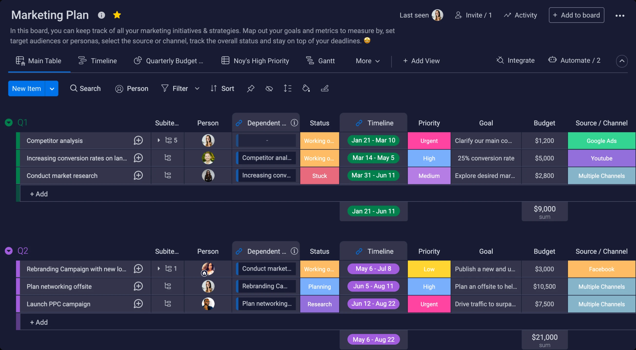
#FDBC64, Stuck #E8697D, Urgent #FF44A1) measured. The light version of this screen is ours (no picture exists).4 · Home page with the account menu and the "Change theme" menu open
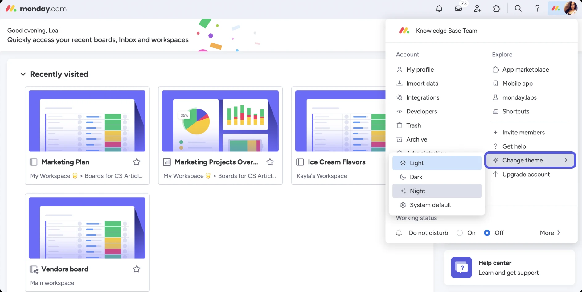
monday's own pictures of the full app
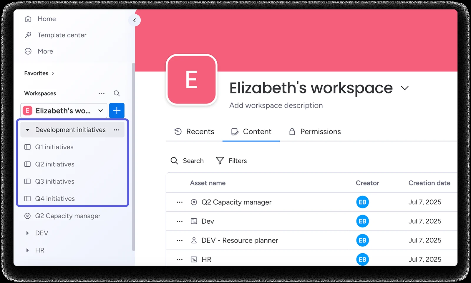
More real monday screens we found (not rebuilt yet)
monday's own pictures from its help centre (public web archive copies, 2024 to 2026). They show screens a public board cannot: filters, search, dashboards, forms, automations, inbox, profile and admin. Click one to see it full size.
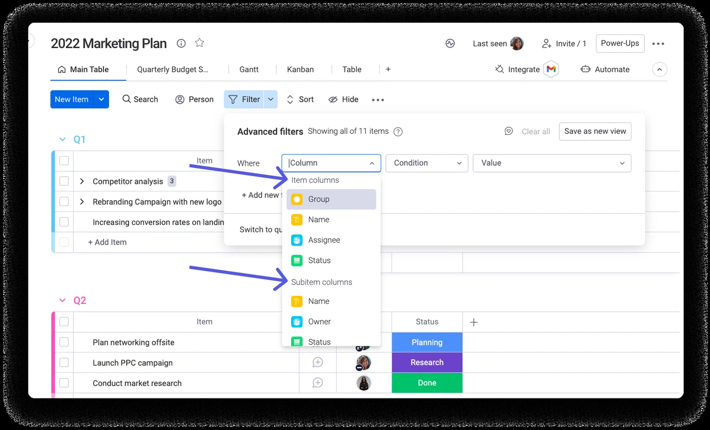 Advanced filters: "Where Status is Done", And / Or groups
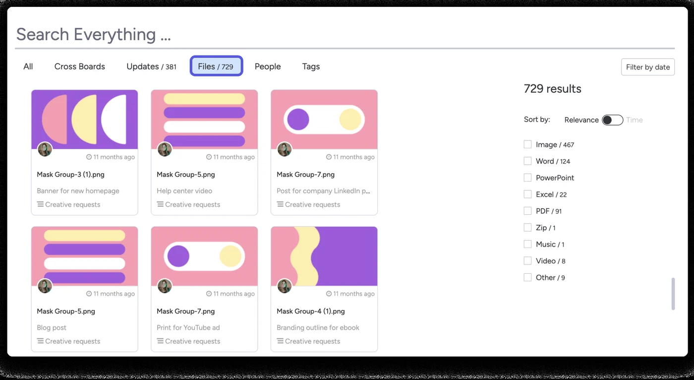 Search Everything: results across boards, files and updates
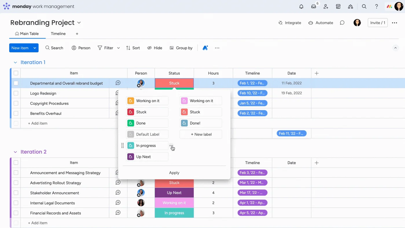 Status column: the label picker open over the board
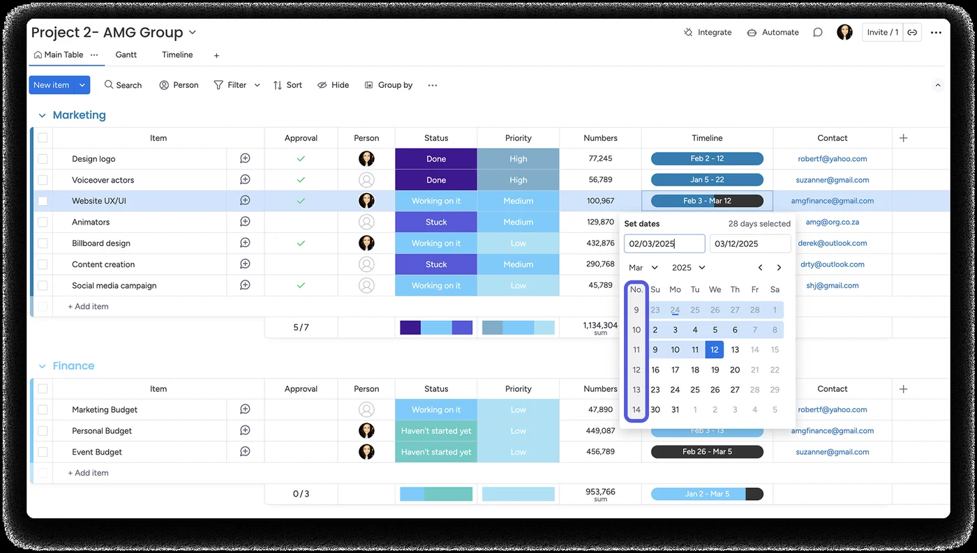 Timeline column: picking a date range, many rows selected
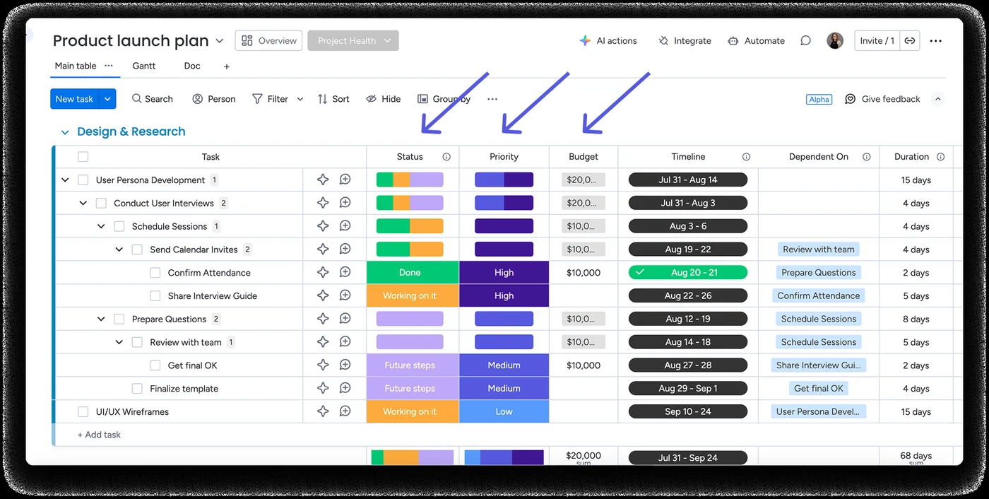 Subitems in several levels, with a Gantt-style timeline
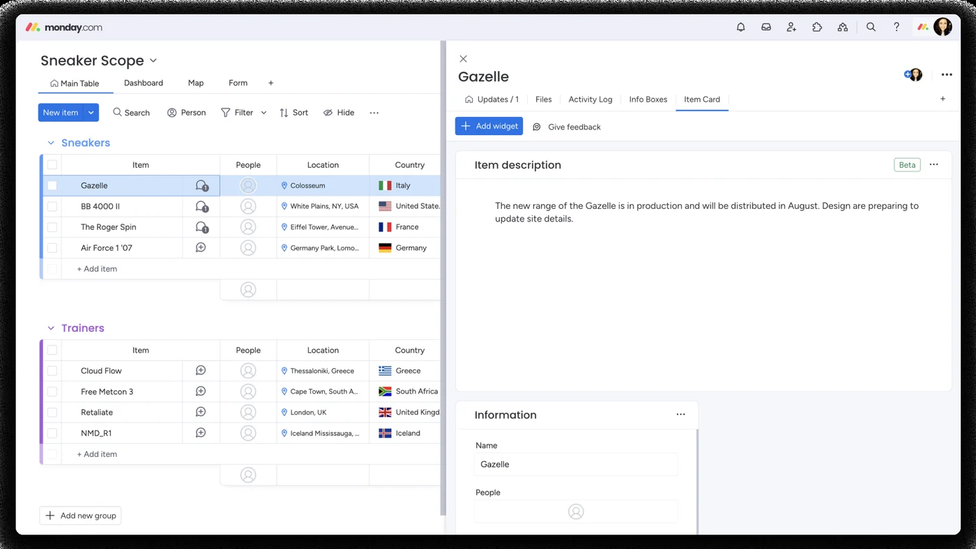 Item description: the item page with an empty-state description
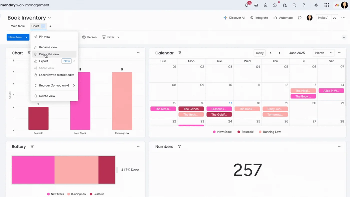 Board views menu: Chart, Calendar, Battery and Numbers on one dashboard
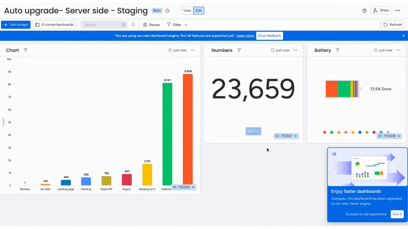 Dashboard: widgets for a whole workspace
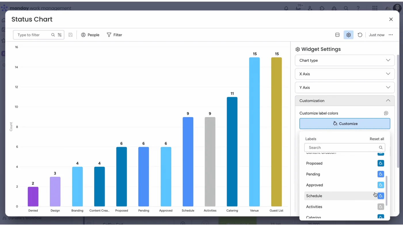 Chart widget with its settings panel
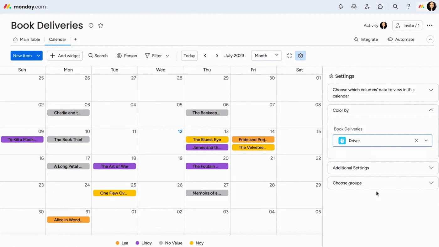 Calendar view with its settings panel
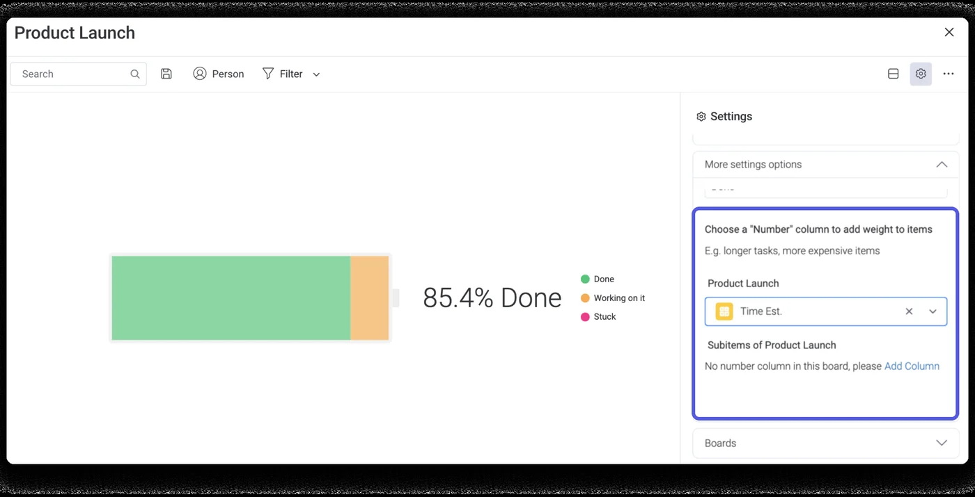 Battery widget: how far along a project is
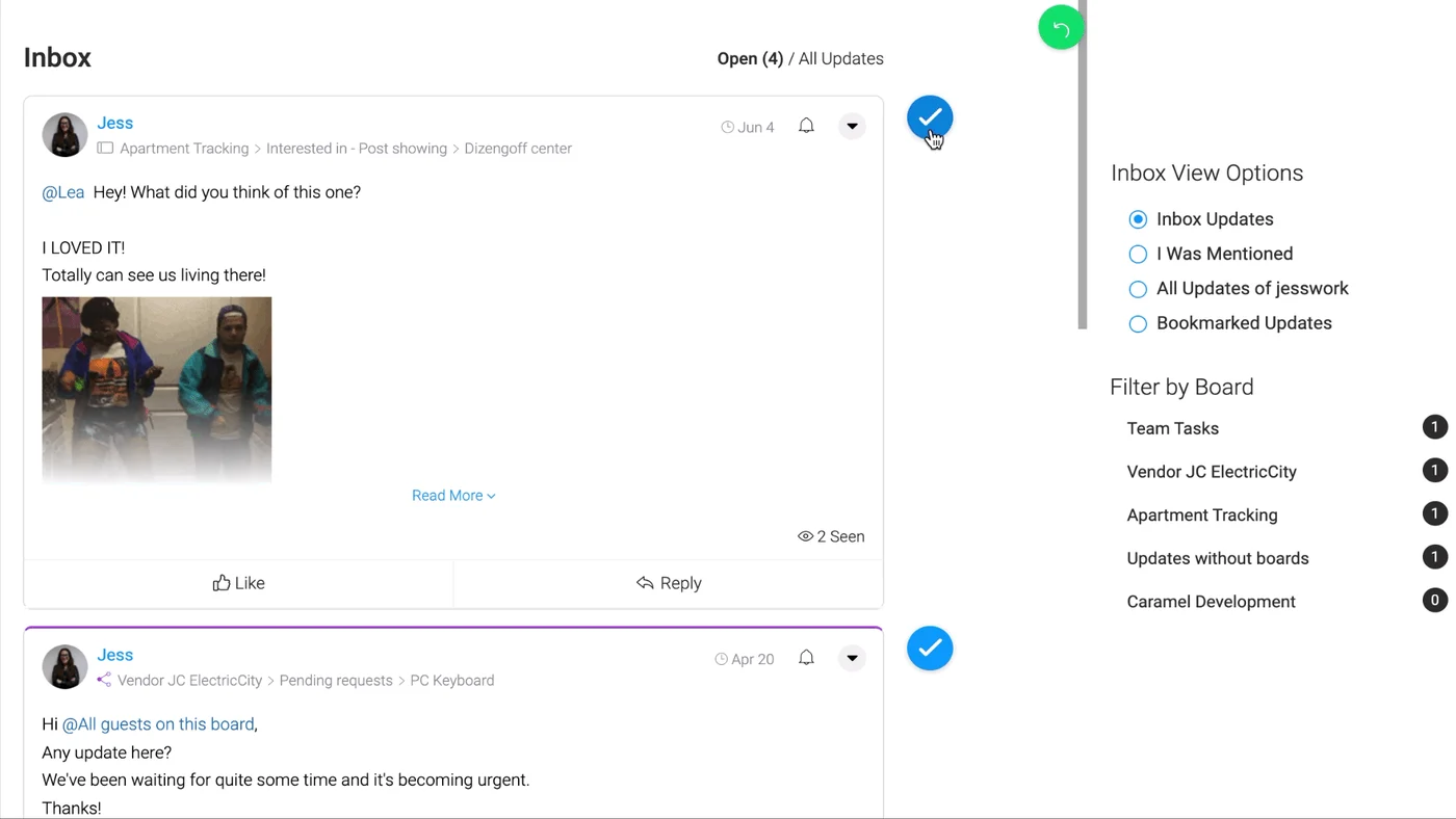 Inbox: updates from every board in one feed
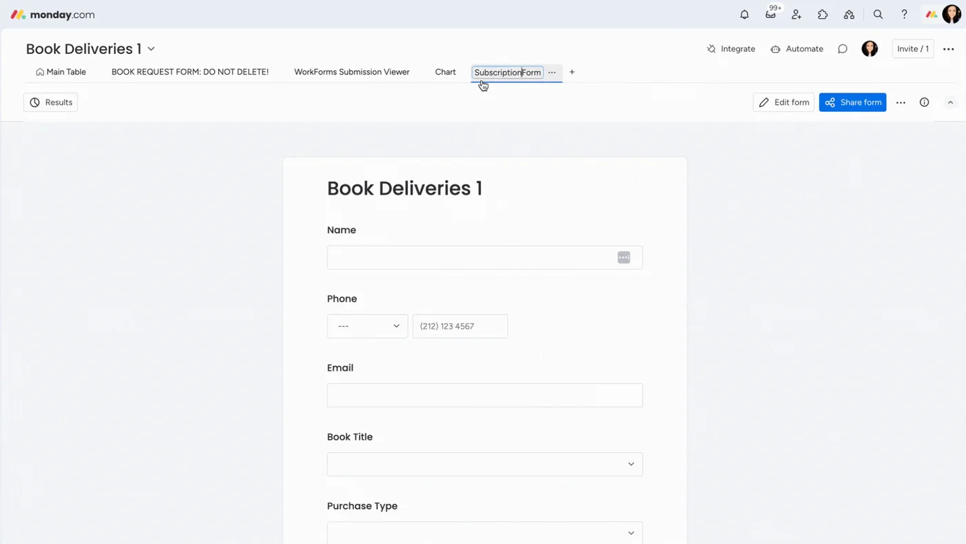 WorkForms: a form built from a board
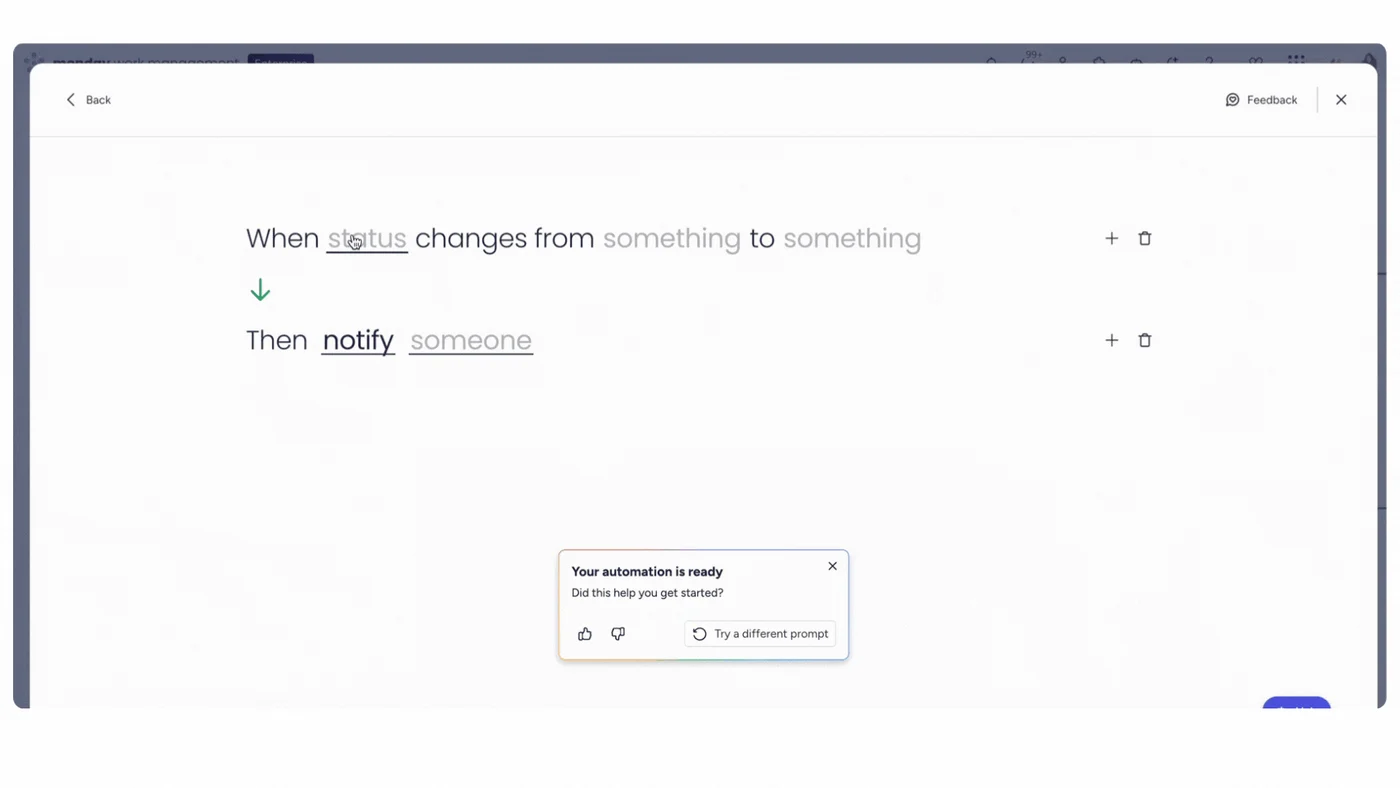 Automation builder: "When status changes, then notify someone"
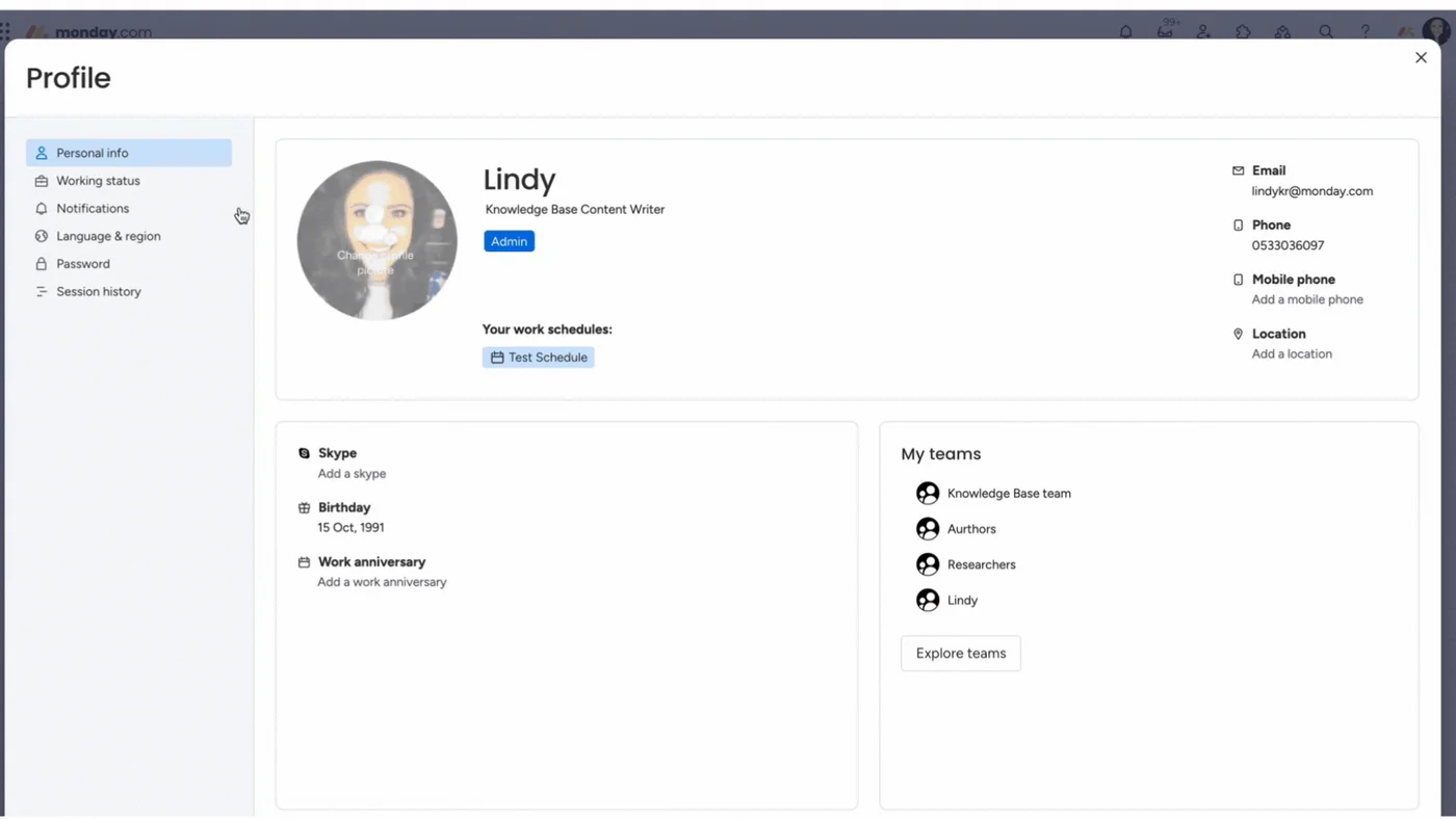 Your profile page
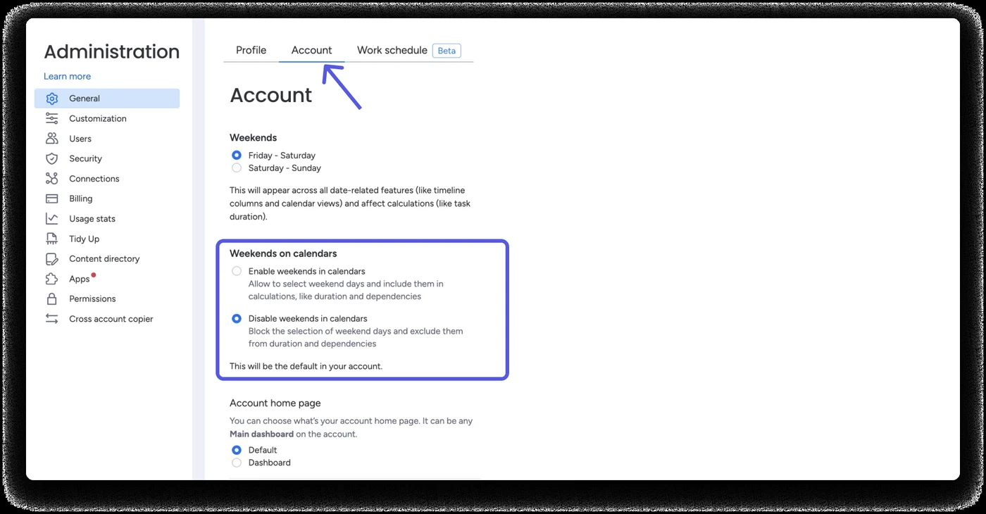 Administration: account settings
Colours monday's own code
monday names colours by their job ("primary", "text", "border"), so one name works in all three themes. Every value below is read live from monday-tokens.css, so it is exact.
Status and label colours
These fill status cells, group strips and labels. monday puts white text on all of them, even the pale ones; the contrast check below shows where that fails. Click a colour to copy its name.
Contrast check (light / dark / black)
4.5 : 1 is the minimum for normal text, 3 : 1 for large text and icons. Worked out live from the tokens. Disabled text is allowed to be faint (it is not meant to be read as an action).
Typography monday's own code
Two free fonts: Poppins (round and friendly) for titles and Figtree for everything you read. Sizes come in a short scale. One honest surprise: monday's public board does not download either font, so there the text falls back to Roboto measured.
Icons monday's own code
All 277 icons from monday's open-source set (@vibe/icons). Thin line icons on a 20 px grid that take the text colour. Search, then click one to copy its name.
Shape & space monday's own code
Small corners (4 px) on buttons and inputs, 8 px on cards and menus, 16 px on big dialogs. Space grows in steps of 4. Board rows are 36 px; buttons are 24 / 32 / 40 / 48 px tall.
Space
Shadows monday's own code
Four soft shadows. In dark themes they turn navy or black, and popovers also get a thin outline so they still stand out.
Components monday's own code
Every part below uses monday's own component CSS (Vibe), unchanged. Point at things, click them, use Tab: hover, pressed, focus and disabled are all real.
Buttons
0 0 0 3px hsla(209,100%,50%,.5) · hover primary goes to #0060B9. Classes: .v-Button-button .v-Button-sizeMedium .v-Button-kindPrimary .v-Button-colorPrimaryInputs & choices
--ui-border-color, the line turns dark on hover and blue when typing · checkbox 16 px, 2 px corners, grows in 70 ms when ticked · toggle 41 × 24 px, the knob slides in 100 ms.Status cells & labels
Board table
#D0D4E4 · Item column 400 px, name 40 px in · "+ Add item" row with a half-strength strip · summary under the group: a colour "battery" for status columns and counts for files · hover row turns #F4F5F8 · selected #CCE5FF with a grey line round the name measuredMenus & tooltips
Tabs & avatars

Toasts & dialogs
App frame & item card
#ECEFF8 · board title Poppins 32 · view tabs with thin dividers · toolbar blue "New Item" split button then plain buttons · item card slides in from the right over the board (about 150 ms), title Poppins 16, tabs, a "Write an update…" box and a friendly empty state measuredTry it: a mini board
A small working board made with this design system. Click a status to change it, add an item, rename one by double-clicking, fold a group. The colour battery under each group updates as you go.
States & motion measured
Every state below was seen on monday's own board, in all three themes, and then copied. The pictures are monday's.
| State | What you see | Values (light · dark · black) | monday's own picture |
|---|---|---|---|
| Row under the mouse | Row turns light grey; › and the expand button appear over the name; ⋯ appears left of the row | #F4F5F8 · #33354B · #272729; status cells at 70% |  |
| Row selected | Row turns light blue, a grey line around the name, the full name shows in a dark tooltip | #CCE5FF · #133774 · #133774 |  |
| Status clicked (read-only) | "You can only view this board" in a dark tooltip | tooltip #323338 · white · #EEEEEE | 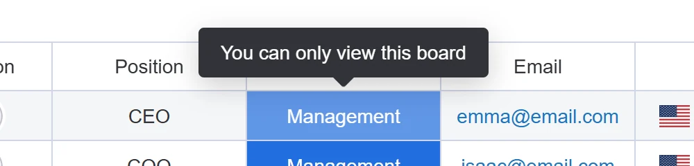 |
| ⋯ menu open | Button turns light blue; a white menu card drops below | button #CCE5FF · #133774; card white · #30324E · #2C2C2C | 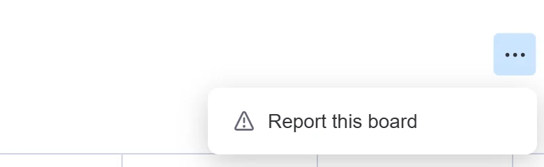 |
| Keyboard focus | A soft blue ring outside, a thin darker line inside | 0 0 0 3px hsla(209,100%,50%,.5) + inset 0 0 0 1px #0060B9 | from monday's code |
| Disabled | Everything at 38% strength | --disabled-component-opacity: .38 | from monday's code |
Movement
Click a card to feel the timing. Short ones are for hovers and small changes; long ones for things that enter the screen.
Dark mode monday's own code
monday has three real themes: Light, Dark (deep navy) and Black (near-black). All three are in monday's own code, and we captured the same board in all three. Use the switch at the top: this whole page, both copies and every component change with it.
#FFFFFF, cells white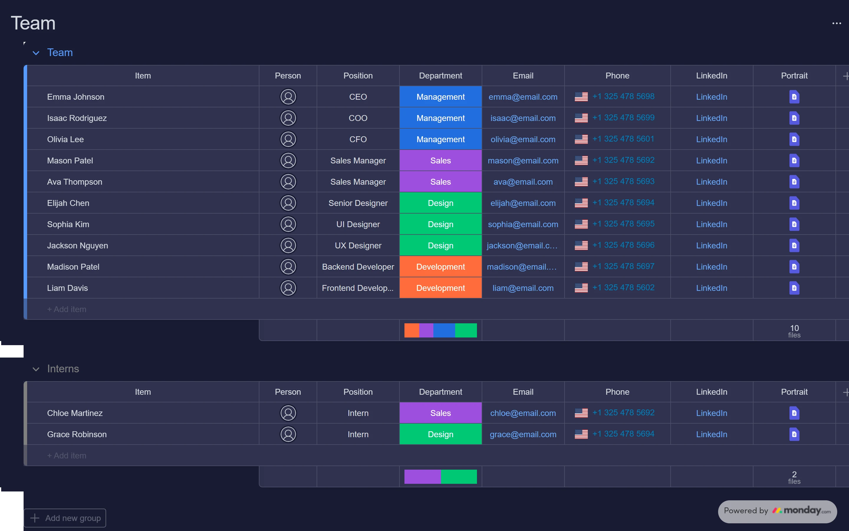
#181B34, cells #30324E, text #D5D8DF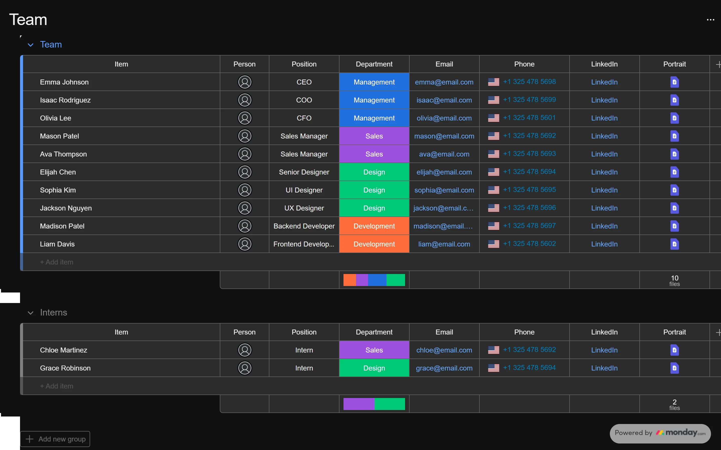
#111111, cells #2C2C2C, text #EEEEEEStatus colours stay the same
The cell colours do not change between themes; only the frame around them does. A status means the same thing everywhere.
Cells sit one step lighter
In dark, rows are a lighter navy than the page (#30324E on #181B34), so the table still reads as a table.
What is ours
The white wordmark in dark (monday's dark logo file was not public) and the item-card screen in dark (monday published it in light only). Everything else is monday's.
Do & don't
How monday keeps a busy board readable. Each rule names the Law of UX behind it; click the label to read it.
Do
- Make the whole status cell the button, edge to edge. Fitts's Law
- Give each status one colour and keep it everywhere. Similarity
- Group rows, give each group a colour strip and a summary underneath. ChunkingCommon Region
- Show progress as a small colour bar (the battery). Goal-Gradient
- Keep the name column fixed while the rest scrolls sideways. Working Memory
- Use one blue for the main action only ("New Item"). Von Restorff
Don't
- Don't put white words on pale colours (peach, bubble, yellow); they fail contrast. Aesthetic-Usability
- Don't colour every column; when everything is bright, nothing stands out. Selective Attention
- Don't show every column by default; 5 to 7 is enough. Miller's Law
- Don't make people leave the list to do a quick change. Flow
- Don't hide what the board is counting; show the totals. Tesler's Law
- Don't hide the only way to open an item behind a small icon. Hick's Law
UX principles, in plain words
What makes monday feel easy, and what AltLeads can take from it.
It feels like a sheet
One row per thing, one column per fact. People already know how to use it.
For AltLeads: keep the lead list a table; don't turn it into cards.
Colour carries meaning
You read a status from across the room, before reading the word.
For AltLeads: one colour per stage, and dark words on pale colours.
Progress is always visible
The battery under each group shows how far along the team is, without a report.
For AltLeads: a small bar per list: called, connected, meeting booked.
Change things in place
Click a status and pick a new one; no form, no save button.
For AltLeads: log a call outcome right in the lead row.
Details slide in, the list stays
The item card opens on the right, over the board, so you never lose your place.
For AltLeads: the same slide-in panel for a lead's notes and calls.
Three real themes
Light, dark navy and black are designed, not just inverted.
For AltLeads: design dark mode properly, with cells one step lighter than the page.
Laws of UX scorecard
All 29 laws from lawsofux.com, each checked against what we really saw on monday. "Not seen" means we could not see it without logging in, so we did not guess.
Copy & use
To build something that looks like monday, link these files and use the class names. Put dark-app-theme or black-app-theme on the page to switch theme.
<link rel="stylesheet" href="monday/monday-tokens.css">   <!-- colours, sizes, letters, movement: 3 themes -->
<link rel="stylesheet" href="monday/monday-vibe.css">     <!-- buttons, inputs, menus, tabs, toasts ... (Vibe, unchanged) -->
<link rel="stylesheet" href="monday/monday.css">          <!-- the board: groups, rows, status cells, summaries -->
<link rel="stylesheet" href="monday/monday-app.css">      <!-- the app frame and the item card -->
<script src="monday/monday-icons.js"></script>          <!-- mIcon('Search', 20) gives an icon -->

<html class="dark-app-theme">   <!-- or black-app-theme; nothing = light -->
<button class="v-Button-button v-Button-sizeMedium v-Button-kindPrimary v-Button-colorPrimary">New Item</button>
<span class="mb-status" style="--s: var(--color-done-green)">Done</span>
Where it came from
Only real sources. No login, no bot-check bypass. Where we could not see something, the page says so.
- monday's own design system, Vibe (open source, MIT): @vibe/style 4.1.0 (all colours, sizes, letters, movement, shadows; light, dark, black), @vibe/core 4.5.35 (component CSS), @vibe/icons 4.2.0 (277 icons). Copied 1:1.
- monday's public board view.monday.com/embed/6276056051… ("Team"), opened read-only in Chrome on 9 and 12 Oct 2026 at 1440 × 900: computed styles, every state, and all three themes. measured
- monday's help centre (support.monday.com) shows a bot check, so we did not open it. We used the public web archive's copies instead: "The Item Card" (19 Feb 2025, screen recording), "display themes: light, dark and night" (2024), "Getting started with workspaces" (Sep 2025). monday's own picture
- Fonts: Figtree and Poppins (SIL Open Font License), Roboto (Apache 2.0), from Fontsource. monday's marketing font (Sofia Pro) is not free, so it is not used.
- Ours: the white logo for dark; the dark and black versions of the item-card screen (from monday's tokens, no picture exists); the "Bicyle" colour on the item-card board is a custom colour, measured. ours
- Limits: the full logged-in app could only be seen through monday's own help pictures, not live. The recording is compressed (256 colours), which lowers its score.