overview
Slack's design system, new (2023 on) and classic (2019 to 2023), light and dark · study copy for the AltLeads team
Slack design system
Slack's colours, type, 722 real icons and components, in the new design (2023 on) and the classic one (2019 to 2023), light and dark. Every value comes from Slack's own public files (its "Slack Kit" stylesheet and icon font) or was measured on Slack's own pictures. Nothing was read behind a login.
Slack at a glance
A friendly chat app. One font (Slack-Lato), 15px text, black-weight names, an aubergine window around a white message pane, and one green for "send". Messages sit in a calm list; colour is saved for mentions, reactions and unread badges. Small things move fast (80ms) along one curve.
What you notice first
Product screens
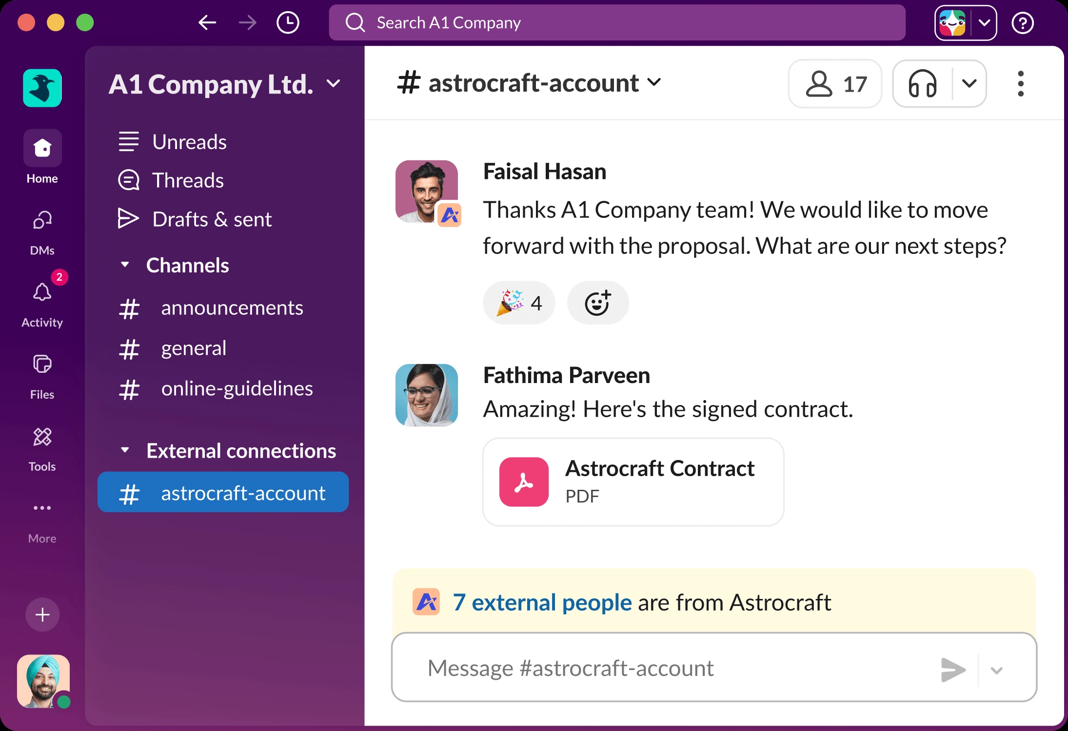
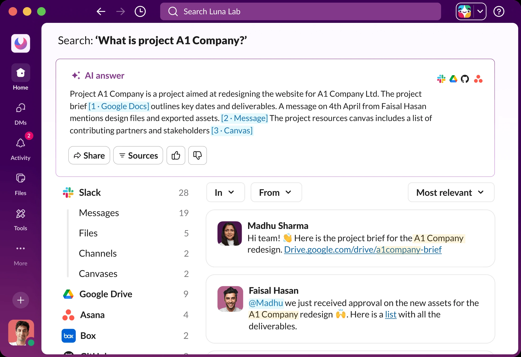
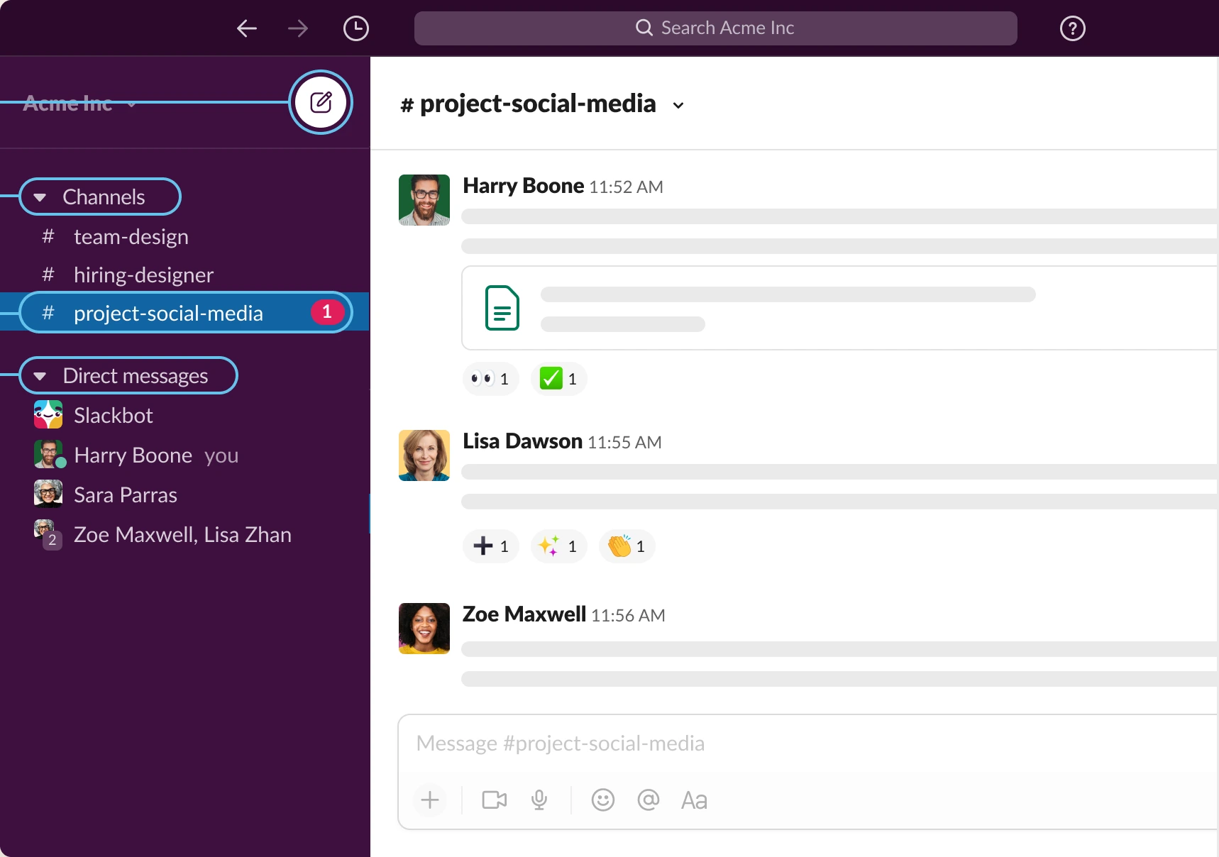
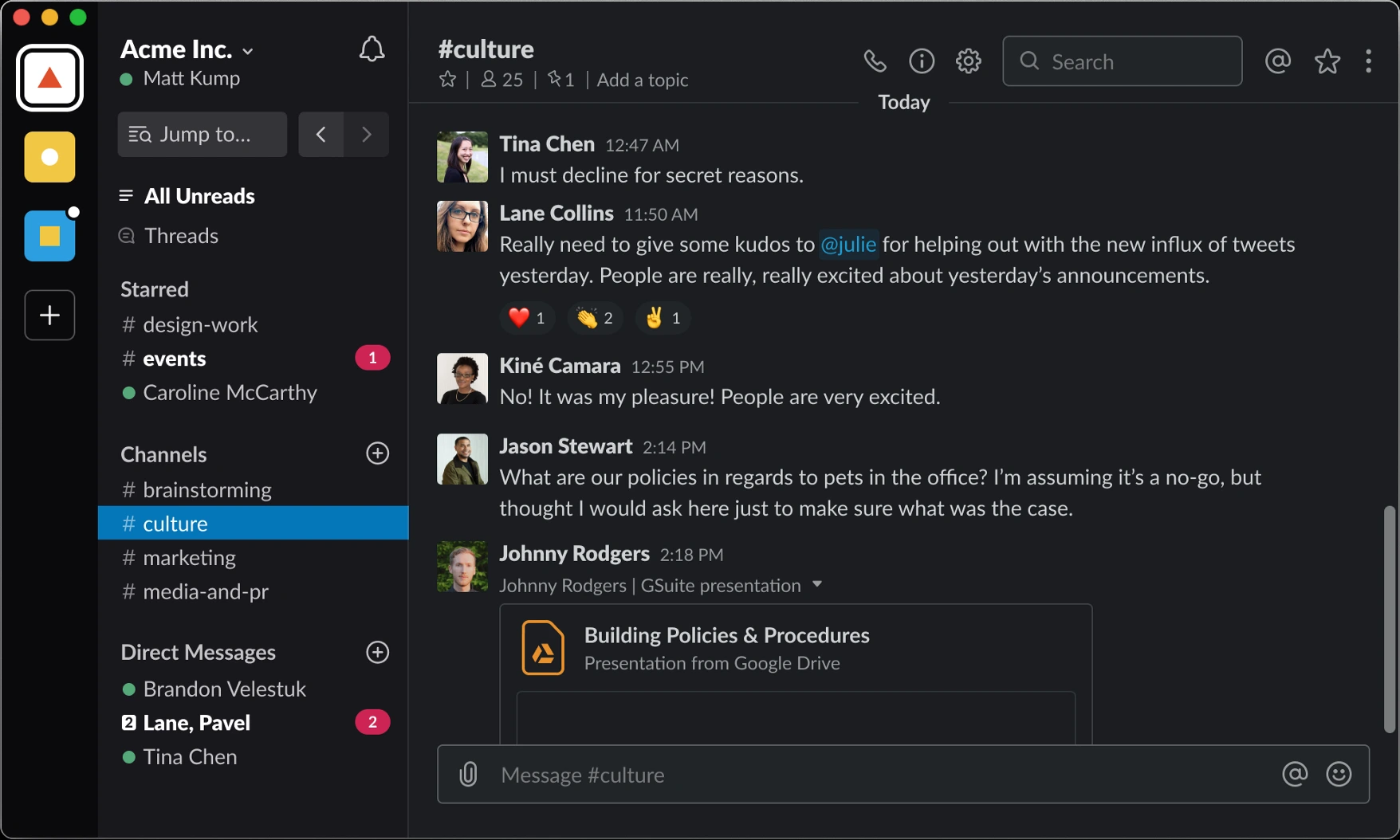
Left: Slack's own picture. Right: our copy, built only from this design system. The copies work. Open one full size to hover messages, react, type and post, switch channels and use the filters. The bar at the bottom of a copy switches dark mode and wipes against the original with a blue line.
New design · channel
New design · search with an AI answer
Classic design (2020 to 2023) · Aubergine theme
Classic design (2019) · real dark mode
Colours real
Slack names colours by job: base = surfaces, content = text and icons, otl = lines (outlines), pry / sec / ter = first, second, third strength, hgl = highlight (1 blue, 2 green, 3 yellow), imp = important (red), inv = for dark-on-light flips. The values below are read live from the token file, so they are always the real ones.
Core roles · light and dark
Light = Slack's own values. Dark (new design) = ours: Slack's real dark values load only inside the signed-in app, so our dark swaps each role for Slack's own "inverse" token. The classic dark further down is real.
The window and sidebar (new design) shot
Not in the public stylesheet; measured on Slack's pictures. The window is a gradient from deep aubergine (#3d0157) to plum (#77236a). The selected channel in the A1 Company picture is blue (#1f70c1).
Full palette real
20 colour families in 12 strengths (0 = palest, 100 = darkest). Aubergine is Slack's own purple; the others carry Slack's playful names (Cilantro, Horchata, Honeycomb…).
Typography real
One font everywhere: Slack-Lato, Slack's own build of Lato 2 (regular, bold, black, light, and italics). Text is 15px with a line height of 1.46668 (22px). Names and titles use the black weight (900), which gives Slack its friendly, chunky look.
Thanks A1 Company team! We would like to move forward with the proposal.
Slack's size steps: 12, 13, 15, 18, 22, 28. Weights: 400, 600 (semibold, rare), 700, 900. Line heights: 1, 1.25, 1.5 and the 1.46668 used for messages.
Icons real
722 named icons from Slack's own icon font, "Slack v2" (a font where each letter is a picture). Each was turned into a drawing (SVG) with its real name, so none are redrawn. They are filled with the text colour and drawn on a 20px square in menus, 16 to 24px elsewhere. Two newer icons (Tools, Unreads) are not in the public font; they are cut from Slack's own picture.
The ones you see on the channel screen
All icons
Shape & space real
Slack keeps corners friendly but small: 4px on small buttons, 8px on medium buttons, inputs and avatars, 12px on large buttons, dialogs and the message pane. Space comes from one 4px grid.
Space steps
Heights and sizes
Shadows real
Slack's shadows are soft and grey, from sm (a 1px whisper) to 2xl (dialogs). Two more are rings, not shadows: a11y is the blue keyboard-focus ring and error the red one.
Components
Live and clickable, built with slack.css. Hover, click and use the keyboard. Buttons, inputs, menus and tooltips are copied from Slack's own stylesheet; the app frame (messages, sidebar, message box) is measured on Slack's pictures.
--dt_color-base-inv-hgl-2 (#007a5a) with white bold text; hover adds a darker layer and a small shadow, pressing removes the shadow. Outline white with a 1px line, hover grey. Ghost no fill until hover. Danger red --dt_color-base-inv-imp. Sizes 28 / 36 / 44px with 4 / 8 / 12px corners. All change colour in 80ms (--dt_static_transition-duration-short). Focus shows Slack's blue ring --dt_static_shadow-a11y.--dt_color-otl-pry; on focus the line is replaced by the blue a11y ring in 80ms. Menu white, 4px corners, a 1px ring plus a soft shadow; rows 28px with 24px sides; the row under the mouse or keyboard turns blue #1264a3 with white text, the danger row turns red. Arrow keys move, Esc closes. Tooltip near-black, 13px bold, 8px corners, appears after a 0.3s pause.--dt_color-base-sec wash and a toolbar of 32px buttons (react, reply in thread, forward, save, more). Mention blue text on a pale blue fill. Reaction real 24px pill, 4% grey; yours turns blue (#0576b9 at 5%, a 30% blue line, bold count). Day divider a bold pill on a thin line.#1f70c1, unread channels in white black-weight with a red badge. Classic full-width 27px rows on #3e103f, white text at 80%, hover #350d36, open channel blue #1264a3. Click a row to open it.
 AL
312
@Madhu
AL
312
@Madhu
--dt_color-base-inv-imp, white 12px bold. Presence 10px dot with a 2px ring in the page colour: green = active, hollow = away. Avatar 8px corners (new), 4px (classic).Try it: mini Slack
A small working Slack built only from this design system. Switch channels, post (use *bold*, _italic_, ~strike~ and `code`), react, reply in a thread, edit or delete your own messages (with Undo), search, and flip between the new and the classic look. It follows the page's dark mode.
States & motion
Every clickable thing has the same few looks. Each state is frozen below so you can compare them without hovering. Button, input, menu and tooltip states are Slack's own rules real; the app-frame ones are measured shot.
Focus = Slack's two-step blue ring: a 1px blue line plus a 4px blue glow at 30% (--dt_static_shadow-a11y). Errors use the same shape in red. Disabled = grey fill, grey text, no pointer.
Motion
Slack moves little and fast, all on one curve (cubic-bezier(.36, .19, .29, 1): quick start, soft landing). Colours change in 80ms; panels and popovers take 160 to 240ms. Press Play to watch each one.
Slack's motion tokens real
If someone turns on "reduce motion" on their computer, every transition on this page switches off.
Dark mode
Two stories. Classic dark is real: Slack's 2019 dark-mode picture gives the sidebar #19171d, the pane #1a1d21 and text #d1d2d3-ish, all measured. New-design dark is ours: the public stylesheet only says "dark" exists; the values load after login. Ours uses Slack's own inverse tokens, so it stays in Slack's family. Flip this whole page with Dark mode at the top.
What changes in dark mode
Classic Slack (2019 to 2023) shot
Before the 2023 redesign Slack had a dark top bar with search (2020 on), a sidebar painted by a theme (Aubergine by default), full-width rows, square-ish avatars (4px corners), and in 2019 a workspace rail with team icons. Slack no longer publishes those styles, so every value here was measured on Slack's own old pictures (file: slack/slack-classic.css).
Theme colours
Classic Slack let anyone paint the sidebar with 8 colours (column, menu hover, active item, active text, hover item, text, presence, mention badge). The commonly quoted Aubergine string is #3F0E40, #350d36, #1164A3, #FFFFFF, #350D36, #FFFFFF, #2BAC76, #CD2553; we could not find it on an archived Slack page, so treat it as hearsay. The measured picture agrees closely: column #3e103f, active #1264a3, badge #e01e5a.
Do & don't
Checked against Slack's own pictures and files. The small grey label after each rule names the Law of UX behind it; click it to jump there. A red bullet marks a rule where Slack itself falls short.
Do
- Keep one job per colour: green sends, red counts mentions, blue is links and your own reaction, yellow warns. SimilarityVon Restorff
- Make names easy to find: black-weight names, grey times, plain text. The eye jumps from name to name down the list. Selective attentionSerial position
- Show actions where the work is: hover a message to react, reply or save, right next to it. Fitts's lawProximity
- Group the sidebar into sections with headers you can fold (Channels, Direct messages, External connections). ChunkingCommon region
- Mark what is new: bold unread channels and red mention badges, so nothing waits unseen. Zeigarnik
- Let people answer with a click: reactions replace "ok, thanks" messages. Doherty thresholdTesler's law
- Keep the send button quiet until there is something to send. Cognitive load
- Warn about outsiders in shared channels (the yellow "7 external people" bar). Mental model
Don't
- Don't add new colours for decoration; the aubergine frame is the only brand colour on screen. Occam's razor
- Don't make people wait for motion: colour changes take 80ms, popovers about 0.2s. Doherty threshold
- Don't move familiar things without warning. Slack's 2023 redesign moved channels, DMs and activity into a new rail, and many people had to relearn it. Jakob's lawMental model
- Don't hide key actions behind hover only. Slack's message toolbar appears only on hover, so touch and new users miss it (Slack offers long-press on phones). Fitts's law
- Don't flood people. Busy workspaces turn every channel bold with badges everywhere, and the important mention drowns. Cognitive loadChoice overload
- Don't use pale grey for text people must read. Slack's tertiary grey (placeholder) is too faint for real text; keep it for hints. Aesthetic-usability
UX principles, in plain words
The rules behind Slack's feel, for AltLeads too. Each card names the UX law, explains it simply, and shows where Slack follows it. All 29 laws are checked one by one in the scorecard below.
Make the main thing big and calm
The thing people come for gets the most space and the least decoration.
One click to answer
Take the work off people: a quick answer should not need typing.
Show what waits for you
Unfinished things should nag a little until they are done.
Group and fold
Long lists get labelled sections that people can fold away.
Actions next to the thing
Put a button where the eye already is, not in a far menu.
Quiet until ready
A main button that lights up only when it can act tells people what to do next.
Works without a mouse
Every action has a key path and a clear focus ring.
Readable for everyone
Check every text colour on its background; see the live check below.
Live contrast check
Checklist before any screen ships
Laws of UX scorecard
All 29 laws from lawsofux.com, each checked against Slack. Every card says what the law means in plain words, what Slack really does, and what AltLeads should take from it. Click a coloured bar to jump to a law, or filter by result.
We copy the look (UI) to learn the feel (UX). The laws explain why one screen feels easy and another feels heavy.
People believe a polished screen is easier to use. That is why we copy every pixel, state and timing.
Use the laws to explain and check a design, then confirm with real callers using AltLeads.
Copy & use
Add these files to any HTML page, then use the classes. Put sk-dark on <html> (or any parent) for dark mode, and slc-dark for classic dark. The same files are in the Figma kit as variables.
<link rel="stylesheet" href="slack/slack-tokens.css">   <!-- Slack Kit tokens: light (real) + dark (ours) -->
<link rel="stylesheet" href="slack/slack-classic.css">  <!-- classic 2019-2023 values, light + real dark -->
<link rel="stylesheet" href="slack/slack.css">          <!-- components: c-button, c-input_text, c-menu, sk-msg… -->
<body class="sk-root">
<script src="slack/slack-icons.js"></script>            <!-- 722 real icons -->
<script src="slack/slack-kit.js"></script>              <!-- draws <svg data-i="…"> -->

<button class="c-button c-button--primary c-button--medium">Send message</button>
<button class="sk-reaction is-mine"><span class="e">🎉</span>5</button>
<svg class="sk-i" data-i="paperplane-filled"></svg>