Use our design systems in Figma
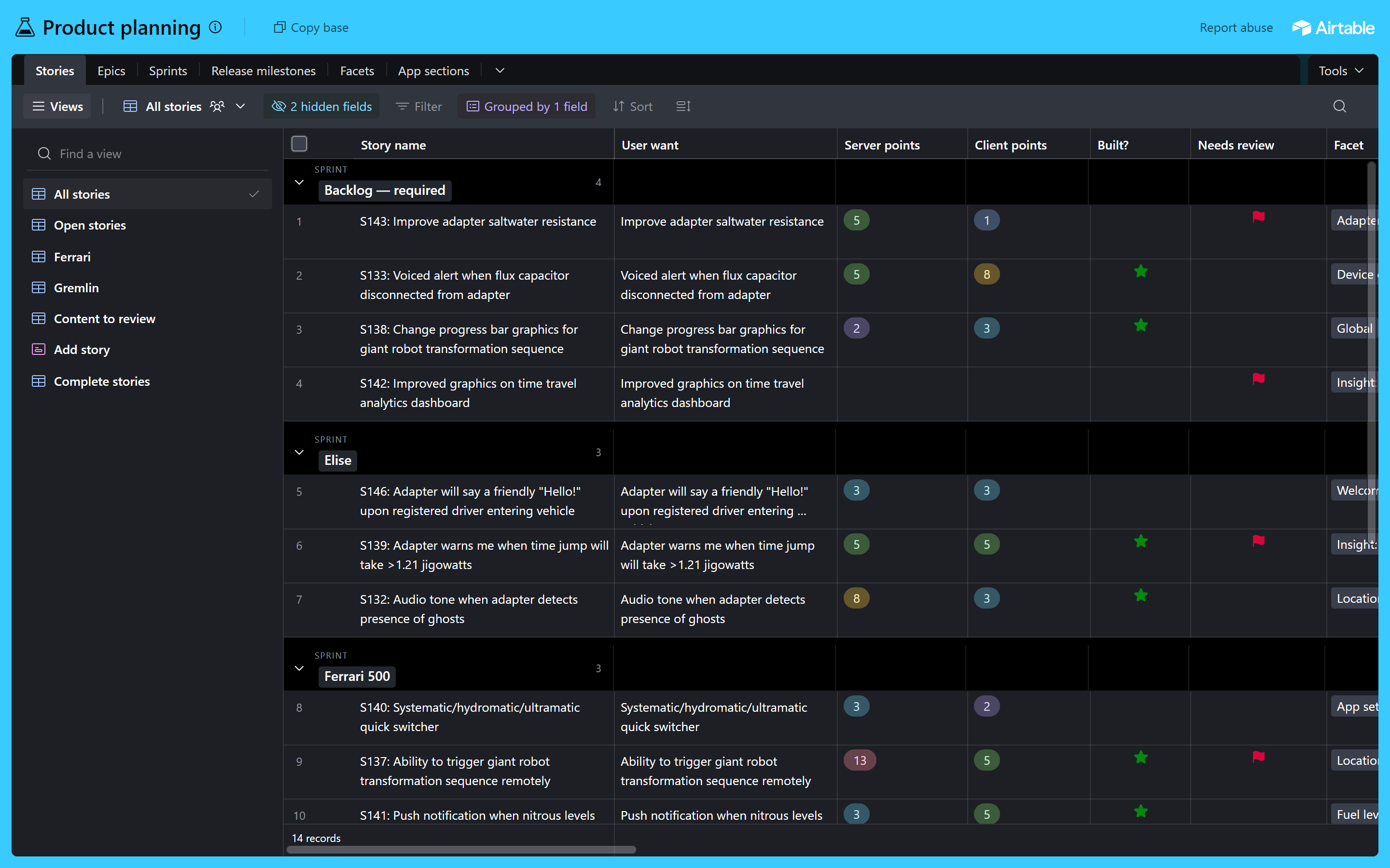
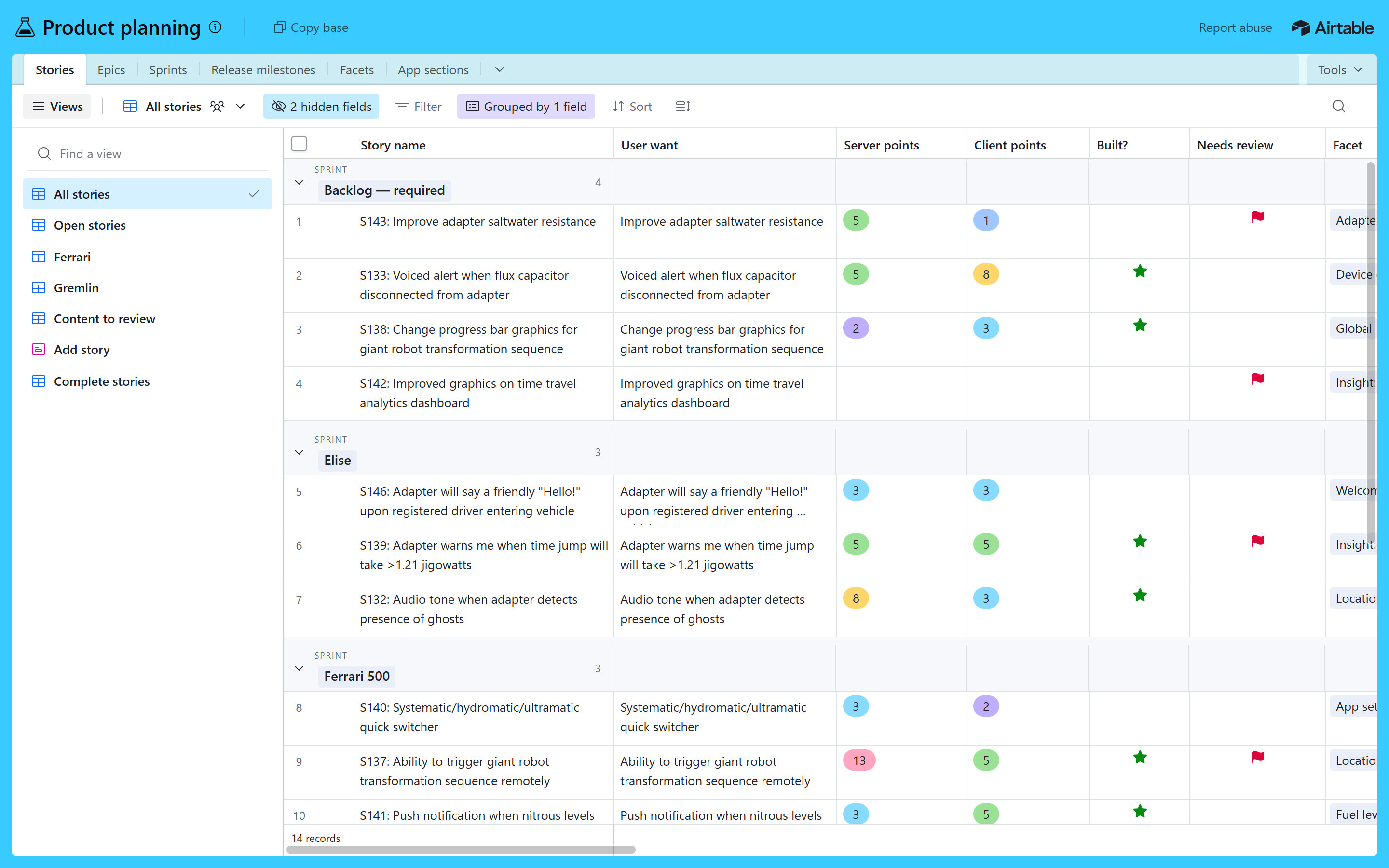
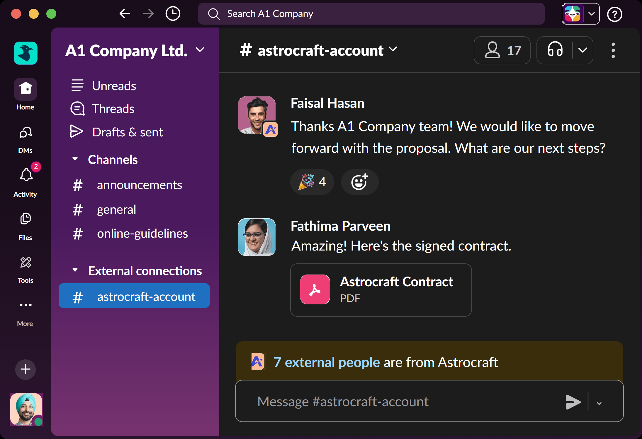
Every design system we built has a Figma kit: its colours and sizes as Figma variables (light and dark), all its icons, its fonts, and pictures of the rebuilt screens. Below are the steps once, then the files for each system.
1Install the fonts
Download the kit's Fonts file and unzip it. Select all the .ttf files, right-click, choose Install. Restart Figma so it sees them.
Figma in the browser needs Figma's free font installer to see fonts on your computer.
2Add the colours and sizes
- In Figma, open Plugins and run Tokens Studio for Figma (free).
- Load the kit's Variables, light + dark file from your computer.
- Use its Styles & Variables export to create Figma variables. Light and Dark become two modes, so any frame can switch theme.
The separate light and dark files are in the standard W3C format, for any other plugin that imports design tokens.
3Add the icons
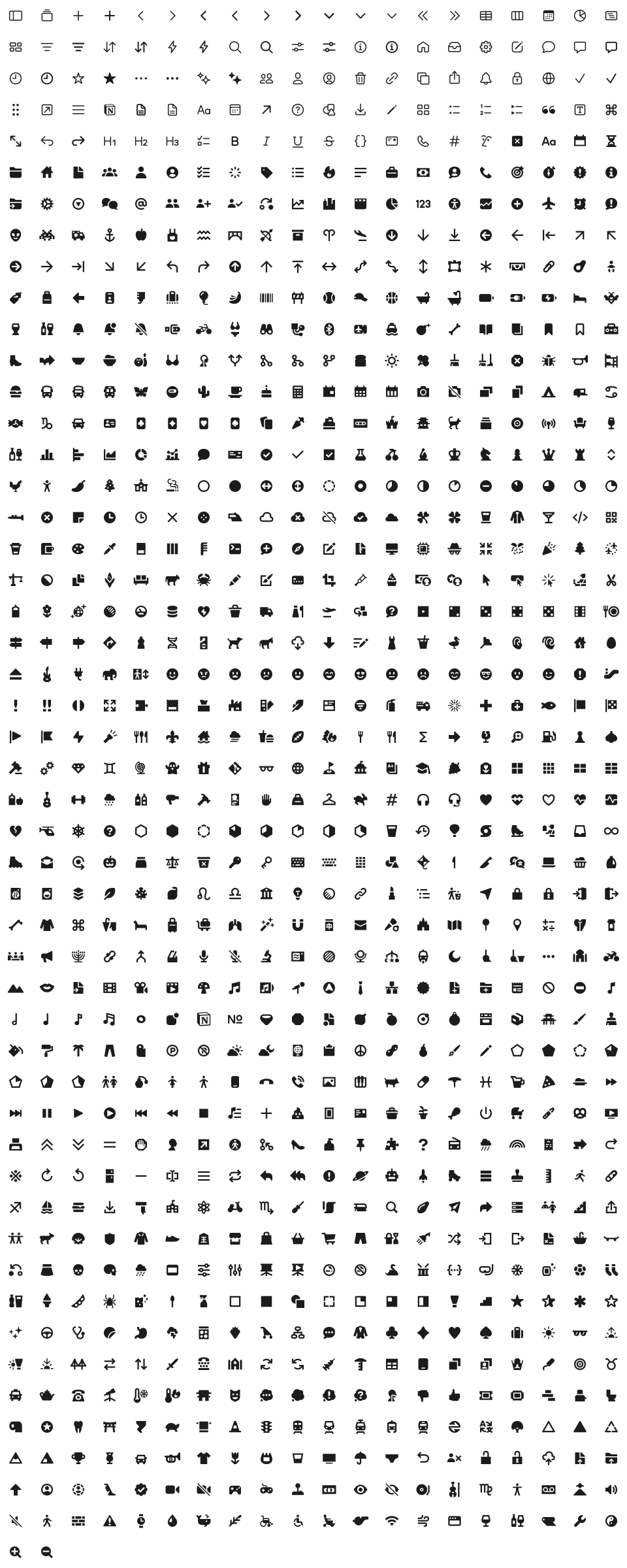
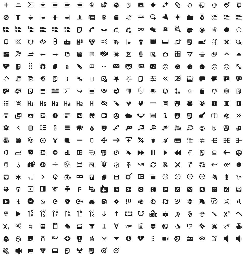
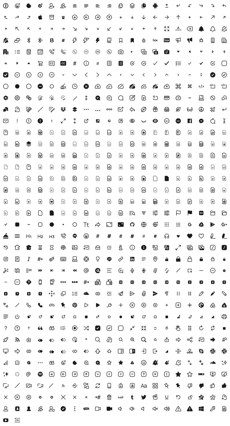
Drag the kit's All icons, one sheet file onto the Figma canvas. Every icon arrives as its own layer, named as in the real app. Ungroup once, select them all, right-click and choose Create multiple components: that is your icon library.
4Bring in the screens
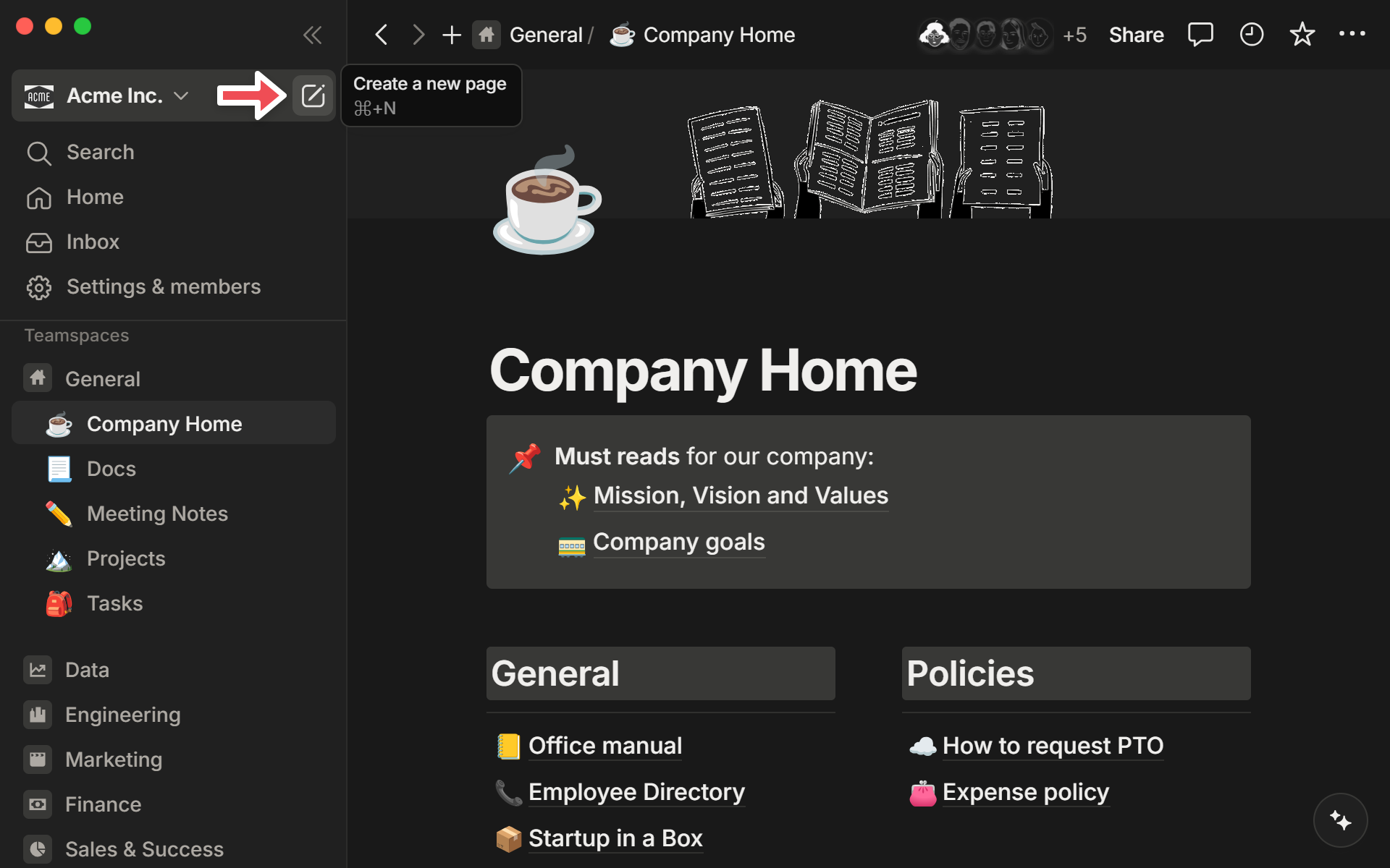
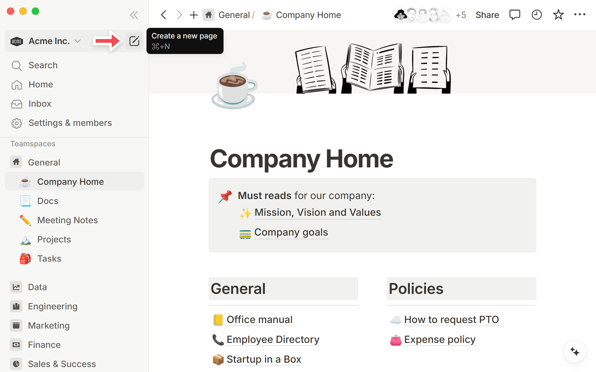
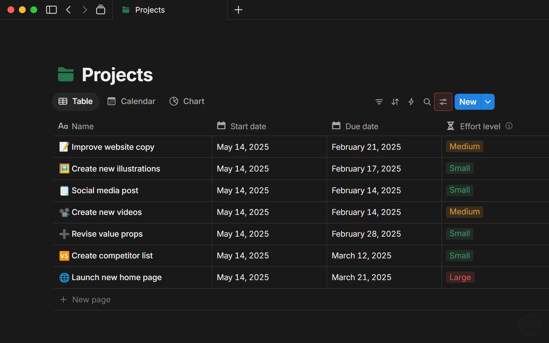
For reference, drag the screen pictures in. For editable layers, use the html.to.design plugin: share the page from Open Design to get a public link, paste the link into the plugin, and it imports the page as Figma frames and text.
Imported layers keep their colours as plain values; reconnect them to the variables from step 2 where you need to.
AltLeads CRM
Open the design systemOur own rebrandable system for AltLeads. Fonts are free on Google Fonts: Outfit, Inter, JetBrains Mono (install them from fonts.google.com).
Notion
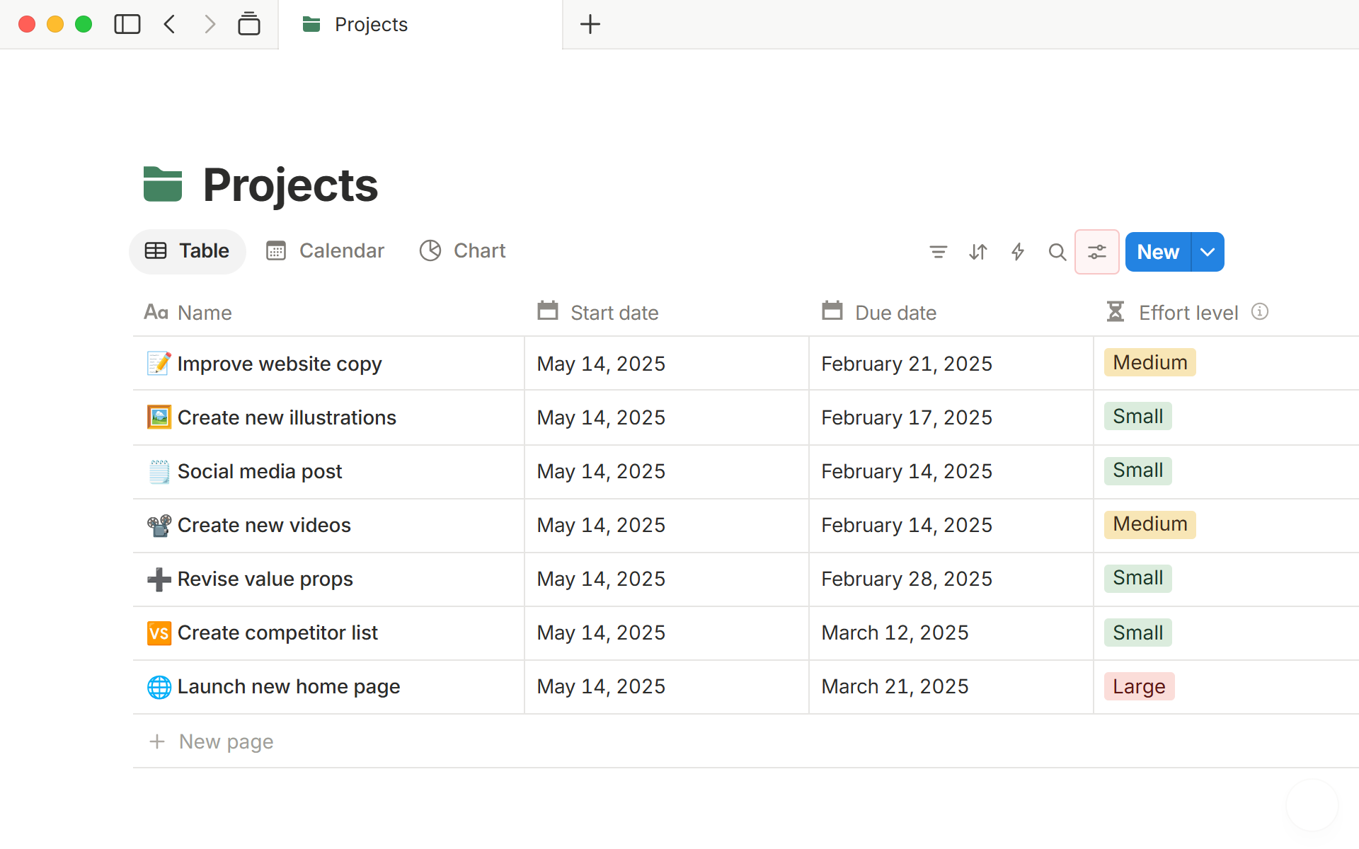
Open the design systemInter stands in for Notion's own font (NotionInter is a modified Inter that is not published).
HubSpot classic
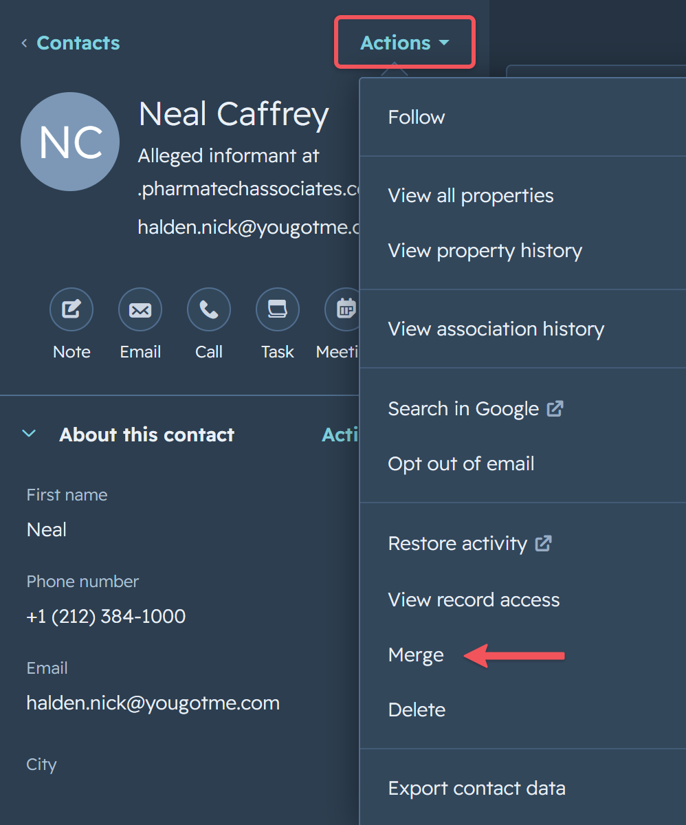
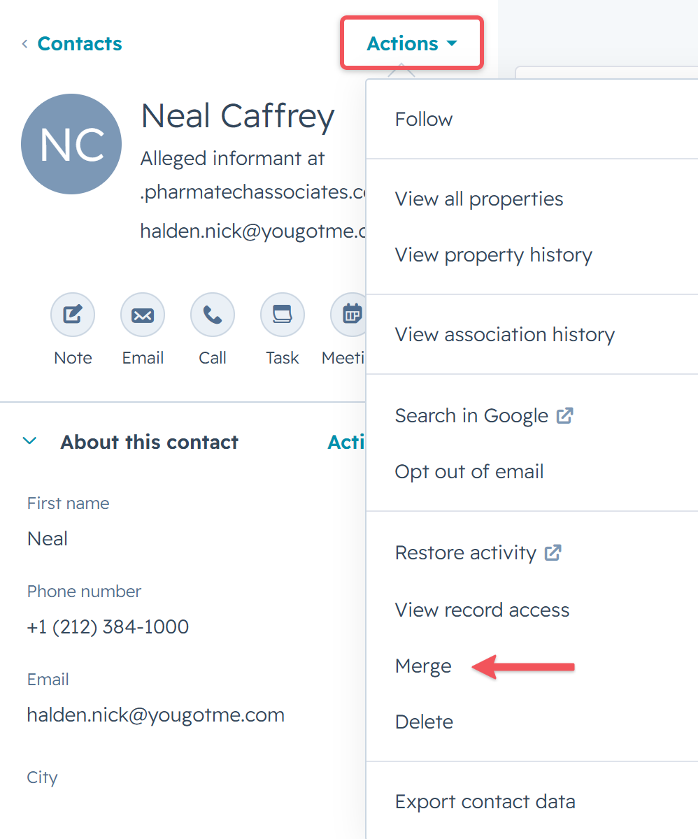
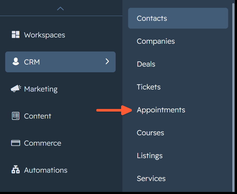
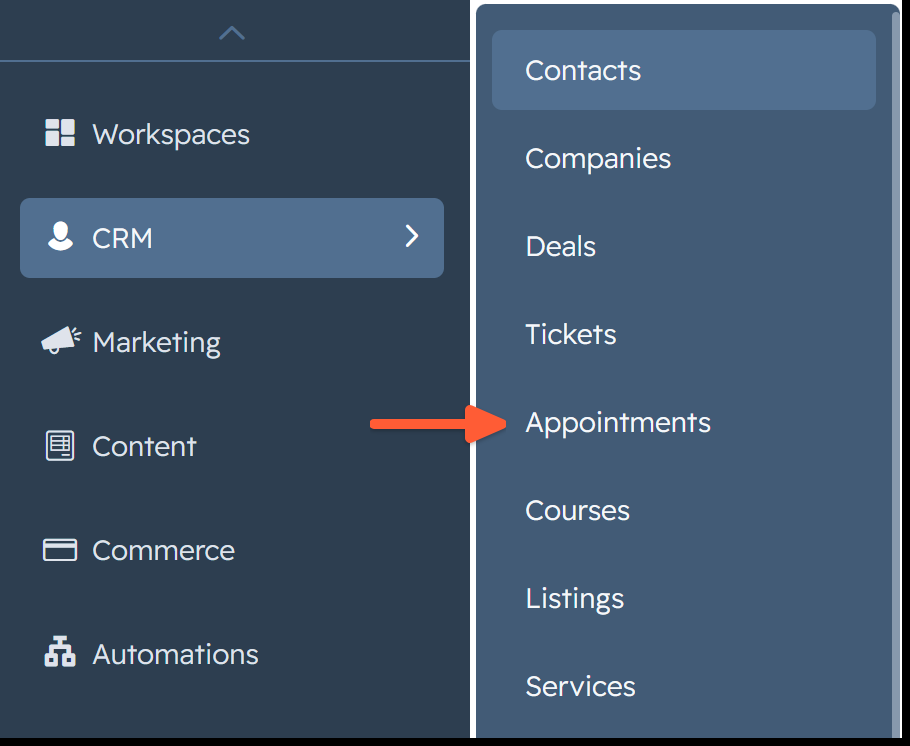
Open the design systemClassic orange HubSpot. Dark mode is ours, built from HubSpot's own palette (classic HubSpot had no dark mode).
Airtable
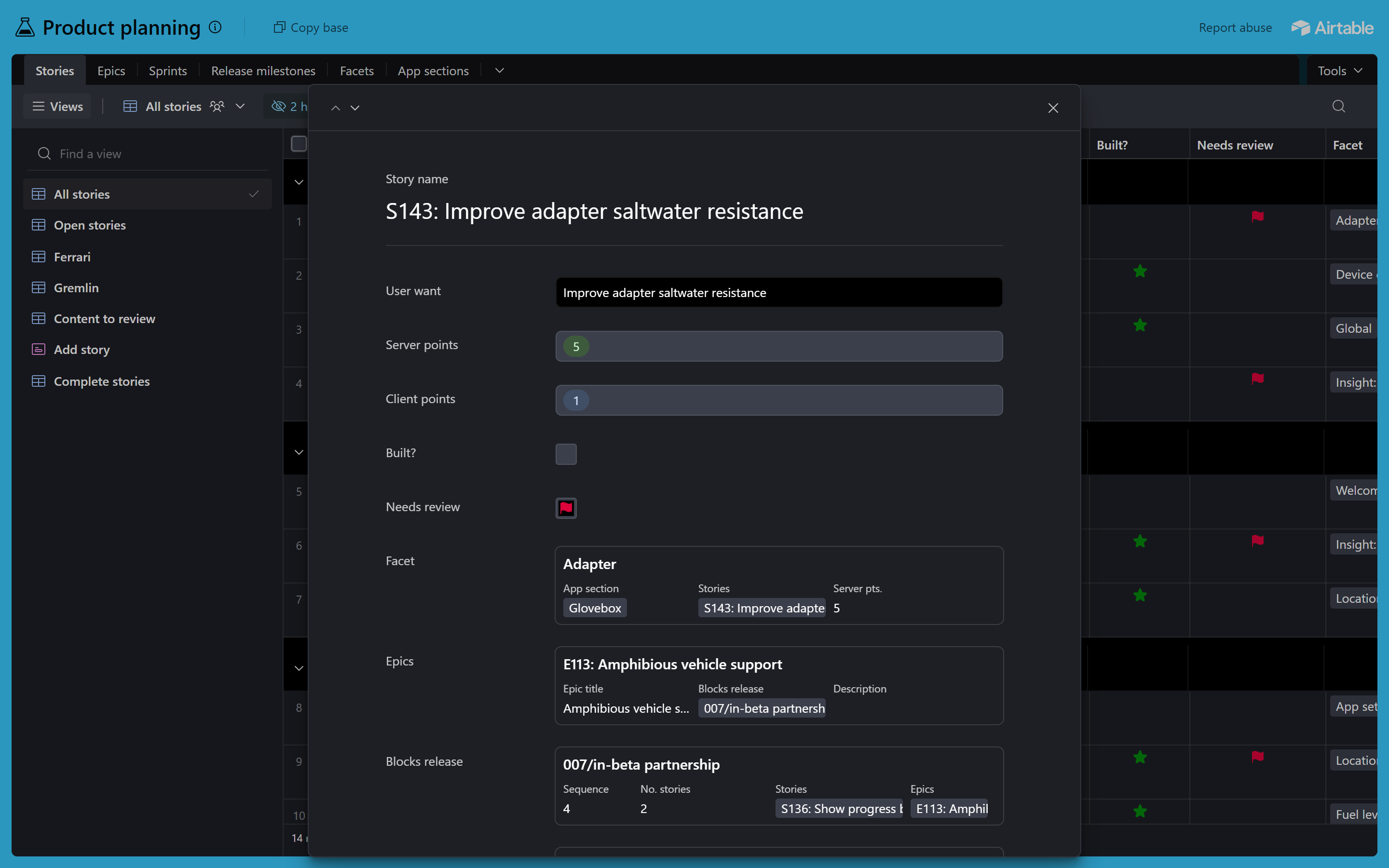
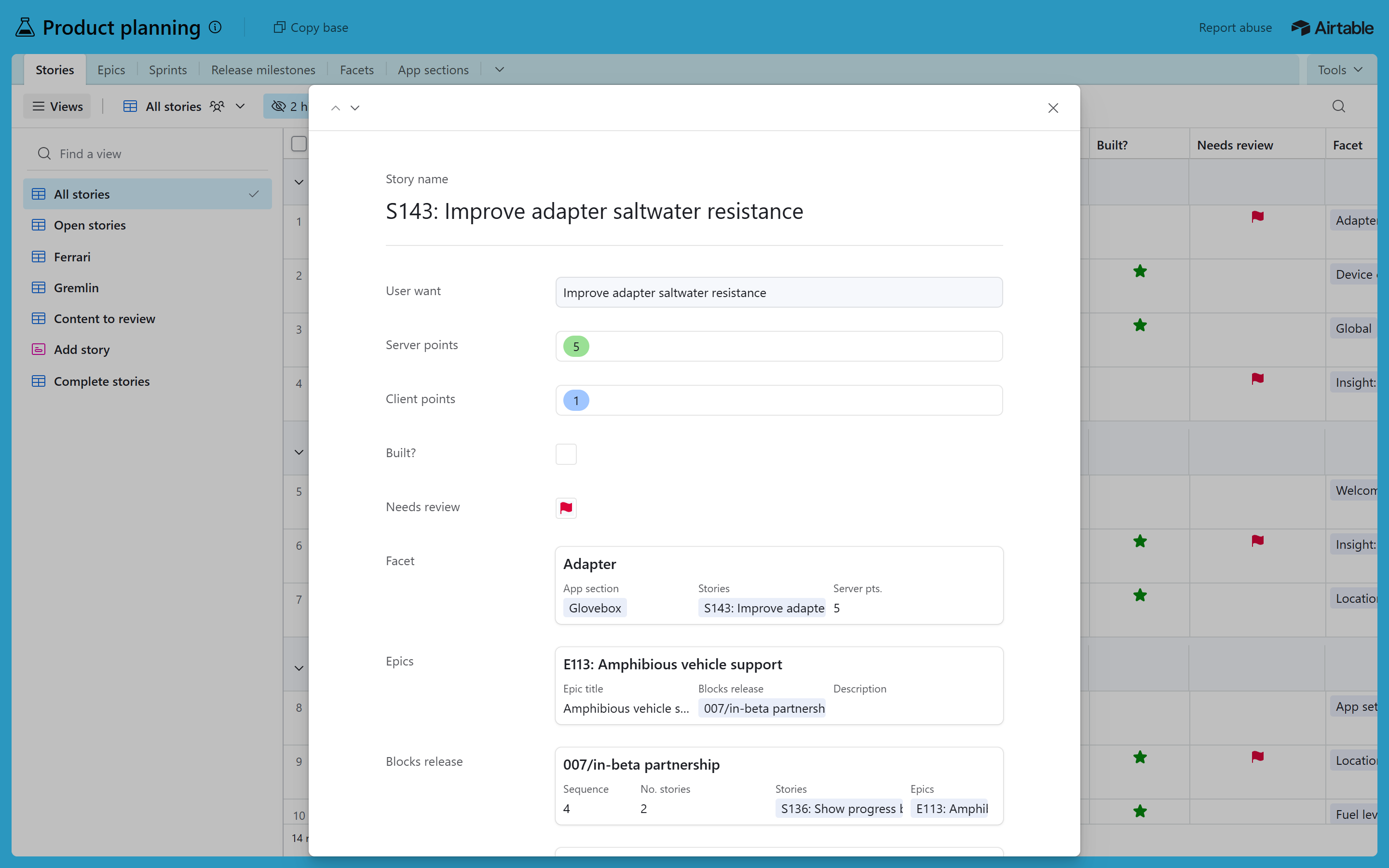
Open the design systemLight and Airtable's real dark mode, both copied from Airtable's own stylesheet. The app uses your system font (Segoe UI on Windows).

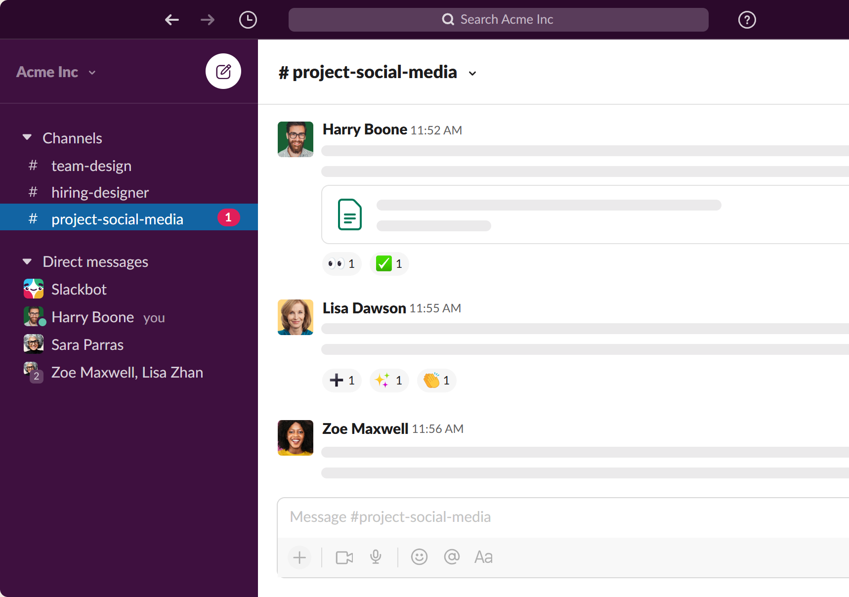
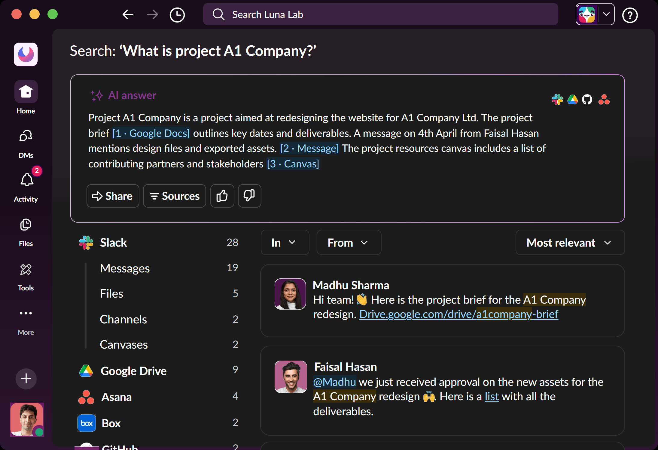
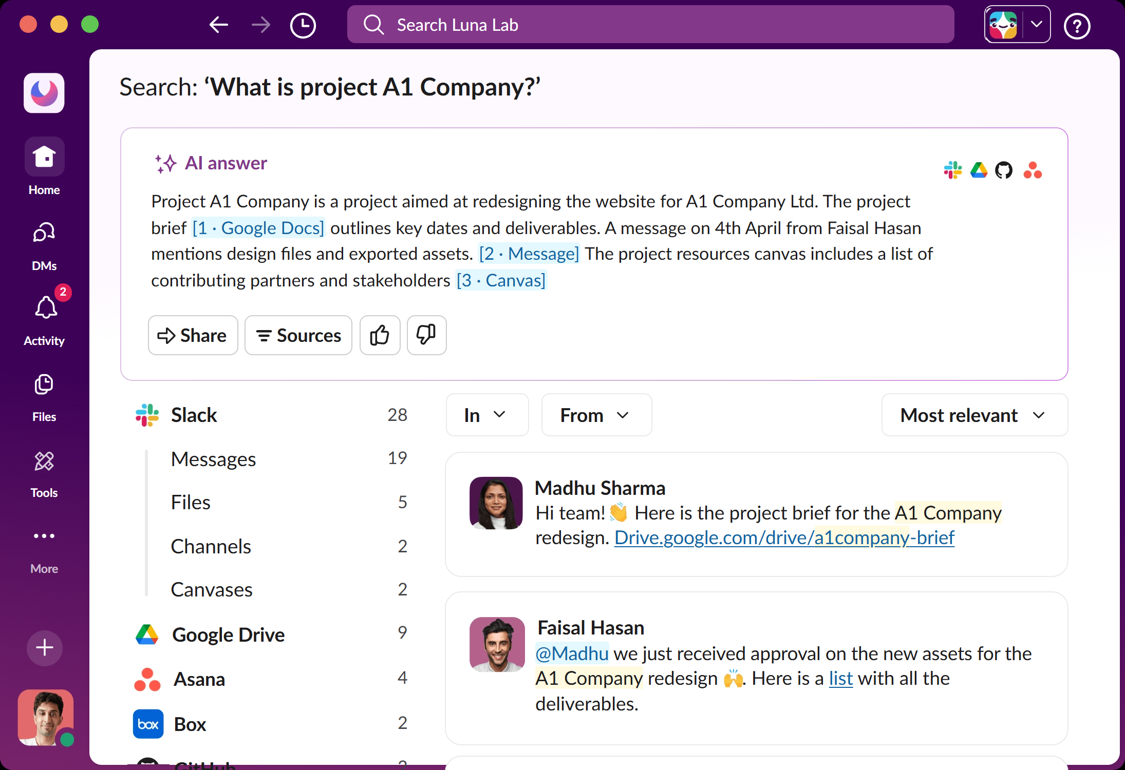
Work in progress: light is Slack's own 418 tokens; dark is ours for now (built from Slack's inverse tokens) until the classic dark screens are measured.
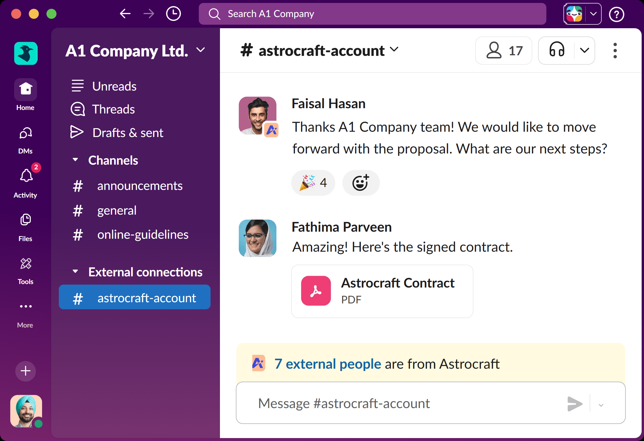
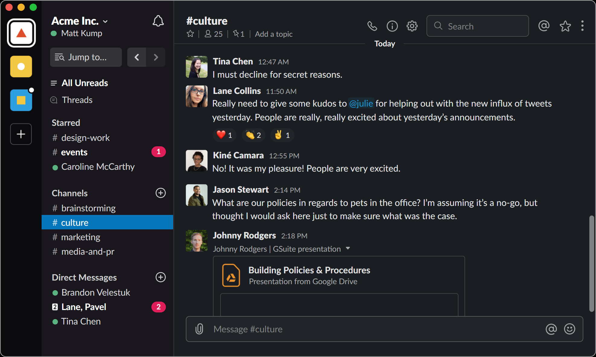
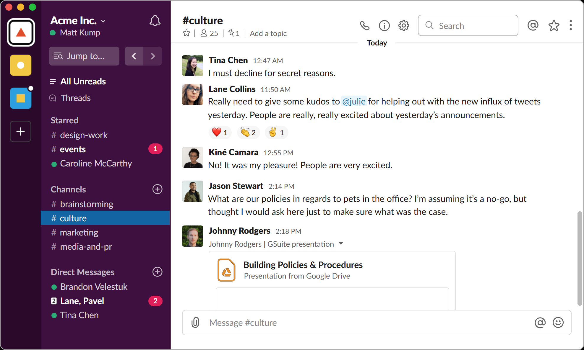
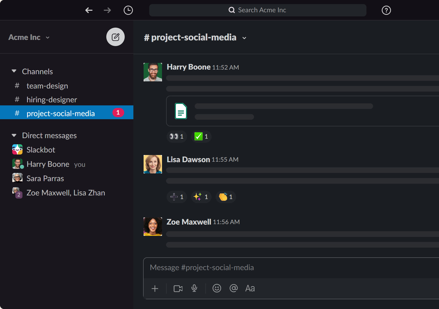
Fonts in the kits are open-licence (Inter, IBM Plex Mono, Lato, Lexend Deca). Icons and the Notion, HubSpot, Airtable and Slack designs belong to those companies: these kits are private study copies for our team. Shadows cannot be Figma variables; Tokens Studio turns them into effect styles instead.