Two real Slack screens, rebuilt
Each copy is built only from our Slack design system (Slack's own colour tokens, its "Slack v2" icon font, Slack-Lato) and checked pixel by pixel against Slack's own screenshots from its feature pages. Those screenshots show the app about 1.5 times larger than normal, so the copies do too. People's photos, logos and emoji are pictures cut from the same screenshots.
Channel: #astrocraft-account
91.1% pixel matchedges only 47.9% Original: slack.com feature page, 2190 × 1500 (1095 × 750 at 2x), current Slack design (2023 onwards)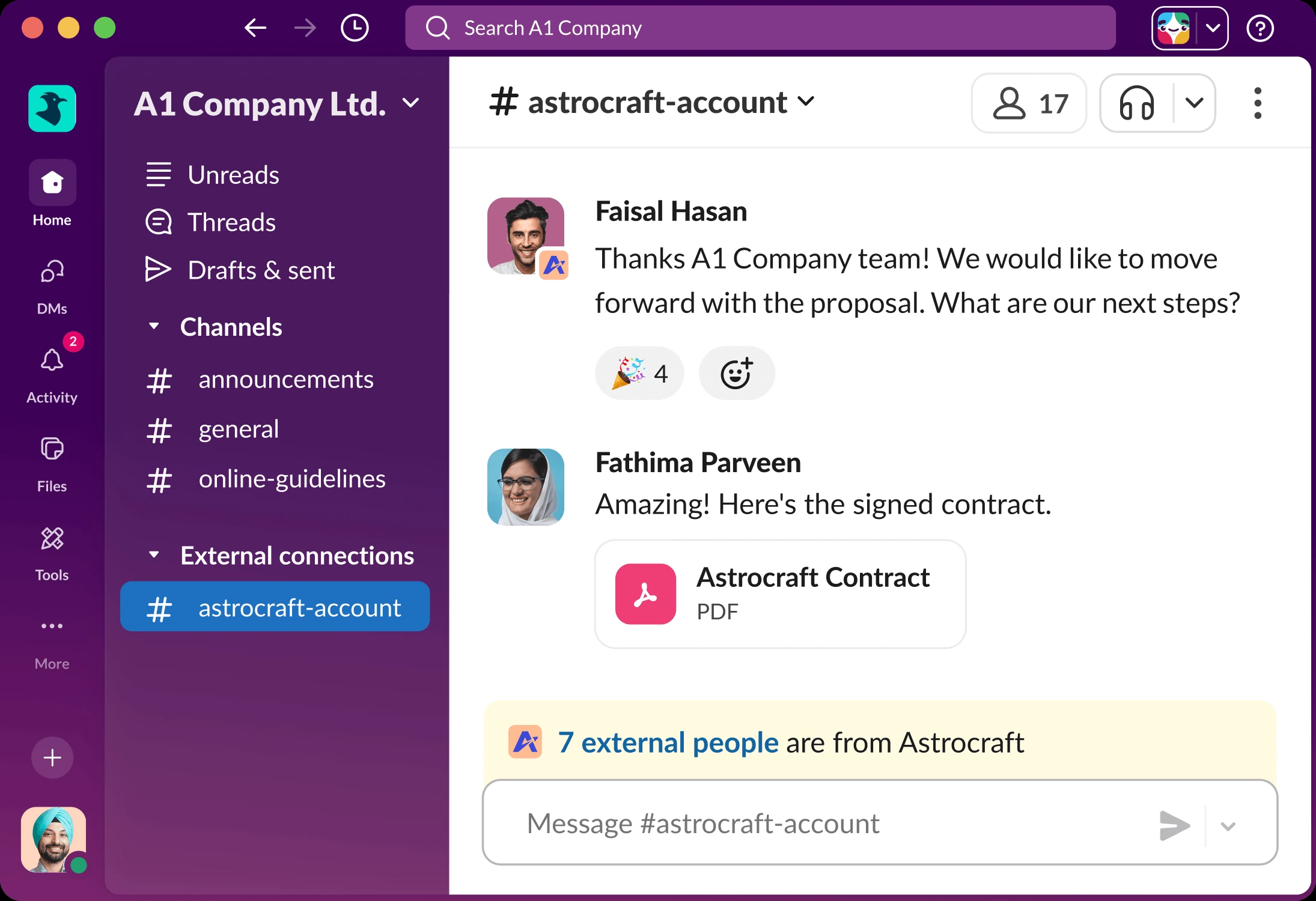
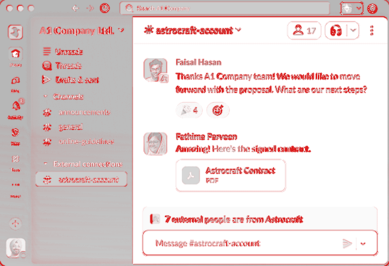
Try it: point at a message to see Slack's message actions, click 🎉 to add your reaction, use the smiley to pick an emoji, click the message box, type and press Enter to post, and click #general to switch channel (your post is still there when you come back). The search bar opens the search copy.
Search with an AI answer
88.3% pixel matchedges only 40.2% Original: slack.com feature page, 2190 × 1500, current Slack design
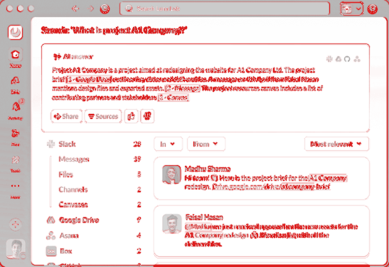
Try it: pick a source on the left (Google Drive, Asana…), filter by From, sort by Newest, rate the AI answer with the thumbs, open Sources or Share, and point at a citation like [1 · Google Docs] to see where it came from.
Classic Slack (2019 to 2023), rebuilt
Before the 2023 redesign Slack looked different: a dark top bar with search, the aubergine sidebar, and in 2019 a workspace rail on the far left. Slack no longer publishes those styles, so the values were measured from Slack's own old pictures: a Help Center screenshot (light, Aubergine theme) and the Slack Engineering blog post that launched dark mode in 2019 (the real classic dark theme). Each copy also has the other mode, built from the same measured values.
Classic channel (2020 to 2023), Aubergine theme
95.9% pixel matchedges only 66.1% Original: Slack Help Center "Quick start" picture (archived 2021 to 2023), 1718 × 1208 (859 × 604 at 2x). Its grey bars hide the message text; Slack drew blue call-out outlines on top, which the copy leaves out.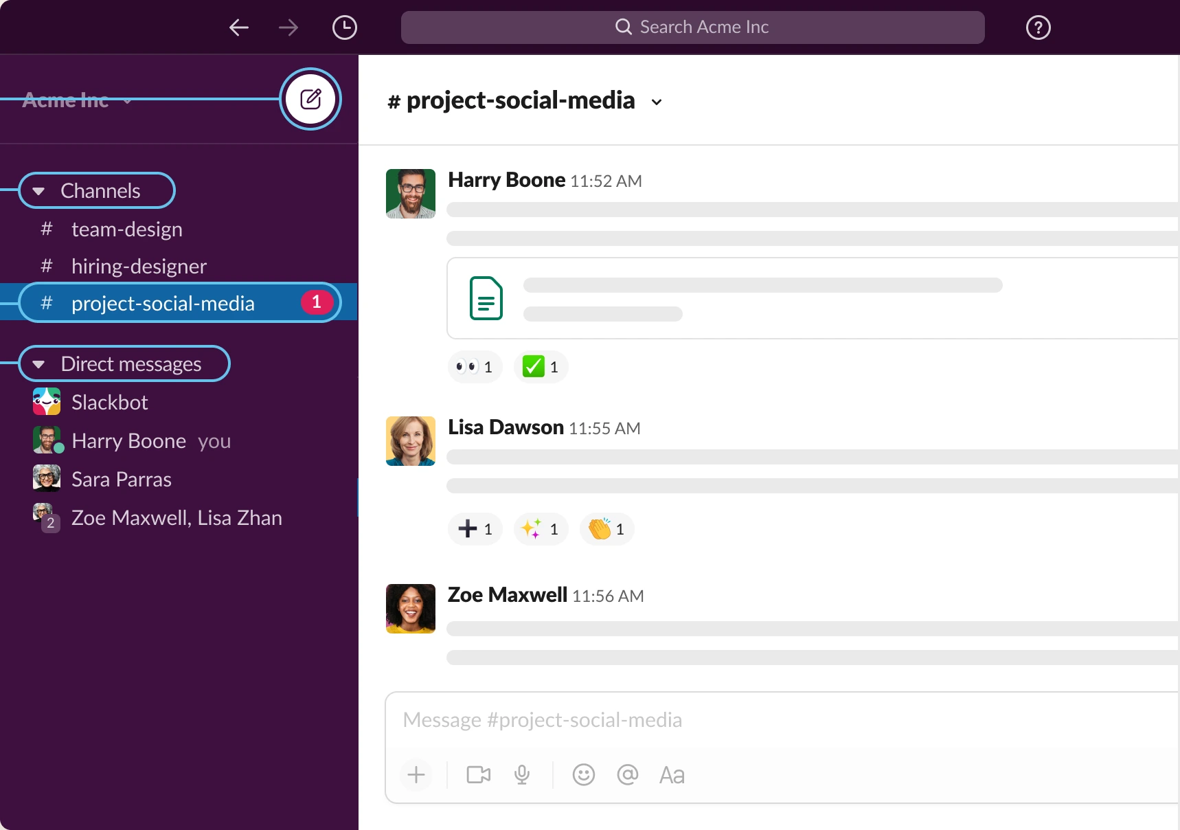
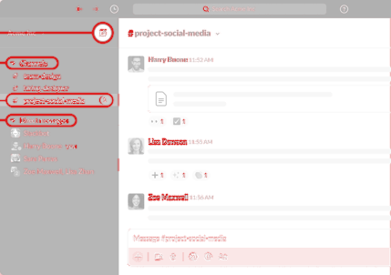
Try it: point at a message for its actions, click a reaction to add yours, click a channel or a person on the left, type in the message box and press Enter.
Classic channel (2019) in dark mode
91.9% pixel matchedges only 57.4% Original: Slack Engineering, "Building dark mode on desktop" (Sept 2019), 1756 × 1054 (988 × 593 at 1.78x, Slack's 2x picture shrunk by the blog).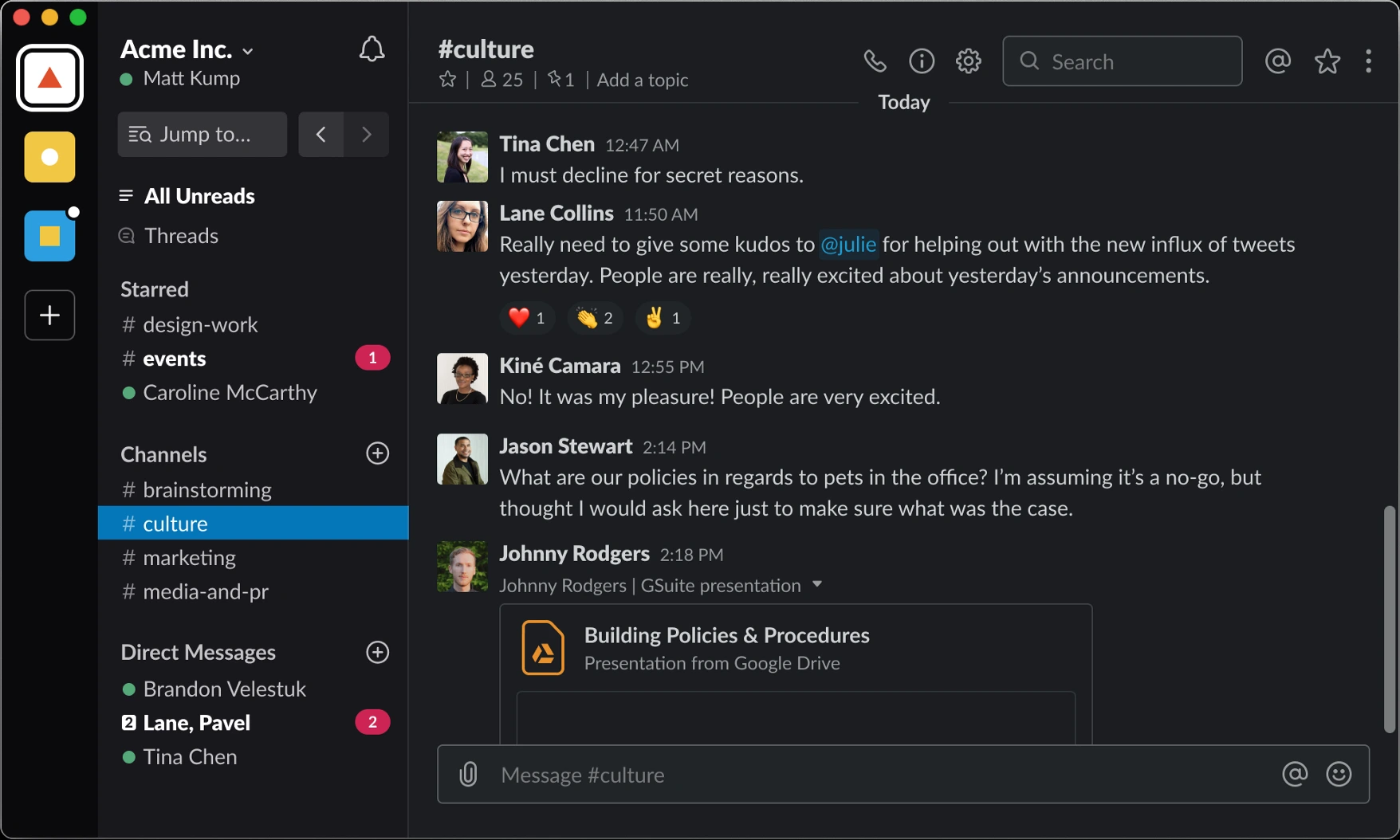
Try it: the same as above, plus the "Jump to", call, channel details and starred buttons explain themselves when you click them. The 2019 "Jump to" icon is not in Slack's current icon font, so it is drawn from the picture.
How to read the scores: Slack's screenshots were drawn on a Mac, which renders text slightly differently from Windows, so the strict "edges only" number (text, lines and icons) stays lower than on the Airtable copies, which were checked against captures from this laptop.
Dark mode: Slack's real dark colours for the current design are only loaded inside the signed-in app, and no public picture shows it in dark, so those two dark copies use Slack's own "inverse" tokens (ours). The classic dark colours are real: measured from Slack's 2019 dark-mode picture.
Opened on its own, each copy has links back at the top and a bar at the bottom: Light / Dark, Compare with original (drag the blue line), and Actual size. Keys: D dark, C compare, Esc closes the compare.